Search packages, repositories and app categories

custom_navigation_bar cover
Package detailsv0.8.2

custom_navigation_bar

A custom navigation bar with bubble click effect. Inspired by The Boring Flutter Development Show EP. 35.

AndroidiOSWebmacOSWindowsLinux
30-day downloads
1.1K
Likes
534
Pub points
140

Install package

flutter pub add custom_navigation_bar

Package Overview

Package selection guidance compiled from public package information, community data, and project usage.

A customizable bottom navigation bar featuring a bubble click effect, inspired by The Boring Flutter Development Show EP. 35. It enhances user interaction with smooth animations and visual feedback on tap. The package supports multiple platforms including Android, iOS, Web, macOS, Windows, and Linux, making it ideal for cross-platform apps. Developers can easily tailor the appearance and behavior to match their app's design language.

Use cases

  • Cross-platform mobile and web apps
  • Apps needing animated navigation feedback
  • Custom UI designs with interactive elements
  • Enhancing user experience in bottom navigation
  • Integrating playful animations into navigation bars

Key features

  • Bubble click animation effect
  • Highly customizable appearance
  • Supports multiple platforms
  • Easy integration with Flutter
  • Smooth touch feedback
  • Configurable item spacing and size

Suitable for

  • Flutter developers seeking animated navigation bars
  • Design-focused applications
  • Projects requiring interactive UI components
  • Developers inspired by The Boring Flutter Development Show
  • Apps targeting multi-platform deployment

Considerations

  • May impact performance on low-end devices
  • Requires careful color and size planning for optimal visuals
  • Limited built-in accessibility features
  • Animation may not suit all design aesthetics
  • Not suitable for minimalistic or flat design themes

Original README

Original README snapshot from the linked source repository. Visit the repository for the latest content.

custom_navigation_bar

A custom navigation bar with bubble click effect.

pub package License: MIT Star on Github Star on Github

Overview

This project is inspired by this post from Dribbble and The Boring Flutter Development Show, Ep. 35

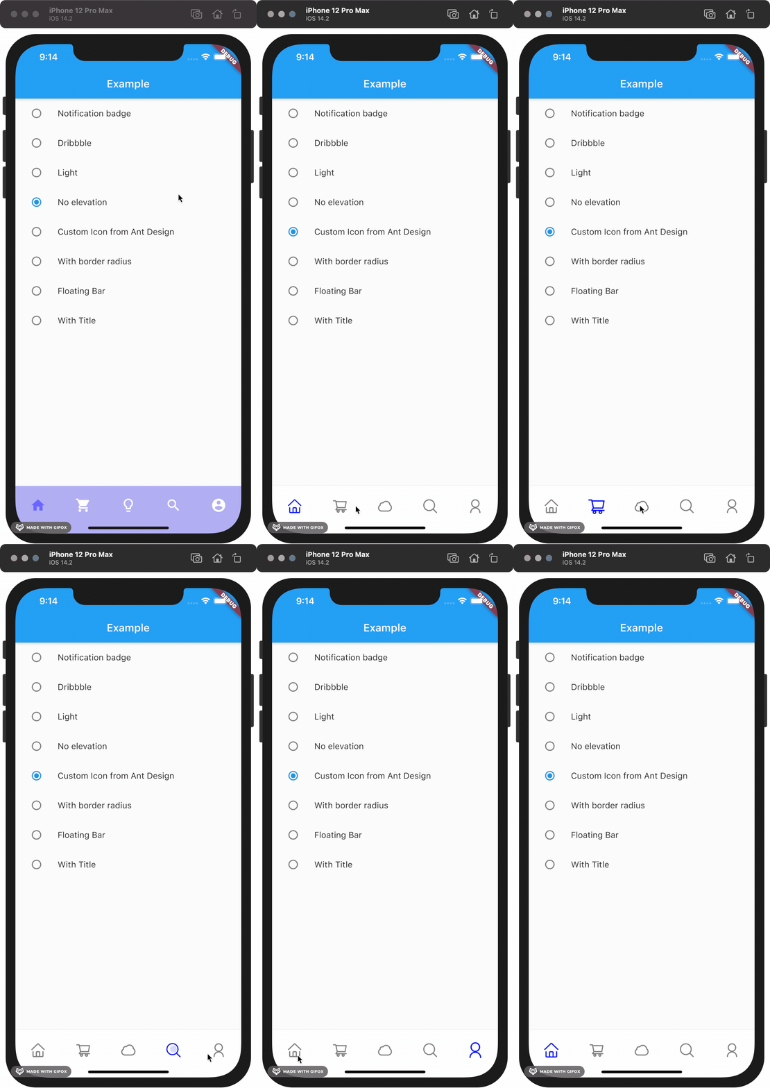
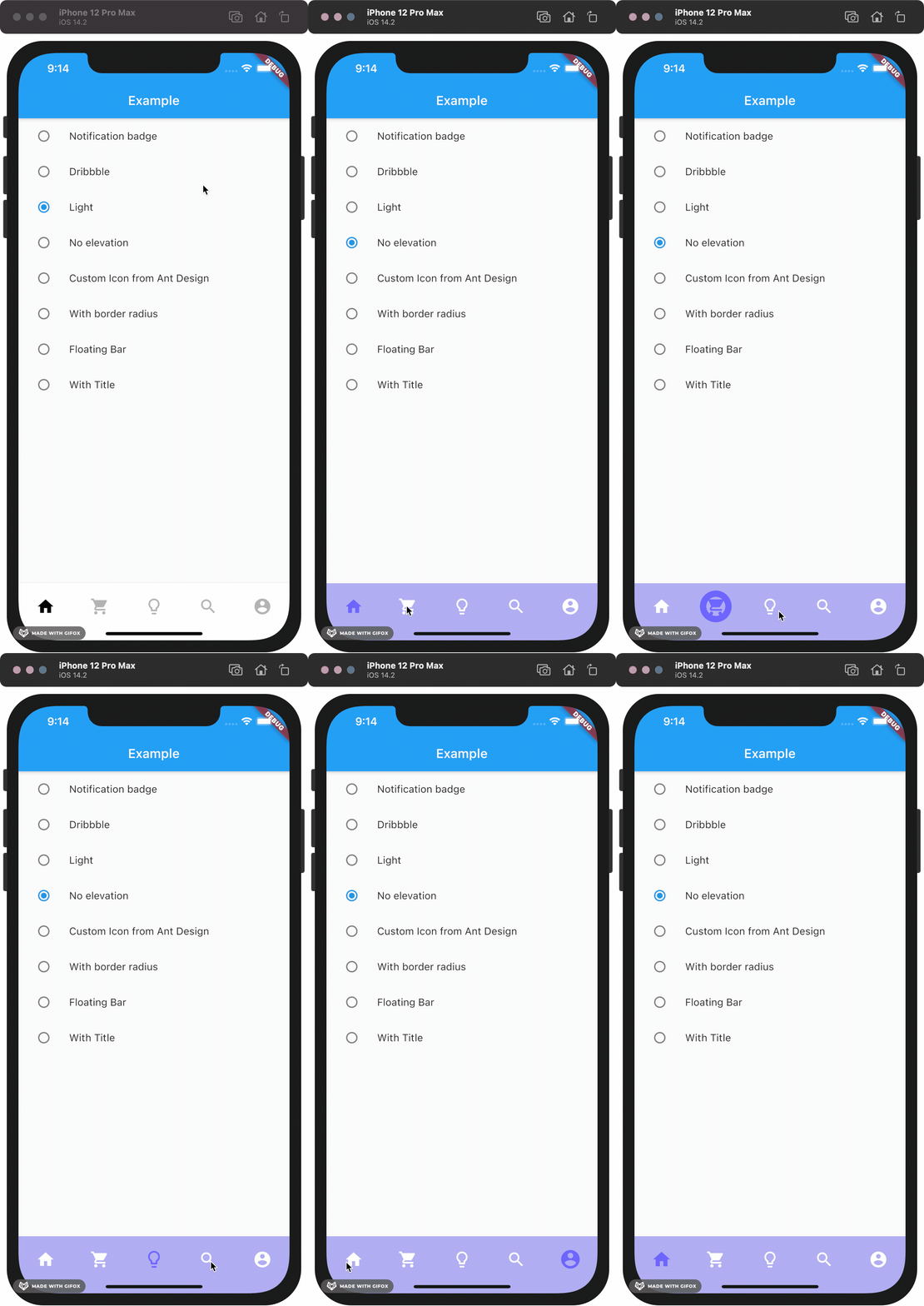
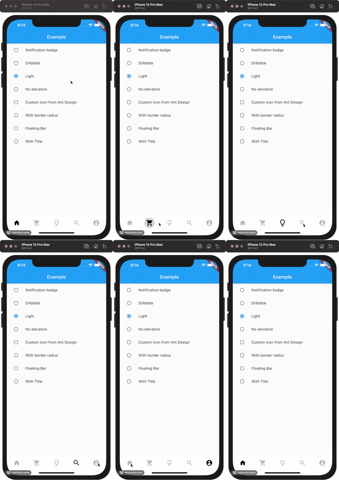
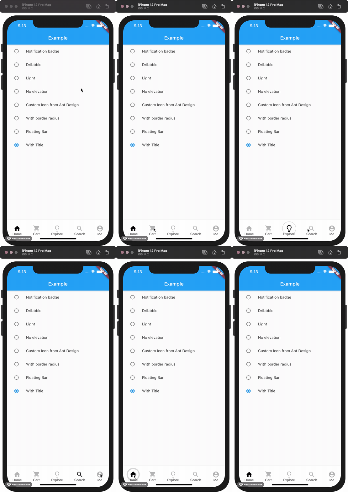
This package gives you a cute bubble effect when you click on the navigation bar.

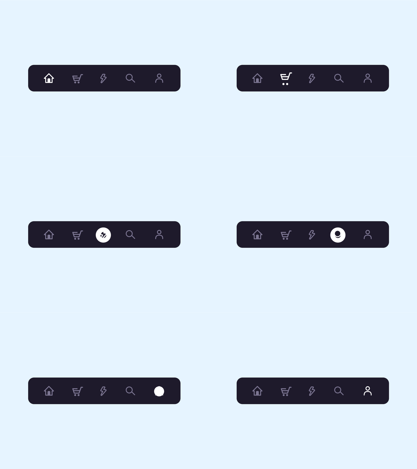
Dribbble:

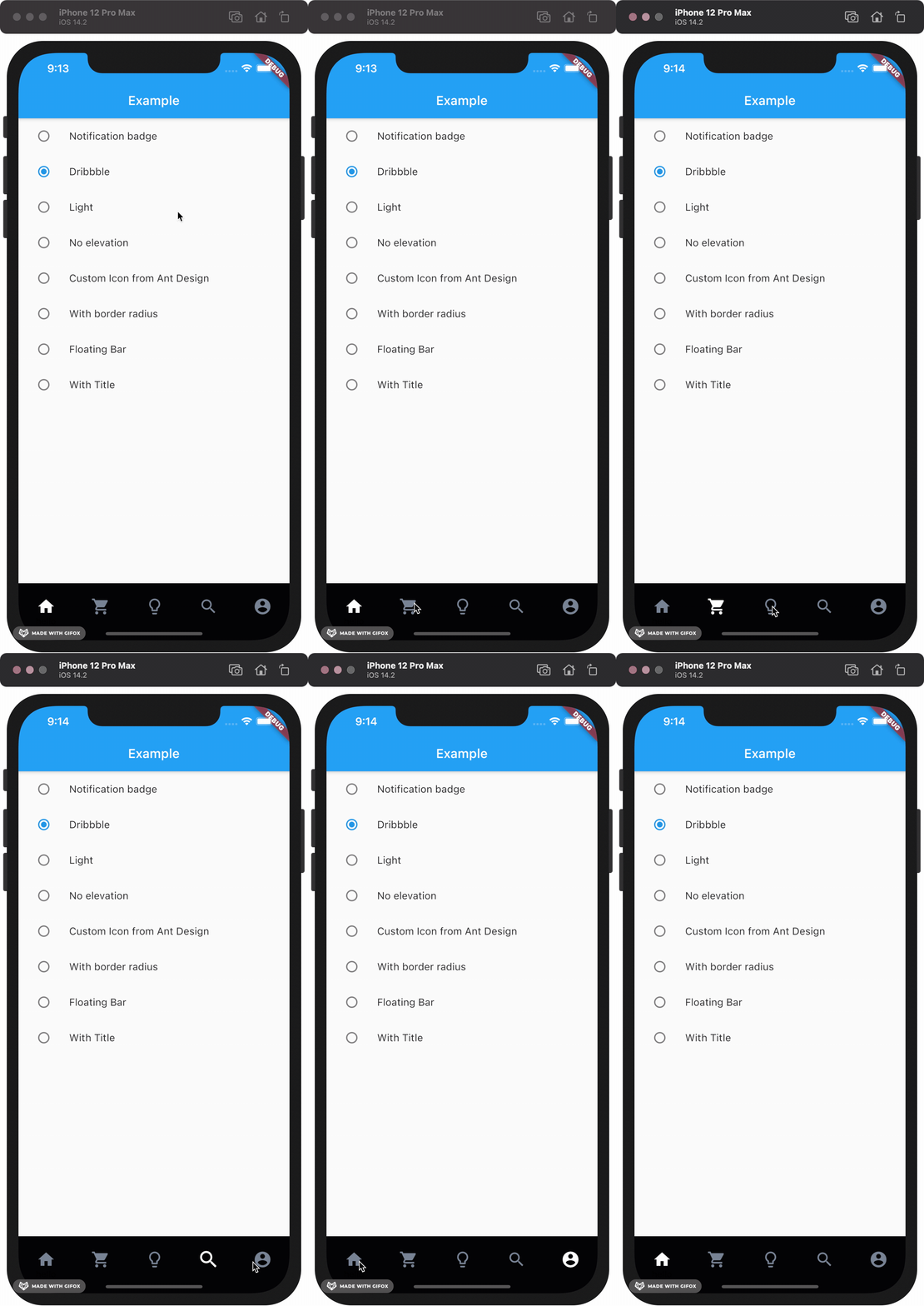
Implemented:

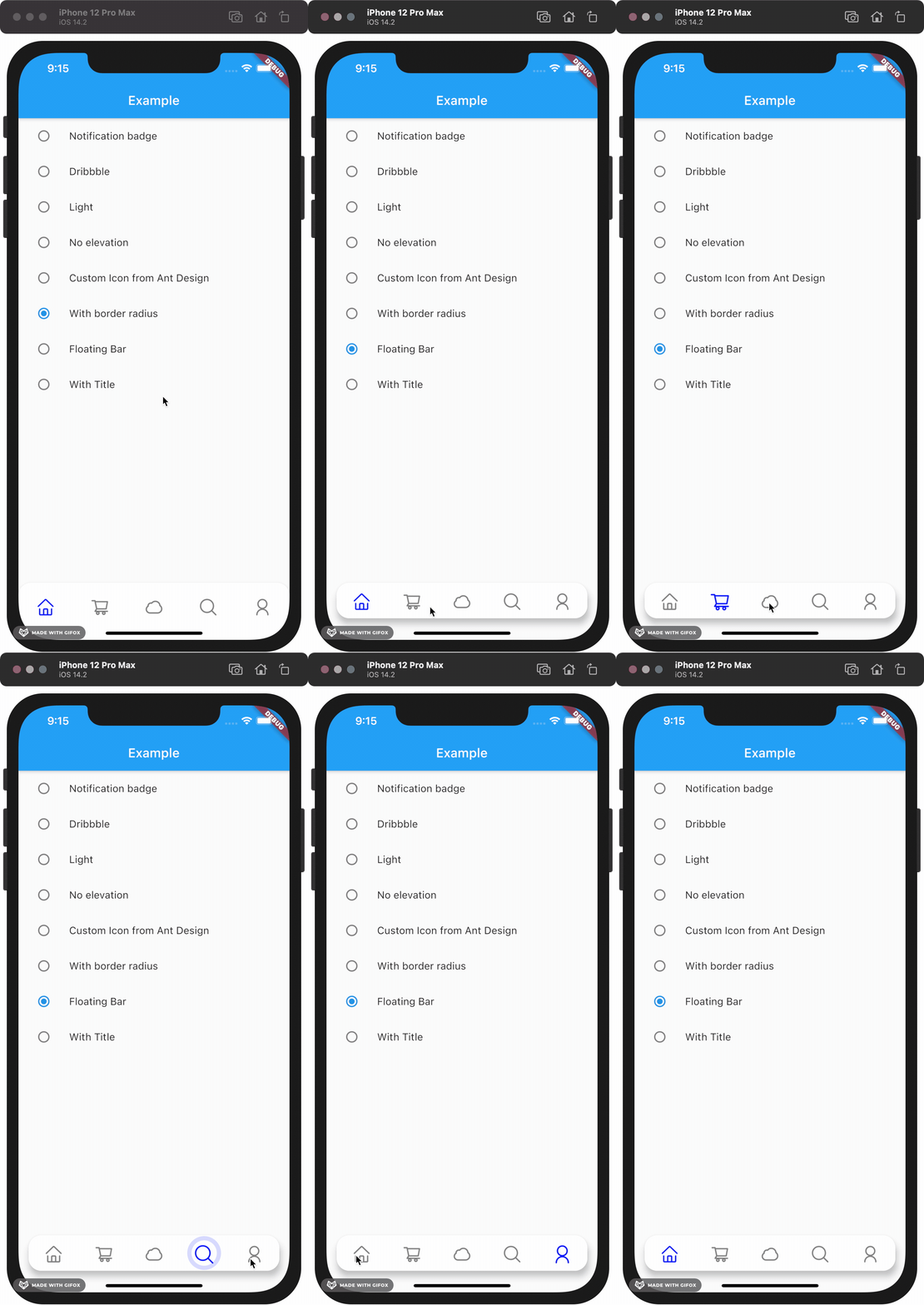
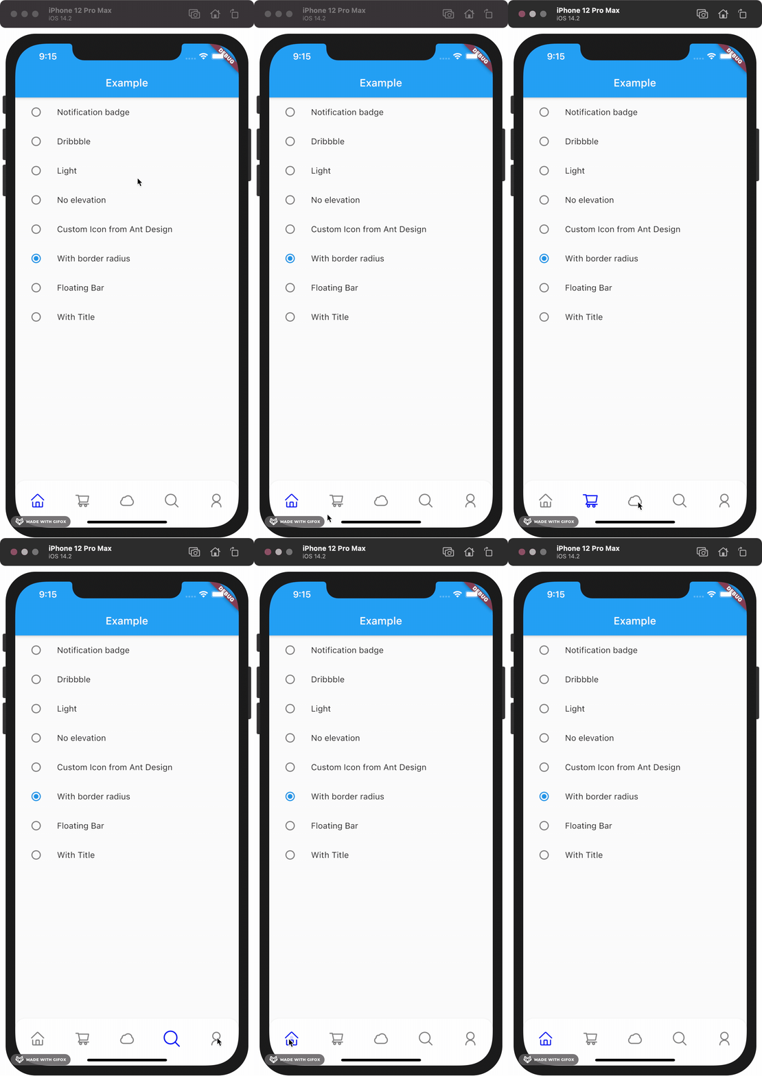
Gallery

How to install

Add this to your package's pubspec.yaml file:

dependencies:
  custom_navigation_bar: lastest version

Documentation

Attention

If you update from version under 0.6.0, there are some breaking changes in the version 0.6.0. The icon in CustomNavigationBarItem has changed from IconData to Widget.

old version

CustomNavigationBarItem(
      {@required this.icon,
      IconData selectedIcon,
      this.selectedTitle,
      this.unSelectedTitle,
      this.badgeCount = 0,
      this.showBadge = true})
      : selectedIcon = selectedIcon ?? icon;

  ///
  /// The icon of the item
  /// Typically the icon is an [Icon].
  ///
  final IconData icon;

new version

CustomNavigationBarItem(
      {@required this.icon,
      Widget selectedIcon,
      this.title,
      Text selectedTitle,
      this.badgeCount = 0,
      this.showBadge = false})
      : selectedIcon = selectedIcon ?? icon,
        selectedTitle = selectedTitle ?? title;

  ///
  /// The icon of the item
  /// Typically the icon is an [Icon].
  ///

  final Widget icon;      
You can customize these attributes in the navigation bar.
Attributes Type Description Default
scaleFactor double scale factor for the icon scale animation. 0.2
elevation double The z-coordinate of this CustomNavigationBar 8.0
items List item data in CustomNavigationBar required
selectedColor Color [Color] when [CustomNavigationBarItem] is selected [blueAccent]
unSelectedColor Color [Color] when [CustomNavigationBarItem] is not selected. grey[600]
onTap Function(int) callback function when item tapped null
currentIndex int current index of navigation bar. 0
iconSize double size of icon. also represent the max radius of bubble effect animation. 24.0
backgroundColor Color Background color of [CustomNavigationBar] Colors.white
strokeColor Color stroke color blueAccent
bubbleCurve Curve animation curve of bubble effect linear
scaleCurve Curve animation curve of scale effect linear
borderRadius Radius border radius of navigation bar Radius.zero
isFloating bool control if CustomNavigationBar is floating false
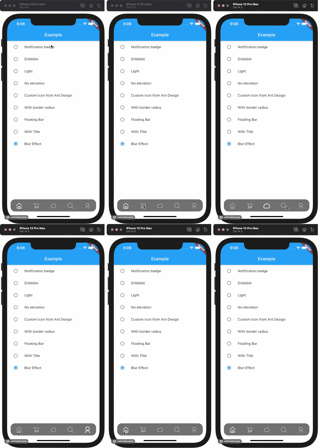
blurEffect bool control if CustomNavigationBar show blur effect false
opacity double control CustomNavigationBar blur effect opacity when blurEffect is true 0.8
brightness Brightness describes the contrast of a theme or color palette. If you want adaptive system display setting like iOS dark mode , you should set Brightness.dark or Brightness.light . if this attribute be set , other attributes with "*Color" (like selectedColor) will not take effect , should use lightThemeData or darkThemeData null
lightThemeData CustomNavigationBarThemeData when brightnessis light,you can custom the light theme color if you want it null
darkThemeData CustomNavigationBarThemeData when brightnessis dark,you can custom the dark theme color if you want it null

Attention: If you set isFloating to true, I would recommand you to set extendBody to true in Scaffold for a better performance.

And for customize icon in the navigation bar, just put the icons you want in the CustomNavigationBarItem like this.

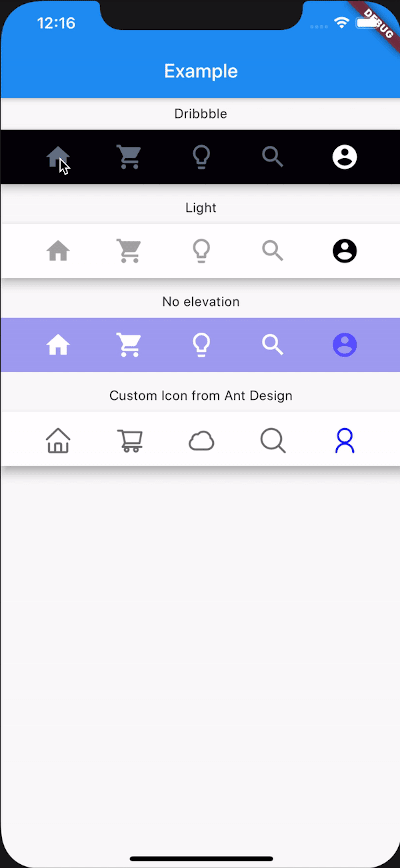
CustomNavigationBar(
        ...
        items: [
          CustomNavigationBarItem(
          icon: Icon(Icons.home),
          title: Text("hello"),
        ),
        CustomNavigationBarItem(
          icon: Icon(Icons.shopping_cart),
        ),
        CustomNavigationBarItem(
          icon: Icon(Icons.lightbulb_outline),
        ),
        CustomNavigationBarItem(
          icon: Icon(Icons.search),
        ),
        CustomNavigationBarItem(
          icon: Icon(Icons.account_circle),
        ),
        ],
        ...
      )

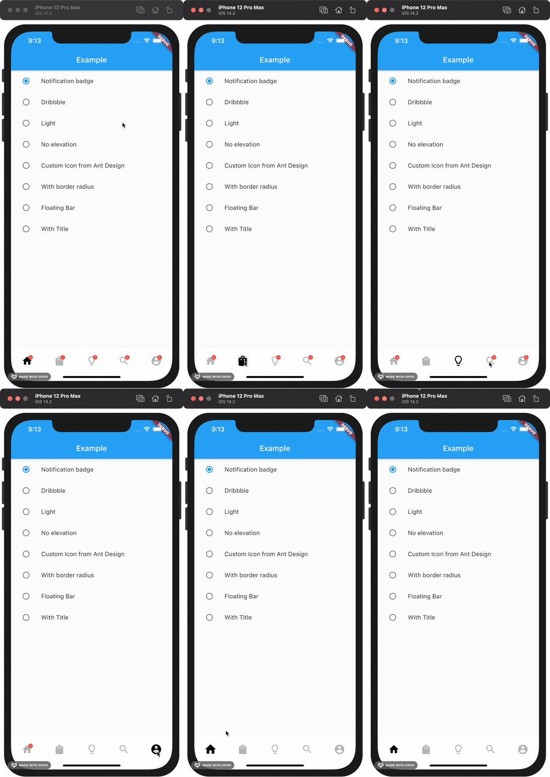
If you want add notification badge, just use like this

CustomNavigationBar(
        ...
        items: [
        CustomNavigationBarItem(
          icon: Icon(Icons.home),
          badgeCount: _badgeCounts[0],
          showBadge: _badgeShows[0],
        ),
        CustomNavigationBarItem(
          icon: Icon(Icons.shopping_bag),
          badgeCount: _badgeCounts[1],
          showBadge: _badgeShows[1],
        ),
        CustomNavigationBarItem(
          icon: Icon(Icons.lightbulb_outline),
          badgeCount: _badgeCounts[2],
          showBadge: _badgeShows[2],
        ),
        CustomNavigationBarItem(
          icon: Icon(Icons.search),
          badgeCount: _badgeCounts[3],
          showBadge: _badgeShows[3],
        ),
        CustomNavigationBarItem(
          icon: Icon(Icons.account_circle),
          badgeCount: _badgeCounts[4],
          showBadge: _badgeShows[4],
        ),
      ],
        ...
      )

To clear a badge, set showBadge to false

If you want add title under icon, just use like this

CustomNavigationBar(
      iconSize: 30.0,
      selectedColor: Color(0xff040307),
      strokeColor: Color(0x30040307),
      unSelectedColor: Color(0xffacacac),
      backgroundColor: Colors.white,
      items: [
        CustomNavigationBarItem(
          icon: Icon(Icons.home),
          title: Text("Home"),
        ),
        CustomNavigationBarItem(
          icon: Icon(Icons.shopping_cart),
          title: Text("Cart"),
        ),
        CustomNavigationBarItem(
          icon: Icon(Icons.lightbulb_outline),
          title: Text("Explore"),
        ),
        CustomNavigationBarItem(
          icon: Icon(Icons.search),
          title: Text("Search"),
        ),
        CustomNavigationBarItem(
          icon: Icon(Icons.account_circle),
          title: Text("Me"),
        ),
      ],
      currentIndex: _currentIndex,
      onTap: (index) {
        setState(() {
          _currentIndex = index;
        });
      },
    );

Example

Check example app for more details.

Contribute

Issues and pull requests are welcomed!!

Future Plans
  • [x] Code format
  • [x] Make it more like native navigation bar in Flutter.
  • [x] Better documentation
  • [ ] More customizations!! And more...

Categories

Source repository

Projects using this package

No data available yet.