
Overview
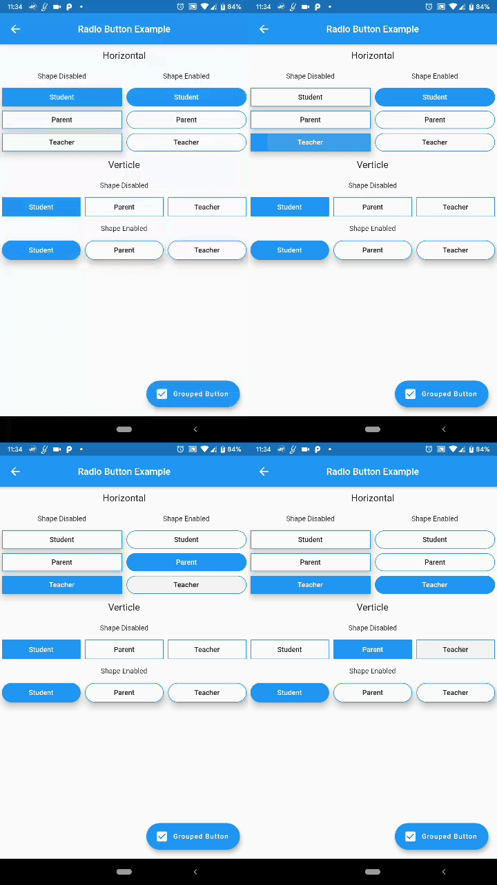
A Flutter package that provides customizable radio buttons and grouped checkbox buttons with support for multiple platforms. It allows developers to create visually distinct and interactive selection components, ideal for forms and user preferences. The package offers flexible styling, easy integration, and responsive behavior across Android, iOS, Web, macOS, Windows, and Linux. It enhances UI consistency while maintaining simplicity in implementation.
Use cases
- Form inputs with single selection
- User preference settings
- Survey or quiz interfaces
- Customizable UI components
- Multi-platform applications
Key features
- Customizable button styles
- Grouped selection logic
- Support for both radio and checkbox modes
- Responsive design across platforms
- Easy integration with existing Flutter projects
Suitable for
- Developers building forms
- UI designers seeking custom controls
- Cross-platform app creators
- Projects requiring interactive selection widgets
Considerations
- Requires manual handling of selection state
- Limited built-in validation
- May need additional styling for complex layouts
- Not optimized for very large option lists
- Depends on external dependencies for advanced features