Search packages, repositories and app categories

dashed_circular_progress_bar cover
Package detailsv0.0.6

dashed_circular_progress_bar

Dashed circular progress bar shows the progress of a task in a circle, which can be customized in color, style, and shape.

AndroidiOSWebmacOSWindowsLinux
30-day downloads
4.5K
Likes
117
Pub points
160

Install package

flutter pub add dashed_circular_progress_bar

Package Overview

Package selection guidance compiled from public package information, community data, and project usage.

A customizable dashed circular progress bar for Flutter that visually represents task progress in a circular format. It supports various colors, stroke styles, and shapes, making it ideal for loading indicators or progress tracking in apps. The widget is lightweight and compatible across all major platforms including Android, iOS, Web, macOS, Windows, and Linux. It can be easily integrated using the pub command and customized to match app themes.

Use cases

  • Loading indicators
  • Progress tracking in forms
  • Task completion visualization
  • Custom UI elements
  • Interactive dashboards

Key features

  • Dashed stroke style
  • Customizable color and width
  • Circular shape with adjustable size
  • Cross-platform compatibility
  • Easy integration via pub
  • Supports animation

Suitable for

  • App developers seeking visual feedback
  • Designers wanting unique progress indicators
  • Projects requiring platform-agnostic components
  • UI-heavy applications
  • Minimalist design aesthetics

Considerations

  • Limited to circular layout
  • No built-in text labels
  • Requires manual animation control
  • Not suitable for linear progress
  • May need additional styling for dark mode

Original README

Original README snapshot from the linked source repository. Visit the repository for the latest content.

Dashed circular progress bar

Open source flutter package, Dashed circular progress bar for flutter apps.

Getting Started

Installing

Add this line to the pubspec.yaml file below the dependencies:

dependencies:
  dashed_circular_progress_bar: ^0.0.6

Now to use, import this package into the desired file as follows:

import 'package:dashed_circular_progress_bar/dashed_circular_progress_bar.dart';

Basic examples

Here are some simple examples you can use to create this package:

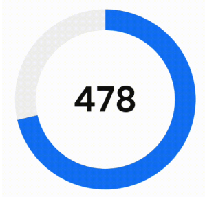
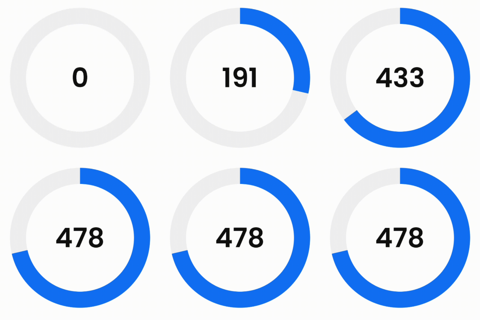
Example 1 - Simple progress bar
simple_example_gif

First of all, to access the amount of progress when doing animation, you need to define a ValueNotifier:

final ValueNotifier<double> _valueNotifier = ValueNotifier(0);

Then add it to the widget:

DashedCircularProgressBar.aspectRatio(
  aspectRatio: 1, // width ÷ height
  valueNotifier: _valueNotifier,
  progress: 478,
  maxProgress: 670,
  corners: StrokeCap.butt,
  foregroundColor: Colors.blue,
  backgroundColor: const Color(0xffeeeeee),
  foregroundStrokeWidth: 36,
  backgroundStrokeWidth: 36,
  animation: true,
  child: Center(
    child: ValueListenableBuilder(
      valueListenable: _valueNotifier,
      builder: (_, double value, __) => Text(
        '${value.toInt()}%',
        style: const TextStyle(
          color: Colors.black,
          fontWeight: FontWeight.w300,
          fontSize: 60
        ),
      ),
    ),
  ),
)
Example 2 - Dashed background progress bar
simple_example_gif
DashedCircularProgressBar.aspectRatio(
  aspectRatio: 2, // width ÷ height
  progress: 34,
  startAngle: 270,
  sweepAngle: 180,
  circleCenterAlignment: Alignment.bottomCenter,
  foregroundColor: Colors.black,
  backgroundColor: const Color(0xffeeeeee),
  foregroundStrokeWidth: 3,
  backgroundStrokeWidth: 2,
  backgroundGapSize: 2,
  backgroundDashSize: 1,
  seekColor: Colors.yellow,
  seekSize: 22,
  animation: true,
)
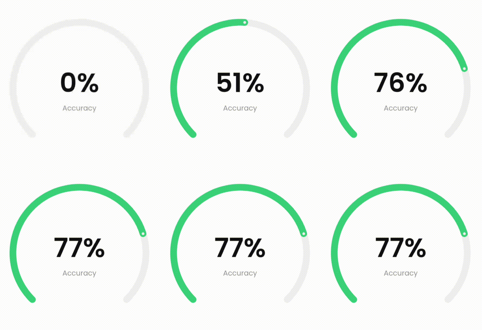
Example 3 - More complex progress bar
more_complex_example_gif
DashedCircularProgressBar.aspectRatio(
  aspectRatio: 1, // width ÷ height
  valueNotifier: _valueNotifier,
  progress: 37,
  startAngle: 225,
  sweepAngle: 270,
  foregroundColor: Colors.green,
  backgroundColor: const Color(0xffeeeeee),
  foregroundStrokeWidth: 15,
  backgroundStrokeWidth: 15,
  animation: true,
  seekSize: 6,
  seekColor: const Color(0xffeeeeee),
  child: Center(
    child: ValueListenableBuilder(
      valueListenable: _valueNotifier,
      builder: (_, double value, __) => Column(
        mainAxisSize: MainAxisSize.min,
        children: [
          Text(
            '${value.toInt()}%',
            style: const TextStyle(
              color: Colors.black,
              fontWeight: FontWeight.w300,
              fontSize: 60
            ),
          ),
          Text(
            'Accuracy',
            style: const TextStyle(
              color: Color(0xffeeeeee),
              fontWeight: FontWeight.w400,
              fontSize: 16
            ),
          ),
        ],
      )
    ),
  ),
)
Example 4 - Dashed progress bar

You can also use the desired dimensions instead of aspect ratio.

dashed_example_gif
DashedCircularProgressBar.square(
  dimensions: 350,
  progress: 180,
  maxProgress: 360,
  startAngle: -27.5,
  foregroundColor: Colors.redAccent,
  backgroundColor: const Color(0xffeeeeee),
  foregroundStrokeWidth: 7,
  backgroundStrokeWidth: 7,
  foregroundGapSize: 5,
  foregroundDashSize: 55,
  backgroundGapSize: 5,
  backgroundDashSize: 55,
  animation: true,
  child: const Icon(
    Icons.favorite,
    color: Colors.redAccent,
    size: 126
  ),
)
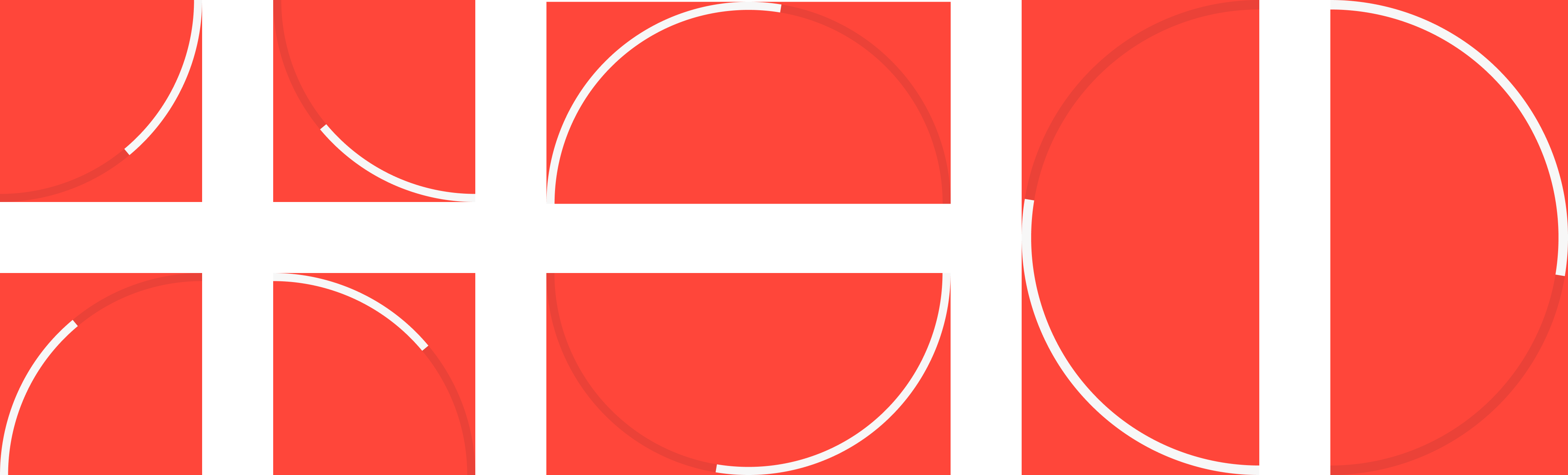
Example 5 - Play with circle center alignment

By changing the center, you can specify the location of the progress bar.

play_with_circle_center_alignment_example.png

For example to make a progress bar in the shape of the first image (first row, first image from the left):

DashedCircularProgressBar.aspectRatio(
  aspectRatio: 1, // width / height
  progress: 60,
  startAngle: 90,
  sweepAngle: 90,
  corners: StrokeCap.butt,
  foregroundStrokeWidth: 7,
  backgroundStrokeWidth: 7,
  circleCenterAlignment: Alignment.topLeft,
  foregroundColor: Colors.white,
  backgroundColor: const Color(0x22000000),
  animation: true
)

Parameters description

Parameter Default Description
width
double
0 Progress bar width.
height
double
0 Progress bar height.
aspectRatio
double
0 Progress aspect ratio.
progress
double
0 Current value of progress bar.
maxProgress
double
100 Maximum value of progress.
startAngle
double
0 The starting angle of the arc.
sweepAngle
double
360 The sweep angle of the arc.
foregroundStrokeWidth
double
2 Foreground arc thickness.
backgroundStrokeWidth
double
2 Background arc thickness.
foregroundColor
Color
Colors.blue Foreground arc color.
backgroundColor
Color
Colors.white Background arc color.
corners
StrokeCap
StrokeCap.round Styles to use for arcs endings.
foregroundGapSize
double
0 Foreground arc gap size.
foregroundDashSize
double
0 Foreground arc dash size.
backgroundGapSize
double
0 Background arc gap size.
backgroundDashSize
double
0 Background arc dash size.
seekSize
double
0 Progress bar seek size.
seekColor
Color
Colors.blue Progress bar seek color.
circleCenterAlignment
Alignment
Alignment.center Align center of progress bar.
animation
bool
false Active progress bar animation.
animationDuration
Duration
Duration(seconds: 1) Progress bar animation duration.
animationCurve
Curve
Curves.easeOut Progress bar animation curve.
onAnimationEnd
void Function()?
null This function is called when animation ended.
ltr
bool
true Specifies how to draw arcs from right to left or vice versa.
child
Widget?
null This widget is placed on the progress bar.
valueNotifier
ValueNotifier?
null Animated value notifier.

Categories

Source repository

Projects using this package

No data available yet.