
Overview
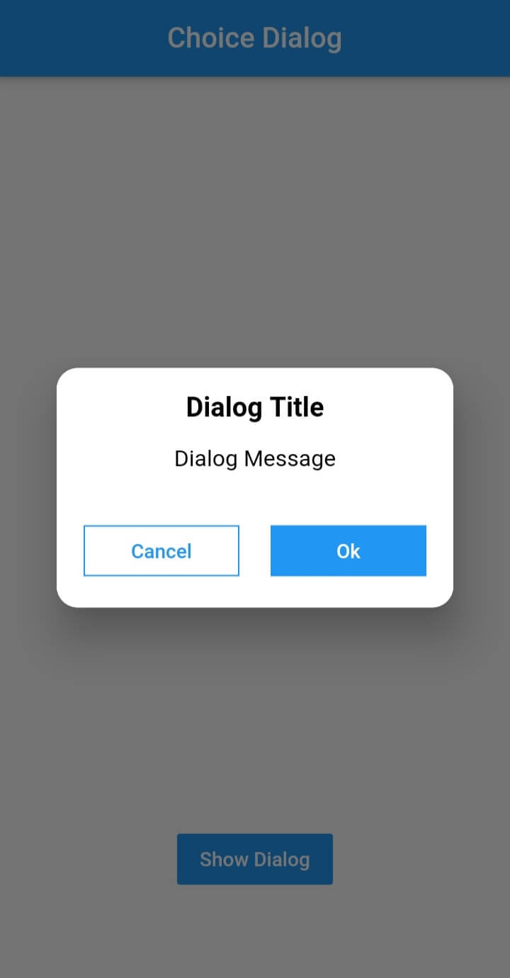
The dialogs package offers a collection of beautifully designed, customizable dialog components for Flutter applications. Built with attention to detail and user experience, it provides consistent and modern dialog interfaces across all platforms. Developers can easily integrate and tailor dialogs to match their app's design language, with options for styling, animations, and behavior. The package supports Android, iOS, Web, macOS, Windows, and Linux, ensuring cross-platform compatibility. It is ideal for displaying alerts, confirmations, and custom modals in a polished way.
Use cases
- Displaying alert messages
- Handling user confirmations
- Creating custom modal dialogs
- Showing loading indicators
- Implementing form validation feedback
- Enhancing UI consistency across platforms
Key features
- Beautiful, modern designs
- Extensive customization options
- Cross-platform support
- Easy integration with Flutter
- Built-in animations
- Responsive layout handling
Suitable for
- Flutter developers seeking polished dialogs
- Apps requiring consistent UI across platforms
- Projects emphasizing user experience
- Developers wanting quick dialog implementation
- Teams focused on design consistency
- Applications needing lightweight dialog solutions
Considerations
- Limited to dialog components only
- Customization may require learning specific APIs
- Not suitable for complex navigation flows
- Depends on Flutter's Material or Cupertino themes
- May need additional styling for non-standard use cases
- No built-in internationalization support