Search packages, repositories and app categories

dot_curved_bottom_nav cover
Package detailsv0.0.2

dot_curved_bottom_nav

Stunning Animating Curved Shape Around Indicator Navigation Bar. Adjustable color, background color, animation curve, animation duration.

AndroidiOSWebmacOSWindowsLinux
30-day downloads
169
Likes
51
Pub points
150

Install package

flutter pub add dot_curved_bottom_nav

Package Overview

Package selection guidance compiled from public package information, community data, and project usage.

A visually striking Flutter package that creates an animated curved shape beneath the indicator in a bottom navigation bar. It allows customization of the curve's color, background color, animation curve, and duration, enhancing user experience with smooth, dynamic transitions. Ideal for modern app interfaces seeking a polished, interactive bottom navigation feel. The package supports all major platforms including Android, iOS, Web, macOS, Windows, and Linux.

Use cases

  • Enhancing app navigation with animated visual feedback
  • Creating modern UIs with curved bottom bars
  • Customizing navigation indicators with dynamic animations
  • Improving user engagement through visual polish
  • Designing responsive bottom navigation across multiple platforms

Key features

  • Animated curved shape under navigation indicator
  • Customizable color and background color
  • Adjustable animation curve and duration
  • Smooth, fluid animations
  • Cross-platform compatibility
  • Easy integration via pub add command

Suitable for

  • UI designers seeking advanced navigation effects
  • Developers building modern mobile and web apps
  • Apps requiring animated bottom navigation
  • Teams focused on visual polish and interactivity
  • Flutter developers using bottom navigation bars

Considerations

  • May impact performance on low-end devices
  • Requires careful tuning of animation settings
  • Limited to bottom navigation bar use cases
  • Not suitable for simple or minimalistic designs
  • Depends on correct implementation of navigation structure
Original README

Original README snapshot from the linked source repository. Visit the repository for the latest content.

Stunning Curved Bottom Navigation

Title Image

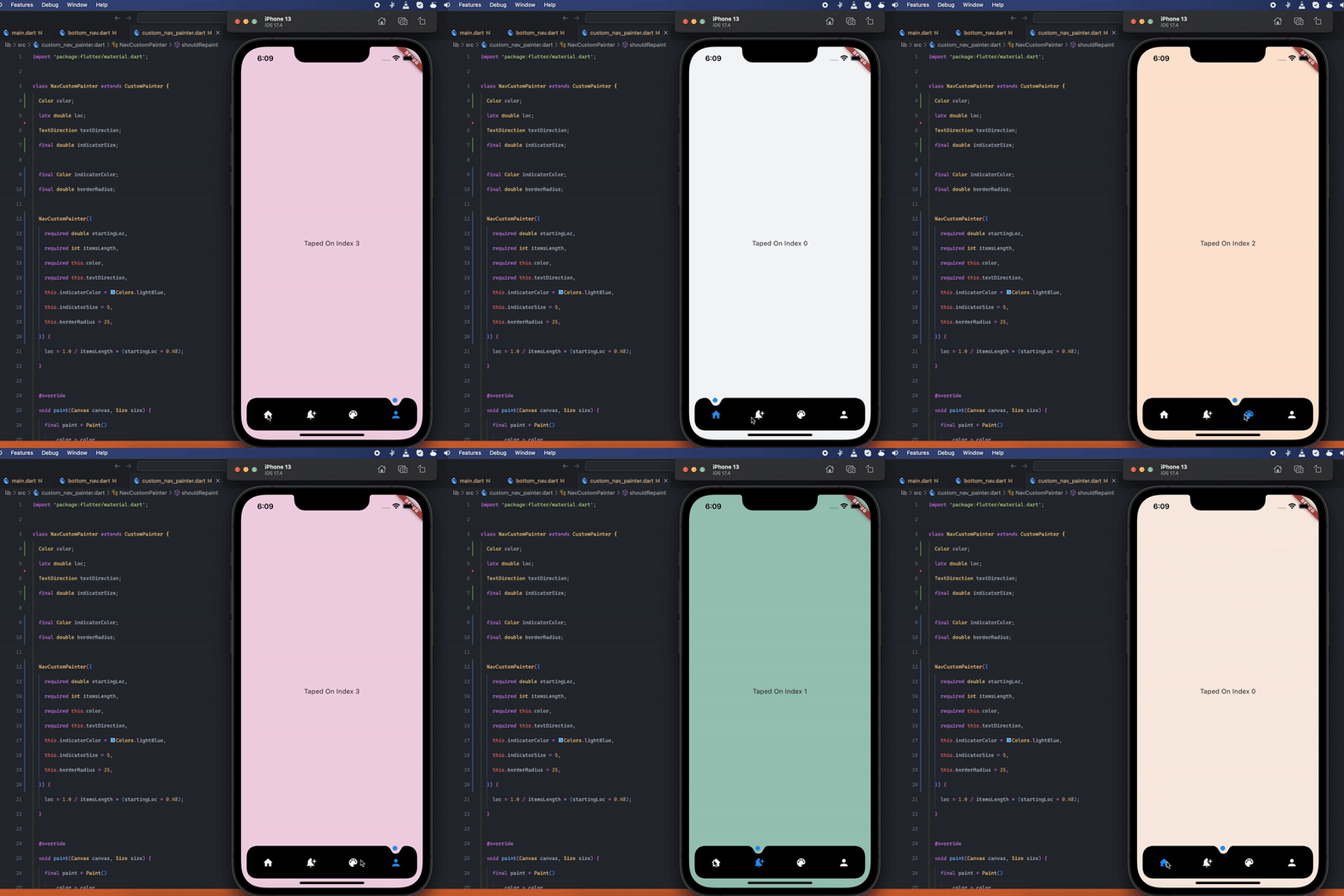
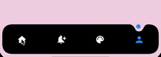
Preview

Preview

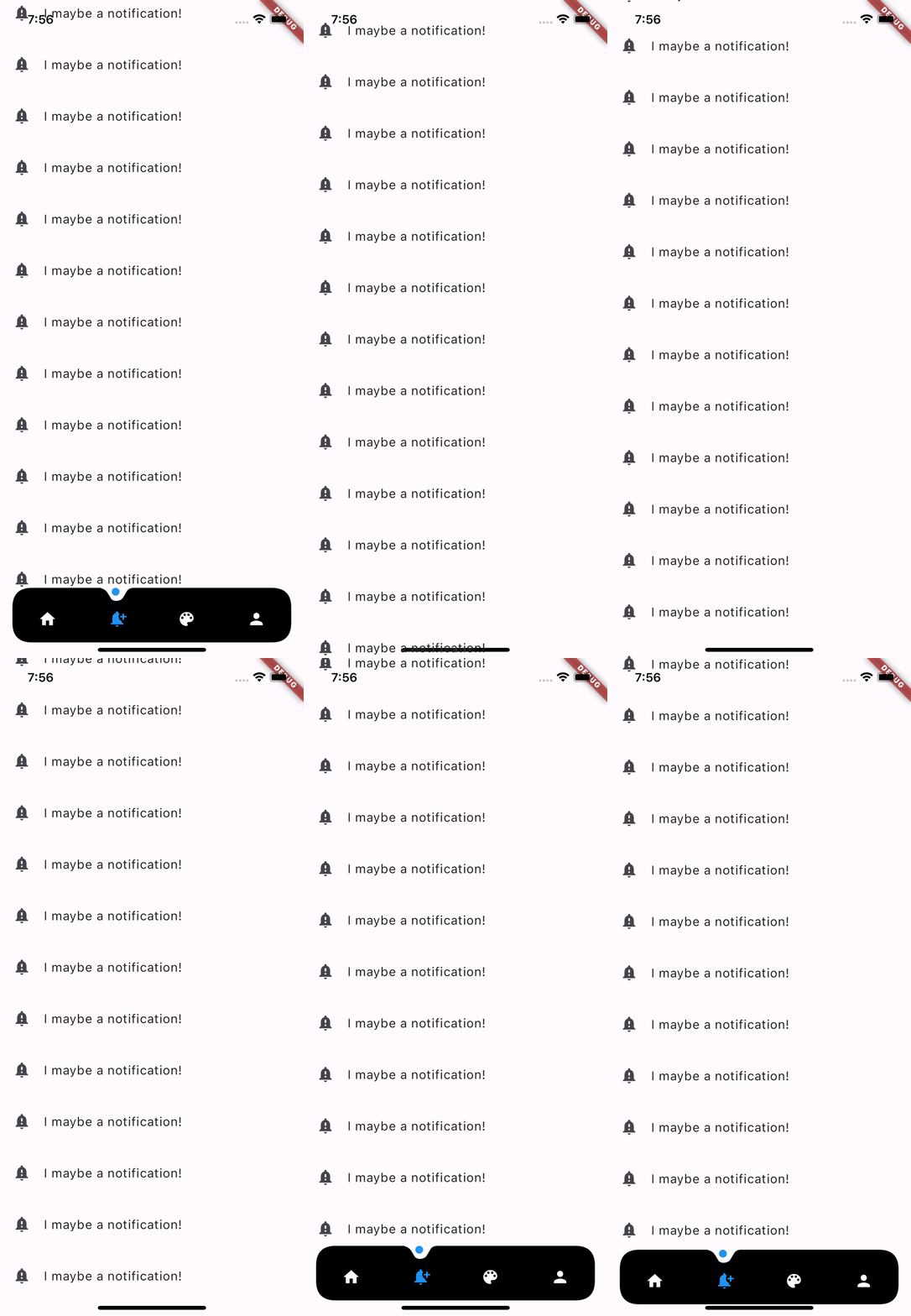
Optional Hide On Scroll

Preview

Getting Started

Add the dependency at pubspec.yaml:

dependencies:
  dot_curved_bottom_nav: ^0.0.1

Basic Usage

bottomNavigationBar: DotCurvedBottomNav(
    scrollController: _scrollController,
    hideOnScroll: true,
    indicatorColor: Colors.blue,
    backgroundColor: Colors.black,
    animationDuration: const Duration(milliseconds: 300),
    animationCurve: Curves.ease,
    selectedIndex: _currentPage,
    indicatorSize: 5,
    borderRadius: 25,
    height: 70,
    onTap: (index) {
    setState(() => _currentPage = index);
    },
    items: [
    Icon(
        Icons.home,
        color: _currentPage == 0 ? Colors.blue : Colors.white,
    ),
    Icon(
        Icons.notification_add,
        color: _currentPage == 1 ? Colors.blue : Colors.white,
    ),
    Icon(
        Icons.color_lens,
        color: _currentPage == 2 ? Colors.blue : Colors.white,
    ),
    Icon(
        Icons.person,
        color: _currentPage == 3 ? Colors.blue : Colors.white,
    ),
    ],
),

Properties

Property Description
scrollController Used to listen when the user scrolls and hides the bottom navigation
hideOnScroll Used to enable or disable hide on scroll behavior. (NOTE: scrollController must be provided when hideOnScroll is TRUE)
indicatorColor Color of the indicator displayed on currently selected item
backgroundColor Configures the background color of the bottom navigation
animationDuration Configures animation duration of hiding and indicator movement between items
animationCurve Configures curve of the animation of indicator movement and hide on scroll animation
selectedIndex Configures currently selected item / page
indicatorSize Configures the size of indicator displayed on top of the item
borderRadius Configures border radius of border DotCurvedBottomNav
height Configures height of DotCurvedBottomNav
onTap Configures callback function that is invoked whenever user taps on an item
items Configures list of items of bottom nav

TODO:

  1. Add More Indicator shapes e.g diamond shape with diamond cut out and more.

Contributions

Feel free to create an issue if you find a bug or if you need new features. Of course PRs are welcome!

If you want to connect with me on LinkedIn: Muzammil Hussain


If you like this work, please consider 👍 the package and ⭐ the repo. It is appreciated.

Categories

Source repository

Projects using this package

No data available yet.