Search packages, repositories and app categories

dot_navigation_bar cover
Package detailsv1.0.2

dot_navigation_bar

Simple smooth animations, providing a nice and cleanUI/UX Bottom Nav Bar.

AndroidiOSWebmacOSWindowsLinux
30-day downloads
1.2K
Likes
436
Pub points
150

Install package

flutter pub add dot_navigation_bar

Package Overview

Package selection guidance compiled from public package information, community data, and project usage.

A Flutter package that delivers a sleek, animated bottom navigation bar with smooth transitions and a clean UI/UX design. It enhances app navigation with subtle dot-based indicators, offering an elegant alternative to traditional tab bars. Ideal for apps seeking modern, minimalist navigation patterns across multiple platforms. The package supports all major platforms including Android, iOS, Web, macOS, Windows, and Linux, ensuring consistent user experience. With minimal setup via pub add, it integrates seamlessly into existing projects.

Use cases

  • Mobile app navigation
  • Web application interfaces
  • Cross-platform desktop apps
  • Minimalist UI designs
  • Enhanced user experience with animations

Key features

  • Smooth animations
  • Clean dot-based design
  • Cross-platform support
  • Easy integration
  • Customizable appearance
  • Responsive layout

Suitable for

  • Developers prioritizing UI/UX
  • Apps with simple navigation needs
  • Projects requiring lightweight components
  • Design-focused applications
  • Multi-platform Flutter apps

Considerations

  • Limited customization beyond basic styling
  • May not suit complex navigation structures
  • Best for apps with 3–5 tabs
  • Not ideal for highly interactive nav bars
  • Requires careful color contrast planning

Original README

Original README snapshot from the linked source repository. Visit the repository for the latest content.

Dot Navigation Bar


undefined undefined
undefined undefined undefined undefined undefined
undefined undefined

A bottom navigation bar that you can customize with the options you need, without any limits. You can also customize the appearance of the navigation bar with simple smooth animations, providing a nice and clean UI/UX.

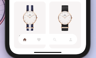
style1 Example flutter project


NEW


  • Round nav bar
  • Example file
  • Floating nav bar
  • shadow to Floating nav bar

Getting Started

To install, add it to your pubspec.yaml file:

dependencies:
    dot_navigation_bar:

import 'package:dot_navigation_bar/dot_navigation_bar.dart';

How to use it

call DotNavigationBar's constructor:

If you want to show body behind the navbar, it should be true

      extendBody: true,

if you are not intersted inmaking round nav bar with show body behind the navbar you have to make that

      extendBody: false,
Widget build(BuildContext context) {
  return Scaffold(
    body: Center(),
    extendBody: true,//<------like this 
    bottomNavigationBar:  DotNavigationBar(
          currentIndex: _SelectedTab.values.indexOf(_selectedTab),
          onTap: _handleIndexChanged,
          dotIndicatorColor: Colors.black,
          // enableFloatingNavBar: false
          items: [
            
            
          ],
        ),
  );
}

basic implementation

   Widget build(BuildContext context) {
    return Scaffold(
      body: Container(
        child: Image.asset("assets/IMG.png"),
      ),
      bottomNavigationBar:  DotNavigationBar(
          currentIndex: _SelectedTab.values.indexOf(_selectedTab),
          onTap: _handleIndexChanged,
          // dotIndicatorColor: Colors.black,
          items: [
            /// Home
            DotNavigationBarItem(
              icon: Icon(Icons.home),
              selectedColor: Colors.purple,
            ),

            /// Likes
            DotNavigationBarItem(
              icon: Icon(Icons.favorite_border),
              selectedColor: Colors.pink,
            ),

            /// Search
            DotNavigationBarItem(
              icon: Icon(Icons.search),
              selectedColor: Colors.orange,
            ),

            /// Profile
            DotNavigationBarItem(
              icon: Icon(Icons.person),
              selectedColor: Colors.teal,
            ),
            
          ],
        ),
    );
  }

The constructor has 18 attributes related to the Widget:

  • items: A list of tabs to display, ie Home, Profile,Cart, etc
  • currentIndex: The tab to display.
  • onTap:Returns the index of the tab that was tapped.
  • selectedItemColor:The color of the icon and text when the item is selected.
  • unselectedItemColor: The color of the icon and text when the item is not selected.
  • margin:A convenience field for the margin surrounding the entire widget.
  • itemPadding:The padding of each item.
  • duration: The transition duration.
  • curve: The transition curve.
  • dotIndicatorColor:The color of the Dot indicator.
  • marginR:margin for the bar to give some radius .
  • paddingR:padding for the bar to give some radius.
  • borderRadius:border radius for nav bar.
  • backgroundColor:bgd colors for the nav bar.
  • boxShadow: floating nav bar shadow ,it takes List of BoxShadow
  • enableFloatingNavBar: make Floating nav bar enabled.
  • enablePaddingAnimation: enable the animation on item during item change.
  • splashColor: Color of the item's Splash Color. To disable, use Colors.transparent.

default values

marginR = const EdgeInsets.symmetric(horizontal: 50, vertical: 20),

paddingR = const EdgeInsets.only(bottom: 5, top: 10),

borderRadius = 30,

backgroundColor = Colors.white, enableFloatingNavBar=true, enablePaddingAnimation=true

Contributors

@iamvivekkaushik @buraktabn @Zheng Xiangrui

Categories

Source repository

Projects using this package
