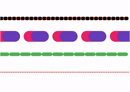
Package selection guidance compiled from public package information, community data, and project usage.
The dotted_line_flutter package enables developers to easily draw customizable dotted lines in Flutter applications. It provides a simple and efficient way to add decorative or functional dotted lines across various UI elements. With support for different dot sizes, spacing, and colors, it enhances visual design without requiring complex custom painting. The package is lightweight and integrates seamlessly into Flutter projects across multiple platforms.
Use cases
Adding decorative dividers in layouts
Creating dashed borders for cards or containers
Designing progress indicators with dotted paths
Enhancing form fields with visual separation
Building custom UI components with dotted accents
Key features
Customizable dot size and spacing
Support for different line colors
Easy integration with existing widgets
Cross-platform compatibility
Lightweight and performant
Flexible alignment options
Suitable for
UI designers seeking visual enhancements
Developers building forms or dashboards
Projects requiring subtle visual cues
Apps with minimalist or modern design aesthetics
Flutter beginners exploring decoration widgets
Considerations
Limited to basic dotted line patterns
No built-in animation support
Requires manual handling of dynamic line updates
Not suitable for complex stroke patterns
Depends on Flutter's rendering performance
Original README
Original README snapshot from the linked source repository. Visit the repository for the latest content.
Dotted Line Flutter Package
A highly customizable Flutter package for drawing dotted, dashed, and gradient lines in both horizontal and vertical directions. It also supports shadow effects and multiple shapes.
✨ Features
✅ Dotted and Dashed Lines
✅ Gradient Color Support
✅ Customizable Dash Width & Gap
✅ Horizontal & Vertical Orientation
✅ Shadow Effect for Depth
✅ More Shapes (Star, Circle, etc.)
✅ Star Shape
✅ Circle Dotted Line
✅ Custom Dash Shapes
✅ Patterned Dashes (Short-Long)
The direction of the dotted line (horizontal/vertical).
shadowColor
Colors.black54
The color of the shadow.
shadowBlurRadius
4.0
The blur radius of the shadow.
Example
Here's how you can use DottedLine inside a Column or Row widget:
Column(
  children: [
    Text("Above the line"),
    DottedLine(
      colors: [Colors.red, Colors.orange],
      dashWidth: 6.0,
      dashGap: 4.0,
    ),
    Text("Below the line"),
  ],
)
This will create a colorful dotted line between two text widgets.
DottedStar Widget
Overview
DottedStar is a customizable Flutter widget that renders a star shape with a dotted outline using a gradient color effect. It is built using CustomPaint and provides various customization options.
The DottedStar widget uses a CustomPainter class (StarPainter) to draw the dotted outline of a star. It follows these steps:
Creates a star shape using _createStarPath.
Applies a radial gradient to the dots.
Iterates over the path using PathMetrics to place dots at equal intervals.
Draws each dot on the canvas at calculated positions.
DottedText Widget
The DottedText widget is a custom Flutter widget that renders text using dots instead of solid strokes. It provides customization options for dot size, spacing, colors, and text styling.
Features
Render text with a dotted effect
Customizable dot size and spacing
Supports gradient colors
Uses Flutter's CustomPainter for efficient rendering
Installation
To use DottedText, simply add the Dart file to your Flutter project and import it.
DottedWidget is a Flutter custom widget that allows you to create a widget with a customizable dotted border. It supports different shapes, colors, and shadow effects, making it a versatile component for UI design.