Package selection guidance compiled from public package information, community data, and project usage.
A Flutter package that provides a grid layout enabling users to select items through both tapping and dragging gestures. It enhances user interaction by allowing continuous selection across multiple grid tiles, ideal for applications requiring batch operations or visual content curation. The package supports all major platforms including Android, iOS, Web, macOS, Windows, and Linux, ensuring cross-platform consistency. Built with performance and usability in mind, it integrates seamlessly into existing Flutter projects.
Use cases
Batch item selection in photo galleries
Interactive task management interfaces
Content curation tools
Multi-selection in e-commerce apps
User-driven data filtering
Drag-to-select in productivity apps
Key features
Supports tap and drag selection
Cross-platform compatibility
Customizable selection behavior
Efficient rendering for large datasets
Built-in gesture handling
Easy integration with existing grids
Suitable for
Developers building interactive grid-based UIs
Apps requiring multi-item selection
Projects targeting multiple platforms
Designers focused on intuitive user interactions
Teams prioritizing smooth gesture responsiveness
Considerations
May require additional state management for complex selection logic
Performance impact with very large grids if not optimized
Not suitable for single-item selection only use cases
Original README
Original README snapshot from the linked source repository. Visit the repository for the latest content.
drag_select_grid_view
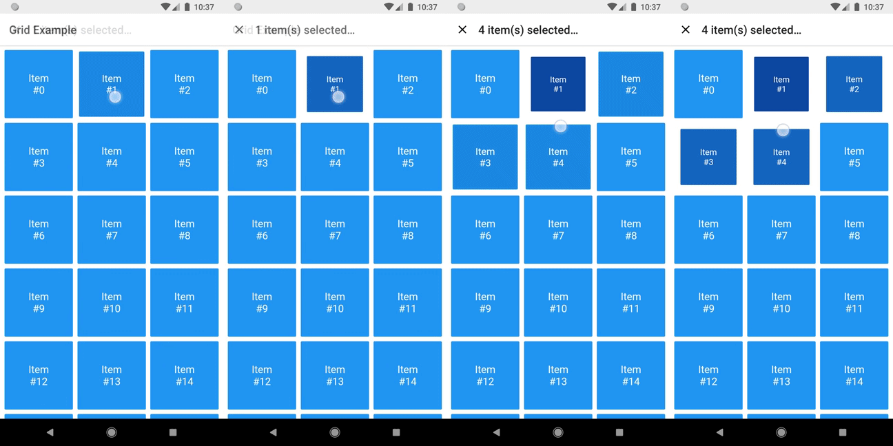
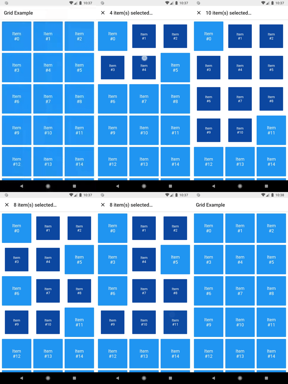
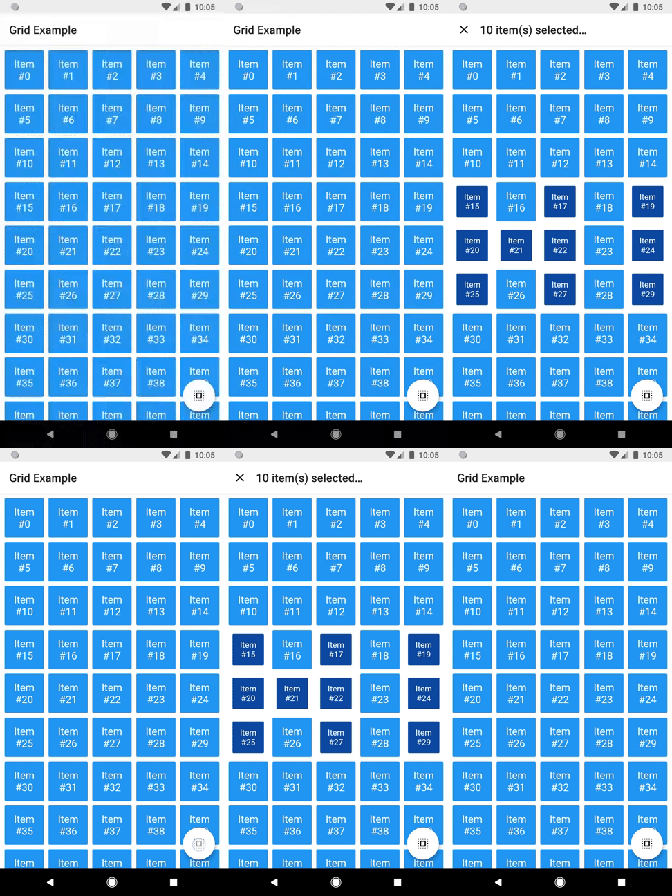
A grid that supports both dragging and tapping to select its items.
Basic usage
DragSelectGridView constructor is very similar to GridView.builder, so you should take your time to understand the latter before diving into this library.
Once you are familiar with GridView.builder, probably the only additional piece of information you'll need is DragSelectGridViewController. With it, you're able to know which indexes are selected.
As you may have noticed in the code above, DragSelectGridView must be used along two other widgets in order to provide a proper user experience. In the example, they are:
SelectableItem: A selectable widget, which is going to visually indicate whether the item is selected or not.
SelectionAppBar: A custom AppBar, which shows the amount of selected items and an option to unselect them.
The example project provides some samples of those widgets. I won't add them to the library, since they are unrelated to the grid itself, but feel free to copy them into your project, as long as you respect the license terms.
Advanced usage
You can use the setter DragSelectGridViewController.value to directly change the selection (I'm not quite sure why you'd need this, but I don't ask questions).
There are some other minor settings you can do to make DragSelectGridView fit your needs, like DragSelectGridView.autoScrollHotspotHeight. Those features are well documented, so I'll let you take your discovery time.
Hopefully, this is everything you need to know to use this library.
Running the example
cd example
flutter create .
flutter run
Thanks ❤️
Once upon a time I asked at Flutter Study Group how to implement a specific feature that I intended to add to this library. Simon Lightfoot offered to help me and effortlessly implemented what eventually became part of this library (check this gist). A big thanks to him.