Search packages, repositories and app categories

drawerbehavior cover
Package detailsv3.0.4

drawerbehavior

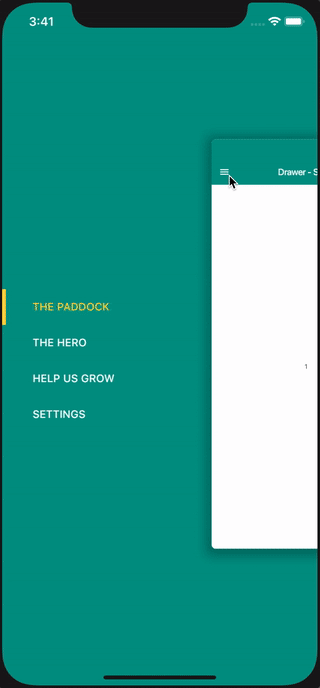
Drawer behavior is a library that provide an extra behavior on drawer, such as, move view or scaling view's height while drawer on slide..

AndroidiOSWebmacOSWindowsLinux
30-day downloads
323
Likes
168
Pub points
150

Install package

flutter pub add drawerbehavior

Package Overview

Package selection guidance compiled from public package information, community data, and project usage.

DrawerBehavior is a Flutter package that enhances drawer functionality by enabling dynamic visual effects during sliding, such as moving or scaling the content view's height. It provides smooth, interactive transitions that improve user experience in navigation-heavy apps. Designed for developers seeking more control over drawer interactions, it integrates seamlessly with standard Drawer widgets. The library supports multiple platforms including Android, iOS, Web, macOS, Windows, and Linux, making it versatile for cross-platform applications.

Use cases

  • Enhancing drawer animations
  • Creating immersive navigation experiences
  • Improving UI responsiveness
  • Customizing drawer interaction effects
  • Building modern app interfaces

Key features

  • Dynamic view movement during drawer slide
  • Height scaling of content view
  • Cross-platform compatibility
  • Easy integration with existing drawers
  • Smooth, customizable transition effects

Suitable for

  • Developers building complex navigation patterns
  • Design-focused Flutter apps
  • Apps requiring animated drawer interactions
  • Cross-platform mobile and web projects
  • UI/UX enhancement specialists

Considerations

  • May require additional performance tuning
  • Limited documentation available
  • Best suited for apps with heavy drawer usage
  • Potential conflicts with other gesture detectors
  • Requires understanding of gesture and animation principles

Original README

Original README snapshot from the linked source repository. Visit the repository for the latest content.

pub package

All Contributors

Drawer Behavior - Flutter

Drawer Behavior is a Flutter library that provides advanced effects and behaviors for the side navigation drawer. Unlike the standard Flutter drawer, this package allows you to create immersive interactions such as moving the view, scaling the view's height, or adding 3D effects while the drawer slides.

Alt Text

✨ Features

  • Scale Effect: smoothly scales down the main content as the drawer opens.

  • 3D Effect: Adds a rotation depth effect to the main content.

  • Multi-Directional: Supports both Left and Right side drawers.

  • Peek Drawer: Keep a portion of the drawer visible even when closed.

  • Customization: Full control over headers, footers, item builders, and animations.

  • Null-Safety: Fully supports Dart null-safety.

📦 Installation

Add this to your package's pubspec.yaml file:

dependencies:
  drawerbehavior: ^3.0.0 # Check pub.dev for the latest version
Install it via command line:

flutter pub get

🚀 Usage

1. Import the package
import 'package:drawerbehavior/drawerbehavior.dart';
2. Basic Implementation

Replace your standard Scaffold with DrawerScaffold. Define your drawers using SideDrawer and your main content using the builder.

import 'package:flutter/material.dart';
import 'package:drawerbehavior/drawerbehavior.dart';

class MyHomePage extends StatefulWidget {
  @override
  _MyHomePageState createState() => _MyHomePageState();
}

class _MyHomePageState extends State<MyHomePage> {
  int selectedMenuItemId = 0;

  // Define your menu items
  final Menu menu = Menu(
    items: [
      MenuItem(id: 0, title: 'Home', icon: Icons.home),
      MenuItem(id: 1, title: 'Profile', icon: Icons.person),
      MenuItem(id: 2, title: 'Settings', icon: Icons.settings),
    ],
  );

  @override
  Widget build(BuildContext context) {
    return DrawerScaffold(
      // App Bar handles the menu button automatically
      appBar: AppBar(
        title: Text("Drawer Behavior"),
      ),
      
      // Define the drawer(s)
      drawers: [
        SideDrawer(
          percentage: 0.6, // Scale the main view down to 60%
          menu: menu,
          direction: Direction.left,
          animation: true,
          color: Theme.of(context).primaryColor,
          selectedItemId: selectedMenuItemId,
          onMenuItemSelected: (itemId) {
            setState(() {
              selectedMenuItemId = itemId;
            });
          },
        )
      ],
      
      // Build the main screen content based on selection
      builder: (context, id) => IndexedStack(
        index: selectedMenuItemId,
        children: [
          Center(child: Text("Home Page")),
          Center(child: Text("Profile Page")),
          Center(child: Text("Settings Page")),
        ],
      ),
    );
  }
}

🎨 Customization

You can fine-tune the look and feel using parameters in DrawerScaffold and SideDrawer.

DrawerScaffold Options
Parameter Description
drawers A list of SideDrawer widgets (e.g., left and right).
builder Builder for the main content area. Use this to react to state changes.
defaultDirection The default direction (left/right) controlled by the toggle button.
cornerRadius Radius of the main content's corners when the drawer is open.
contentShadow Shadow definition for the main content panel.
enableGestures Boolean to enable/disable drag gestures.
onSlide Callback triggered while the drawer is sliding.
controller DrawerScaffoldController for programmatic control (open/close).
SideDrawer Options
Parameter Description
percentage How much the main content scales down (e.g., 0.8) when open.
degree The rotation degree for the 3D effect (between 15 and 45).
slide If true, the main content slides horizontally with the drawer.
peekMenu If true, a small part of the drawer remains visible when closed.
peekSize The width of the drawer when peekMenu is active.
direction Direction.left or Direction.right.
headerView Widget to display at the top of the drawer.
footerView Widget to display at the bottom of the drawer.
itemBuilder Custom builder for menu items if you don't want the default look.
color Background color of the drawer.
background Background DecorationImage for the drawer.

🔄 Migration Guide

If you are upgrading from older versions, please note the following breaking changes:

v2.0 to v3.0 (Null-safety & API Cleanup)
  1. DrawerScaffold:

    • mainDrawer property is now defaultDirection.

    • percentage property moved inside SideDrawer.

    • contentView is now builder.

  2. SideDrawer:

    • menuView is now replaced by the drawers list containing SideDrawer.

Example:

// OLD
DrawerScaffold(
  mainDrawer: Direction.left,
  contentView: Screen(...),
  percentage: 0.6,
  menuView: MenuView(...),
)

// NEW
DrawerScaffold(
  defaultDirection: Direction.left,
  builder: (context, id) => ...,
  drawers: [
    SideDrawer(
      percentage: 0.6,
      ...
    )
  ],
)

📱 Previews

Scale Effect
DrawerScaffold(
  drawers: [
    SideDrawer(
      percentage: 0.6,
      // ...
    )
  ],
  // ...
);

Right Drawer
DrawerScaffold(
  drawers: [
    SideDrawer(
      direction: Direction.right,
      // ...
    )
  ],
  // ...
);

3D Effect
DrawerScaffold(
  drawers: [
    SideDrawer(
      degree: 45,
      // ...
    )
  ],
  // ...
);

Drawer with Header
```dart DrawerScaffold( headerView: headerView(context), // ... );

### Drawer with Footer

<img src="https://github.com/shiburagi/Drawer-Behavior-Flutter/blob/preview/preview-ios-4.png?raw=true" width="200px"/>

```dart
DrawerScaffold(
  footerView: footerView(context),
  // ...
);

Drawer with Header and Custom Builder
DrawerScaffold(
  headerView: headerView(context),
  drawers: [
    SideDrawer(
      itemBuilder: (BuildContext context, MenuItem menuItem, bool isSelected) {
        return Container(
          color: isSelected ? Theme.of(context).colorScheme.secondary.withOpacity(0.7) : Colors.transparent,
          padding: EdgeInsets.fromLTRB(24, 16, 24, 16),
          child: Text(
            menuItem.title,
            style: Theme.of(context).textTheme.subtitle1?.copyWith(
              color: isSelected ? Colors.black87 : Colors.white70),
          ),
        );
      }
    )
  ],
  // ...
);

Peek Drawer
DrawerScaffold(
  headerView: headerView(context),
  drawers: [
    SideDrawer(
      peekMenu: true,
      percentage: 1,
      menu: menuWithIcon,
      direction: Direction.left,
    )
  ],
  // ...
);

🤝 Contributing

Contributions are welcome! Please feel free to submit a Pull Request.

📄 License

This project is licensed under the MIT License - see the LICENSE file for details.

Based on the original work by shiburagi.

Contributors

trademunch
trademunch

💻
anjarnaufals
anjarnaufals

💻
Vladimir Vlach
Vladimir Vlach

💻
Chris Hayen
Chris Hayen

💻

Categories

Source repository

Projects using this package

No data available yet.