
Overview
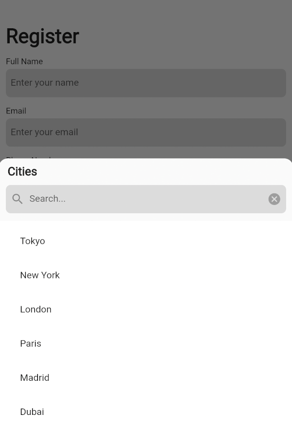
A flexible and customizable dropdown widget for Flutter that supports both single and multiple selection modes. It features an integrated search bar within a bottom sheet, enabling efficient filtering of options. The package provides generic type safety for handling custom data types, ensuring robust and maintainable code. Designed for cross-platform use, it works seamlessly across Android, iOS, Web, macOS, Windows, and Linux. Ideal for forms, filters, and settings where users need to select from a list with enhanced usability.
Use cases
- Form inputs with dynamic options
- Filtering large datasets
- Settings panels with selectable preferences
- Multi-select dropdowns in dashboards
- Searchable lists in mobile and web apps
Key features
- Supports single and multiple selection
- Integrated searchable bottom sheet
- Generic type safety for custom data
- Cross-platform compatibility
- Customizable styling and behavior
- Flexible data handling with type safety
Suitable for
- Developers building form-heavy applications
- Teams needing reusable dropdown components
- Projects requiring searchable selection
- Apps targeting multiple platforms
- Users wanting type-safe dropdown logic
Considerations
- Requires integration with bottom sheet for search functionality
- May need additional styling for complex UIs
- Best suited for moderate to large option sets
- Limited built-in validation beyond selection
- Depends on external dependencies for full customization