
Overview
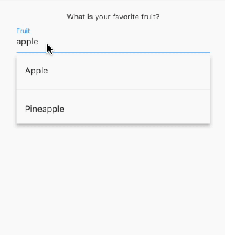
A customizable Flutter package that enhances the standard DropdownButton with search functionality, text input, and autocomplete capabilities. It combines the features of DropdownButton, TextFormField, and Autocomplete into a single, flexible widget. Ideal for forms requiring searchable dropdowns with real-time filtering and user input support. The package is compatible across all major platforms including Android, iOS, Web, macOS, Windows, and Linux.
Use cases
- Form inputs with searchable options
- Dynamic data selection with filtering
- Enhanced user experience in data entry
- Integration with APIs for live suggestions
- Customizable dropdown UI for apps
- Replacing basic dropdowns with advanced features
Key features
- Searchable dropdown with real-time filtering
- Support for custom styling and themes
- Integrated text input and validation
- Auto-suggestions based on user typing
- Extends DropdownButton and TextFormField
- Cross-platform compatibility
Suitable for
- Developers building form-heavy applications
- Apps needing dynamic, searchable selections
- Teams prioritizing UX in data entry
- Projects requiring lightweight yet powerful dropdowns
- Flutter beginners exploring advanced widgets
Considerations
- Requires careful handling of large datasets to avoid performance issues
- May need additional logic for async data loading
- Styling customization requires understanding of Flutter's theme system
- Limited built-in error handling beyond basic validation
- Not suitable for non-interactive dropdown use cases