
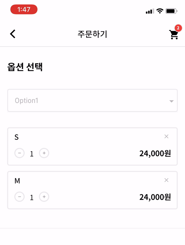
Overview
A customizable Flutter dropdown widget that displays options below the input field, enhancing user experience with flexible styling and behavior. Developers can tailor appearance, animation, and interaction to match their app's design. Ideal for forms and selection interfaces where space and aesthetics matter. The package supports all major platforms, ensuring consistent behavior across devices.
Use cases
- Form inputs with dropdowns
- Customizable selection menus
- Mobile and web UI enhancements
- Dynamic form fields
- Accessibility-focused designs
Key features
- Positioned below the input
- Highly customizable appearance
- Cross-platform compatibility
- Smooth animations
- Extensible API
- Support for custom widgets
Suitable for
- UI/UX designers
- Flutter developers
- Form-heavy applications
- Apps requiring tailored dropdowns
- Projects with strict design guidelines
Considerations
- Requires manual handling of state
- Limited built-in validation
- May need additional styling for complex layouts
- Not optimized for very long lists
- Depends on external dependencies for advanced features