Search packages, repositories and app categories

easy_formz cover
Package detailsv1.1.4

easy_formz

Flutter plugin for easier form generator handling.

AndroidiOSWebmacOSWindowsLinux
30-day downloads
50
Likes
4
Pub points
150

Install package

flutter pub add easy_formz

Package Overview

Package selection guidance compiled from public package information, community data, and project usage.

Easy Formz is a Flutter package designed to simplify form handling by providing a streamlined approach to form generation and validation. It reduces boilerplate code and enhances developer productivity with intuitive APIs for managing form states, validation rules, and submission logic. Built with Dart, it integrates seamlessly into Flutter applications across multiple platforms, including Android, iOS, Web, macOS, Windows, and Linux. The package promotes clean, maintainable code by leveraging immutable data structures and reactive patterns. It's particularly useful for developers aiming to build robust, scalable forms with minimal effort.

Use cases

  • Form creation with minimal boilerplate
  • Reactive form state management
  • Cross-platform form implementation
  • Complex validation logic handling
  • Streamlined form submission workflows

Key features

  • Immutable form states
  • Built-in validation utilities
  • Reactive form updates
  • Support for custom validators
  • Easy integration with Flutter widgets

Suitable for

  • Developers building complex forms
  • Teams prioritizing code maintainability
  • Projects requiring cross-platform form consistency
  • Applications with strict validation needs
  • Flutter beginners learning form handling

Considerations

  • Requires understanding of reactive programming concepts
  • May need additional setup for advanced validation scenarios
  • Best suited for projects using state management solutions like Bloc or Provider
  • Limited documentation beyond basic examples
  • Not ideal for very simple one-off forms

Original README

Original README snapshot from the linked source repository. Visit the repository for the latest content.

EasyFormz Package

The purpose of this package is to facilitate the creation of dynamic forms based on data received from the server. The package provides several basic components, including form types such as 'input', 'textarea', 'dropdown', 'checkbox', 'multicheckbox', 'radio', 'date', and 'time'. Additionally, users have the flexibility to create custom forms if none of the predefined form types suit their needs.

The example app running in iOS

Table of Contents

Available Form Types

  1. Input: Single-line text input.
  2. Textarea: Multi-line text input.
  3. Dropdown: Dropdown selection.
  4. Checkbox: Single checkbox.
  5. Multicheckbox: Multiple checkboxes.
  6. Radio: Radio button selection.
  7. Date: Date picker for selecting a date.
  8. Time: Time picker for selecting a time.

Using the EasyFormz Widget

To integrate the package into your Flutter application, follow these steps:

  1. Add the EasyFormz widget to your widget tree:

    EasyFormz(controller: controller)
    
  2. Initialize the form controller with the desired form data & Keep your UI in sync by listening to changes on the form controller. Example:

     late final EasyFormzController controller = EasyFormzController(forms: forms);
    
     @override
     Widget build(BuildContext context) {
       return Scaffold();
     }
    

    The forms data should be look like this

    final forms = [
     FormConfig(
       id: '412',
       type: 'input',
       formKey: 'dynamic_input_key',
       label: 'Test Form Input',
       props: FormProps(isRequired: true),
     ),
      FormConfig(
       id: '702',
       type: 'dropdown',
       formKey: 'dynamic_dropdown_key',
       label: 'Test Form Dropdown',
       props: FormProps(
         isRequired: true,
         options: [
           FormOption(label: 'Option One', value: 'ONE'),
           FormOption(label: 'Option Two', value: 'TWO'),
           FormOption(label: 'Option Three', value: 'Three'),
         ],
       ),
     ),
     FormConfig(
       id: '432',
       type: 'radio',
       formKey: 'dynamic_radio_key',
       label: 'Test Form Radio',
       props: FormProps(
         isRequired: false,
         options: [
           FormOption(label: 'Option One', value: 'ONE'),
           FormOption(label: 'Option Two', value: 'TWO'),
           FormOption(label: 'Option Three', value: 'THREE'),
         ],
       ),
     ),
     FormConfig(
       id: '612',
       type: 'checkbox',
       formKey: 'dynamic_checkbox_key',
       label: 'Test Form Checkbox',
       props: FormProps(
         isRequired: false,
         options: [
           FormOption(label: 'Option One', value: 'ONE'),
           FormOption(label: 'Option Two', value: 'TWO'),
           FormOption(label: 'Option Three', value: 'THREE'),
         ],
       ),
     ),
     FormConfig(
       id: '612',
       type: 'textarea',
       formKey: 'dynamic_textarea_key',
       label: 'Test Form Text Area',
       props: FormProps(isRequired: true),
     ),
     FormConfig(
       id: '232',
       type: 'checkbox',
       formKey: 'dynamic_checkboxNoOption_key',
       label: 'Test Form Checkbox No Option',
       props: FormProps(isRequired: true),
     ),
     FormConfig(
       id: '132',
       type: 'multicheckbox',
       formKey: 'dynamic_multiCheckbox_key',
       label: 'Test Form MultiCheckbox',
       props: FormProps(
         isRequired: true,
         options: [
           FormOption(label: 'Option One', value: 'ONE'),
           FormOption(label: 'Option Two', value: 'TWO'),
           FormOption(label: 'Option Three', value: 'THREE'),
         ],
       ),
     ),
     FormConfig(
       id: '162',
       type: 'date',
       formKey: 'dynamic_date_key',
       label: 'Test Form Date',
       props: FormProps(isRequired: false),
     ),
     FormConfig(
       id: '164',
       type: 'time',
       formKey: 'dynamic_time_key',
       label: 'Test Form Time',
       props: FormProps(isRequired: true),
     ),
    ];
    
  3. Let's say you have a list of form page then you can do like the following example:

    final formPages = [
        FormPage(
             id: 'gweorj29',
             label: 'Example Page 1',
             description: 'This form displays all the existing forms available',
             formConfigs: forms1,
         ),
            FormPage(
             id: 'gweorj29',
             label: 'Example Page 2',
             description: 'This form displays all the existing forms available',
             formConfigs: forms2,
         ),
    ];
    

    To diplay all the form pages as a ListTile

    ListView.separated(
         itemCount: formPages.length,
         separatorBuilder: (context, index) {
           return const SizedBox(height: 16);
         },
         itemBuilder: (context, index) {
           final form = formPages[index];
    
           return Card(
             margin: const EdgeInsets.symmetric(horizontal: 16),
             clipBehavior: Clip.antiAlias,
             child: ListTile(
               onTap: () {
                 Navigator.push(
                   context,
                   MaterialPageRoute(
                     builder: (context) => FormScreen(form: form),
                   ),
                 );
               },
               title: Text(
                 form.label,
                 style: Theme.of(context).textTheme.titleMedium,
               ),
               subtitle: Text(
                 form.description,
                 style: Theme.of(context).textTheme.bodySmall,
               ),
             ),
           );
         },
       ),
    

    Inside the FormScreen get the form parameter like the following example:

     late final EasyFormzController controller = EasyFormzController(forms: widget.form.formConfigs);
    
     @override
     Widget build(BuildContext context) {
       return Scaffold();
     }
    

Custom Form Creation

In scenarios where the provided form types do not meet specific requirements, users can easily create custom forms tailored to their needs.

Basic Component Builder

To change any in-built form component such as inputBuilder, etc, consider the following example:

EasyFormz(
controller: controller,
inputBuilder: (config, onValueChanged) => Padding(
 padding: const EdgeInsets.all(16),
 child: TextFormField(
   onChanged: (value) {
     onValueChanged(value);
   },
 ),
),
);
Custom Form Component Builder

To create a custom form component based on the form configuration using the customBuilder, consider the following example:

EasyFormz(
  controller: controller,
  customBuilder: (config, onValueChanged) {
    if (config.type == 'custom_form') {
      // Customize and return the specific custom form component based on the condition.
      return CustomDropdown(
        config: config,
        onChanged: (value) => onValueChanged(value),
      );
    }
  },
);
Custom Error Component Builder

Custom error component is available by using the errorBuilder, consider the following example:

EasyFormz(
  controller: controller,
  errorBuilder: (config) {
    return CustomErrorBox(
        label: '${config.label} cannot be rendered',
      );
  },
);
Customizing the Easy Form Theme

To personalize the appearance of the dynamic form, you can modify the theme settings using the theme parameter. Below is an example of customizing the theme for a EasyFormz:

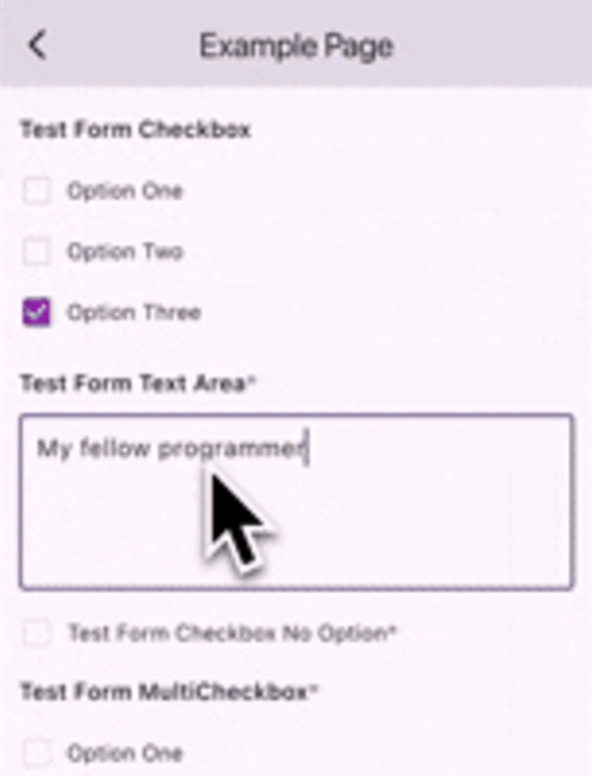
EasyFormz(
  controller: controller,
  theme: EasyFormzTheme()
)

Contributing

Contributions are welcome! Please open an issue or submit a pull request if you have any improvements or bug fixes.

License

This project is licensed under the MIT License. See the LICENSE file for details.

Support Me

If you find this package helpful and want to support its development, consider making a donation. Thank you for your support!

Support via PayPal

Categories

Source repository

Projects using this package

No data available yet.