Search packages, repositories and app categories

easy_loading_button cover
Package detailsv0.4.0

easy_loading_button

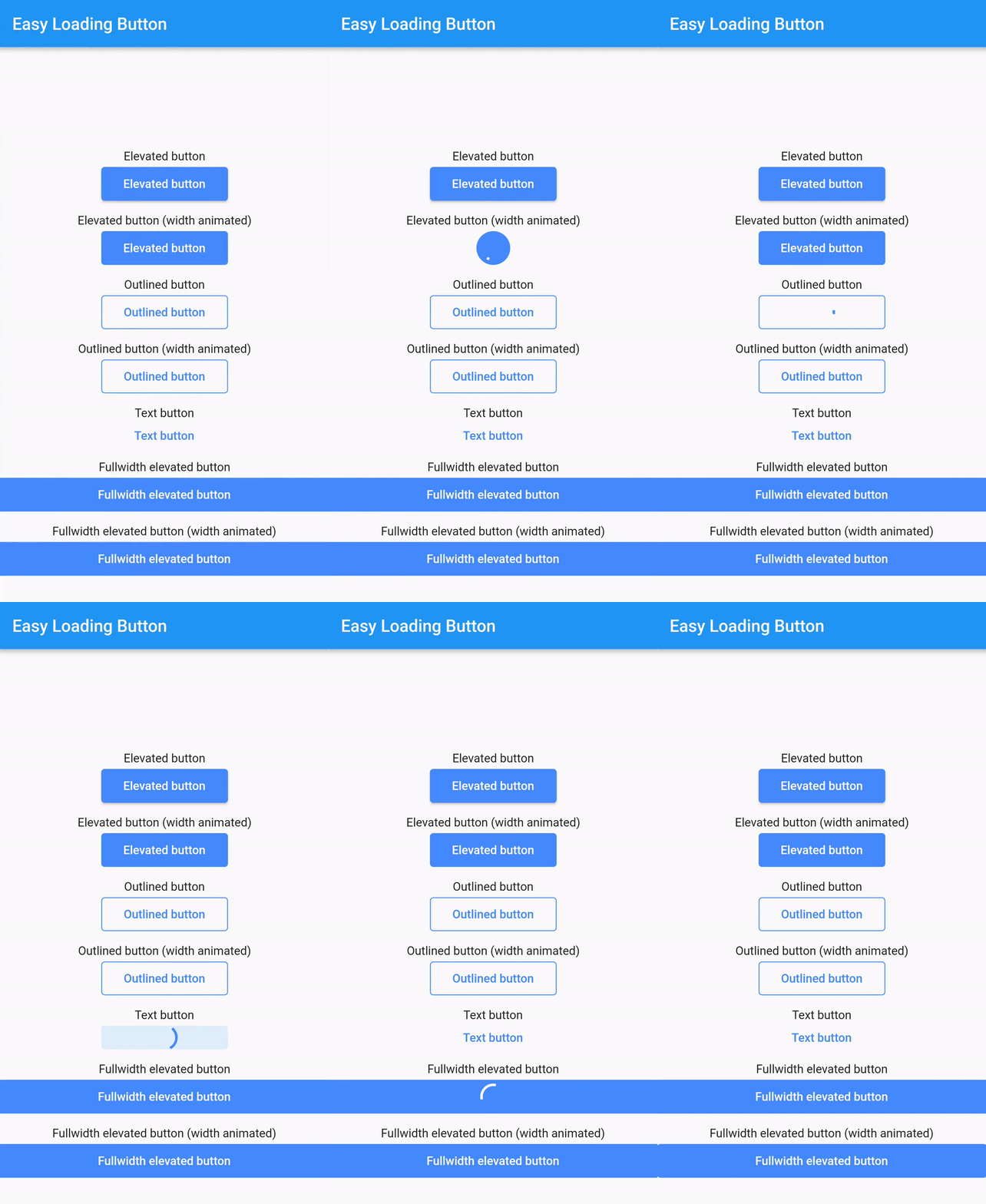
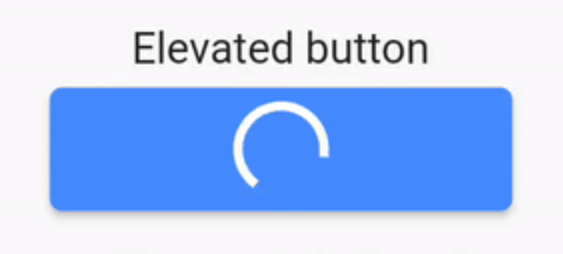
A simple, easy to use, and customizable progress/loading _Material Flutter Button_ that supports variety of button styles (elevated, outlined, text).

AndroidiOSWebmacOSWindowsLinux
30-day downloads
787
Likes
70
Pub points
150

Install package

flutter pub add easy_loading_button

Package Overview

Package selection guidance compiled from public package information, community data, and project usage.

EasyLoadingButton is a Flutter package that provides a simple, customizable progress/loading button with support for multiple styles including elevated, outlined, and text buttons. It enhances user experience by displaying loading states seamlessly during async operations. The button is easy to integrate and configure, offering smooth transitions between normal and loading states. Ideal for forms, actions, and any UI element requiring feedback during processing.

Use cases

  • Form submissions
  • Async action triggers
  • Login/signup buttons
  • Payment processing
  • Data saving operations

Key features

  • Multiple button styles
  • Customizable loading indicators
  • Smooth state transitions
  • Easy integration
  • Supports all Flutter platforms
  • Configurable colors and sizes

Suitable for

  • Beginner Flutter developers
  • Simple app interfaces
  • Fast prototyping
  • User-friendly forms
  • Apps needing clear feedback during async tasks

Considerations

  • Limited advanced customization options
  • May require additional styling for complex designs
  • Not suitable for highly dynamic or animated buttons
  • Depends on Material design principles
  • Best used in standard Material-based apps

Original README

Original README snapshot from the linked source repository. Visit the repository for the latest content.

easy_loading_button

GitHub repo size GitHub code size in bytes GitHub top language GitHub issues GitHub license

easy_loading_button is a simple, easy to use, and customizeable progress/loading Material Flutter Button that supports variety of button styles (elevated, outlined, text).

Or try the demo on DartPad

Get started

Depend on it

Add this to your package's pubspec.yaml file:

easy_loading_button: ^0.3.2
Install it

You can install packages from the command line:

$ flutter pub get

Alternatively, your editor might support flutter pub get.

Import it

Now in your Dart code, you can use:

import 'package:easy_loading_button/easy_loading_button.dart';

How to use

Add EasyButton to your widget tree:

EasyButton(
  type: EasyButtonType.elevated,

  // Content inside the button when the button state is idle.
  idleStateWidget: const Text(
    'Elevated Button',
    style: TextStyle(
      color: Colors.white,
    ),
  ),

  // Content inside of the button when the button state is loading.
  loadingStateWidget: const CircularProgressIndicator(
    strokeWidth: 3.0,
    valueColor: AlwaysStoppedAnimation<Color>(
      Colors.white,
    ),
  ),

  // Whether or not to animate the width of the button. Default is `true`.
  // If this is set to `false`, you might want to set the `useEqualLoadingStateWidgetDimension` parameter to `true`.
  useWidthAnimation: true,

  // Whether or not to force the `loadingStateWidget` to have equal dimension. Default is `true`.
  // This is useful when you are using `CircularProgressIndicator` as the `loadingStateWidget`.
  // This parameter might also be useful when you set the `useWidthAnimation` parameter to `true` combined with `CircularProgressIndicator` as the value for `loadingStateWidget`.
  useEqualLoadingStateWidgetDimension: true,

  // If you want a fullwidth size, set this to double.infinity
  width: 150.0,

  height: 40.0,
  borderRadius: 4.0,

  // The elevation of the button.
  // This will only be applied when the type parameter value is EasyButtonType.elevated
  elevation: 0.0,

  // The gap between button and it's content.
  // This will be ignored when the `type` parameter value is set to `EasyButtonType.text`
  contentGap: 6.0,

  // Color for the button.
  // For [EasyButtonType.elevated]: This will be the background color.
  // For [EasyButtonType.outlined]: This will be the border color.
  // For [EasyButtonType.text]: This will be the text color.
  buttonColor: Colors.blueAccent,

  onPressed: () {},
),

More parameters:

const EasyButton({
  Key? key,
  required this.idleStateWidget,
  required this.loadingStateWidget,
  this.type = EasyButtonType.elevated,
  this.useWidthAnimation = true,
  this.useEqualLoadingStateWidgetDimension = true,
  this.width = double.infinity,
  this.height = 40.0,
  this.contentGap = 0.0,
  this.borderRadius = 0.0,
  this.elevation = 0.0,
  this.buttonColor = Colors.blueAccent,
  this.onPressed,
}) : super(key: key);

Three types supported:

enum EasyButtonType {
    elevated,
    outlined,
    text,
}

Source

Source code and example of this library can be found in git:

$ git clone https://github.com/usefulteam/easy_loading_button.git

License

MIT License

Credits

Thanks to Yang JIANG for the flutter_progress_button package.

My package was based on it. You can also visit their package pub.dev page.

Categories

Source repository

Projects using this package

No data available yet.