Search packages, repositories and app categories

el_tooltip cover
Package detailsv2.2.1

el_tooltip

ElTooltip, a smart positioned tooltip. Use it to display a widget inside a tooltip that you can personalize.

AndroidiOSWebmacOSWindowsLinux
30-day downloads
6.8K
Likes
163
Pub points
150

Install package

flutter pub add el_tooltip

Package Overview

Package selection guidance compiled from public package information, community data, and project usage.

ElTooltip is a customizable, smartly positioned tooltip widget for Flutter applications. It allows developers to display personalized content within a tooltip that automatically adjusts its position based on available space and screen boundaries. Ideal for enhancing user experience with contextual information without cluttering the UI. The package supports multiple platforms including Android, iOS, Web, macOS, Windows, and Linux, ensuring consistent behavior across devices. With simple integration via pub add, it provides an elegant solution for adding tooltips with minimal setup.

Use cases

  • Adding contextual help text
  • Displaying extra info on hover or tap
  • Enhancing UI accessibility
  • Providing feedback on interactive elements
  • Creating tooltips in multi-platform apps

Key features

  • Smart automatic positioning
  • Customizable tooltip content
  • Cross-platform compatibility
  • Easy integration with pub
  • Supports touch and hover interactions
  • Minimal configuration required

Suitable for

  • Developers seeking lightweight tooltips
  • Apps needing accessible UI enhancements
  • Projects targeting multiple platforms
  • Designers wanting flexible tooltip styling
  • Teams prioritizing quick implementation

Considerations

  • May require manual handling for complex layouts
  • Tooltip visibility depends on parent widget constraints
  • Limited built-in animation options
  • Best suited for simple or moderately complex tooltips
  • Performance impact in high-frequency use cases

Original README

Original README snapshot from the linked source repository. Visit the repository for the latest content.

ElTooltip - a smart positioned tooltip

Why el_tooltip?

  • 📦 Add widget elements to your tooltip
  • ↔️ Chose the preferred position for the tooltip to appear relative to the button
  • ↩️ The position changes automagically if the desired one doesn't fit the screen
  • ✅ No external dependencies
  • ❤️ Customizable layout
  • 🛡️ Null safety

Getting Started

🍭 Installation

Add to your pubspec.yaml

dependencies:
  el_tooltip: <last_version>

Import the library and call the Widget ElTooltip() with the required fields child and content

import 'package:flutter/material.dart';
import 'package:el_tooltip/el_tooltip.dart';

void main() {
  runApp(MaterialApp(
    title: 'Flutter Demo',
    theme: ThemeData(
      primarySwatch: Colors.blue,
    ),
    home: const SafeArea(
      child: Center(
        child: ElTooltip(
          child: Icon(Icons.info_outline),
          content: Text('This is a tooltip'),
        ),
      ),
    ),
  ));
}

Full example

🏷️ El Tooltip widget properties
Properties Required Default Description
content true What will appear inside the tooltip.
child true Widget that represent the button to activate the tooltip (no click method required).
color false Colors.white Background color of the bubble and the arrow.
distance false 10.0 Space between the child button and the tooltip.
padding false EdgeInsets.all(14.0) Tooltip padding around the content widget.
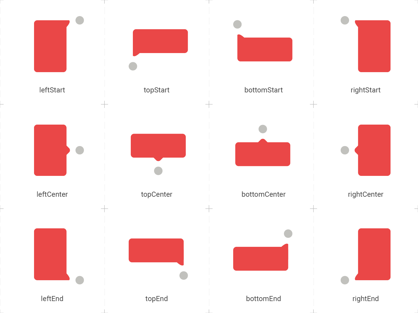
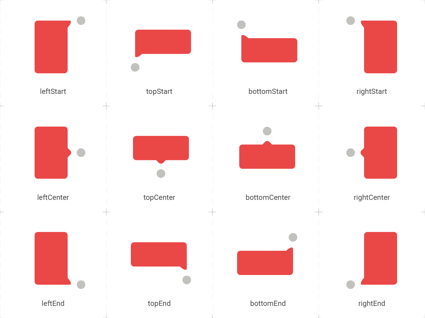
position false topCenter Desired position based on the Enum ElTooltipPosition. Can be topStart, topCenter, topEnd, rightStart, rightCenter, rightEnd, bottomStart, bottomCenter, bottomEnd, leftStart, leftCenter, leftEnd,
radius false Radius.circular(8.0) Border radius of the tooltip.
showModal false true Displays a fullscreen dark layer behind the tooltip.
showArrow false true Displays the arrow pointing to the child widget.
showChildAboveOverlay false true Repeats the child above the tooltip overlay.
modalConfiguration false ModalConfiguration() Configures the modal color and opacity if showModal is true.
timeout false Duration.zero (only disappears on click) How many time to wait for the tooltip to disappear.
appearAnimationDuration false Duration.zero (does not animate) Fade In animation duration.
disappearAnimationDuration false Duration.zero (does not animate) Fade Out animation duration.
controller false null ElTooltipController to show and hide the tooltip.
↔️ El Tooltip available positions

El tooltip header image was created using macrovector illustration on Freepik

Contributors ✨

Thanks goes to these wonderful people:


Marcelo Gil

💻

Matteo Pietro Dazzi

💻

Grzegorz Leoniec

💻

Categories

Source repository

Projects using this package