Search packages, repositories and app categories

empty_widget cover
Package detailsv0.0.5

empty_widget

Custom_Empty widget is flutter custom widget which is designed to notify user about some event.

30-day downloads
537
Likes
70
Pub points
65

Install package

flutter pub add empty_widget

Package Overview

Package selection guidance compiled from public package information, community data, and project usage.

The empty_widget is a Flutter custom widget designed to notify users about specific events, such as empty states in lists or data absence. It provides a customizable placeholder interface that enhances user experience by clearly indicating when no content is available. Built with simplicity and flexibility in mind, it supports various visual configurations like icons, text, and buttons. Ideal for improving UI feedback in apps with dynamic content.

Use cases

  • Displaying empty states in lists
  • Indicating missing data
  • Enhancing user feedback
  • Customizing placeholder visuals
  • Improving UX during data loading
  • Providing call-to-action buttons

Key features

  • Customizable icon and text
  • Supports action buttons
  • Easy integration with existing widgets
  • Configurable appearance
  • Lightweight and efficient
  • Extensible design

Suitable for

  • Developers seeking simple empty state solutions
  • Apps with dynamic content displays
  • UI/UX-focused Flutter projects
  • Teams wanting reusable placeholder components
  • Projects requiring minimal boilerplate

Considerations

  • Limited platform-specific optimizations
  • No built-in animations
  • Requires manual styling for advanced designs
  • Not suitable for complex interactive placeholders
  • Depends on external source code for updates

Original README

Original README snapshot from the linked source repository. Visit the repository for the latest content.

Empty Widget

Open Source Love GitHub last commit GitHub GitHub code size in bytes GitHub stars GitHub forks

pub package Likes Popularity Pub points

Hits

Custom_Empty widget is flutter custom widget which is designed to notify user about some event.
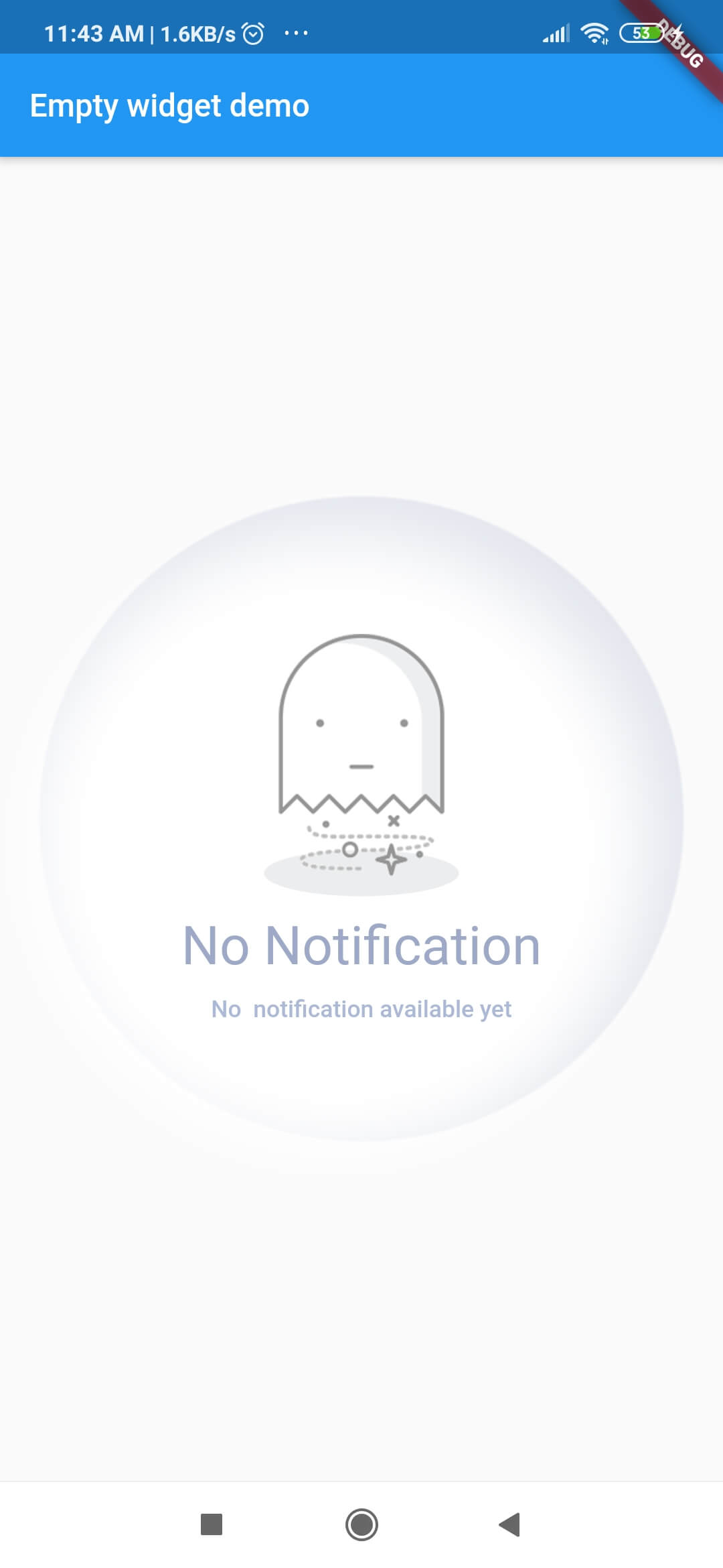
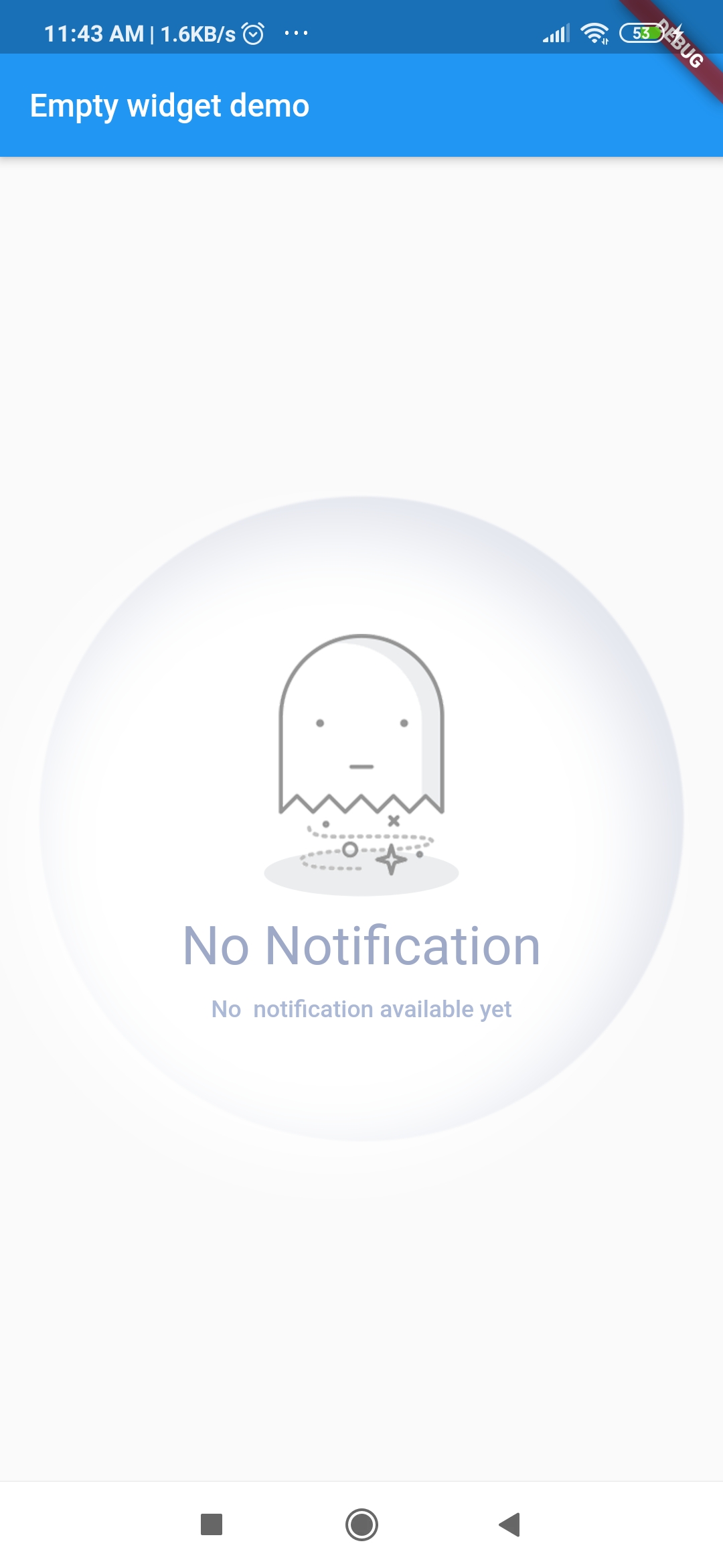
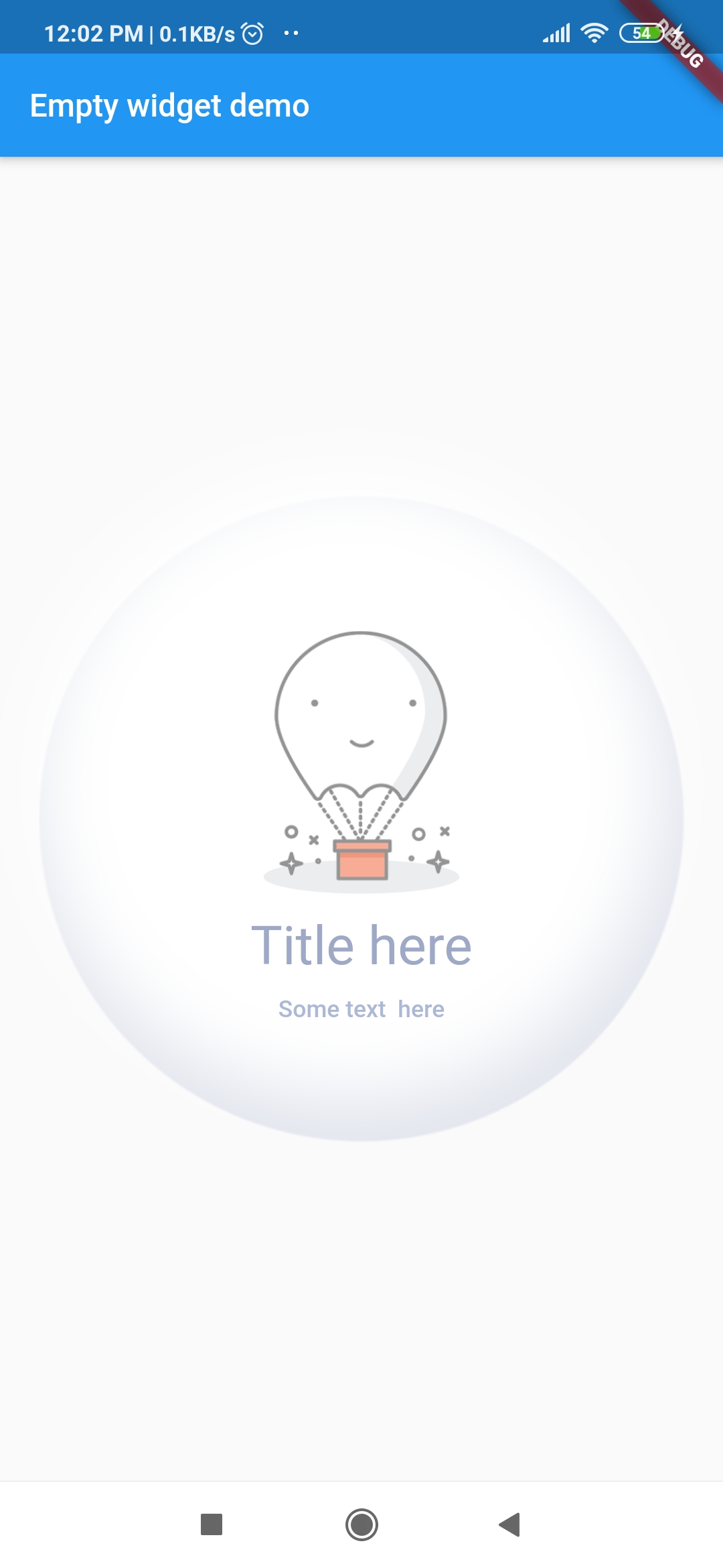
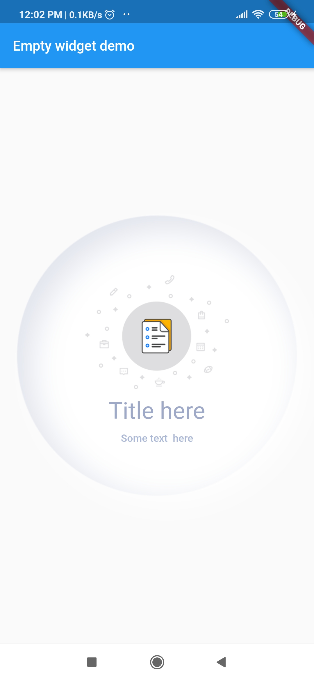
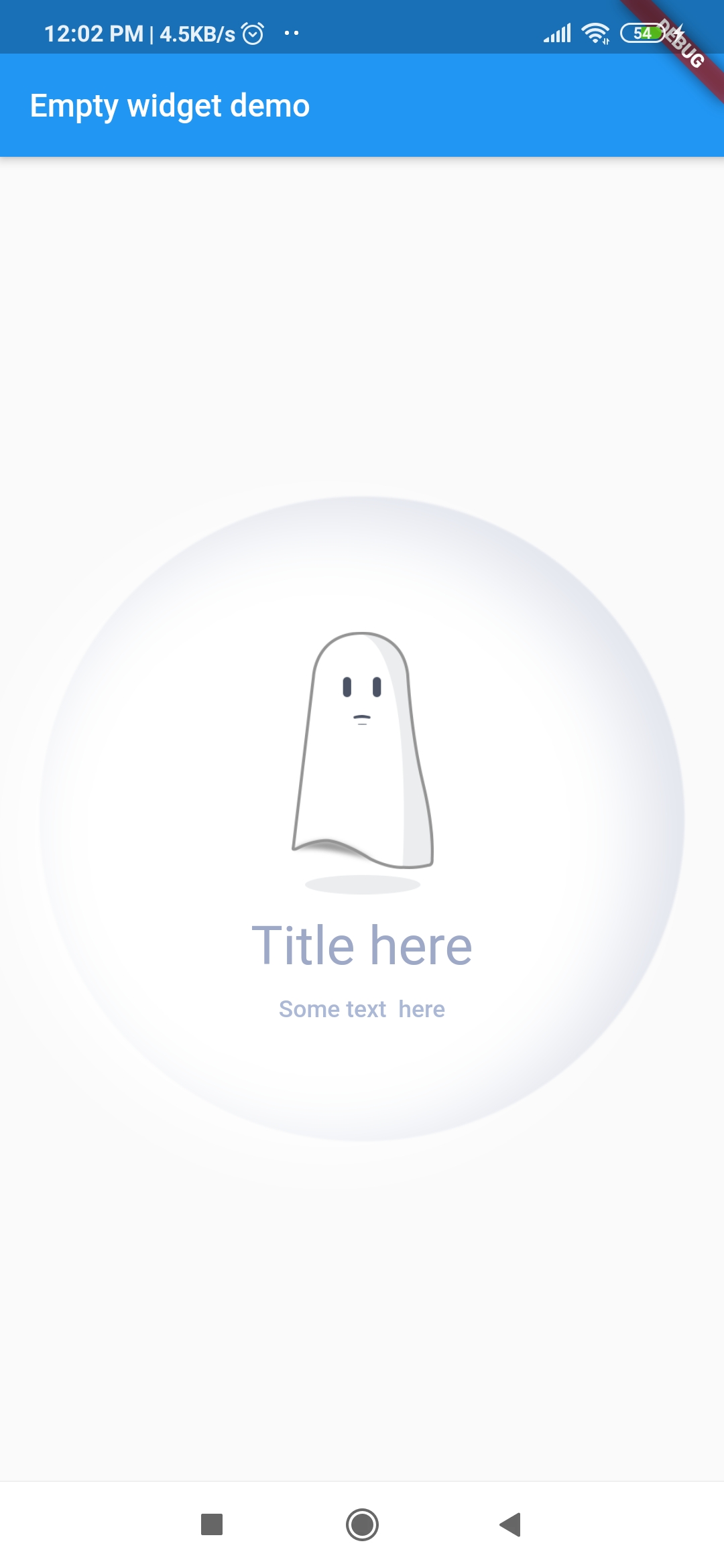
Screenshots

Screenshots Screenshots Screenshots Screenshots

Getting Started

1. Add library to your pubspec.yaml
dependencies:
  empty_widget: ^0.0.3
2. Import library in dart file

import 'package:empty_widget/empty_widget.dart';

3. Use of EmptyWidget
 EmptyWidget(
   image: null,
   packageImage: PackageImage.Image_1,
   title: 'No Notification',
   subTitle: 'No  notification available yet',
   titleTextStyle: TextStyle(
     fontSize: 22,
     color: Color(0xff9da9c7),
     fontWeight: FontWeight.w500,
   ),
   subtitleTextStyle: TextStyle(
     fontSize: 14,
     color: Color(0xffabb8d6),
   ),
 );

Example

import 'package:empty_widget/empty_widget.dart';
import 'package:flutter/material.dart';

void main() => runApp(MyApp());

class MyApp extends StatelessWidget {
  @override
  Widget build(BuildContext context) {
    return MaterialApp(
      title: 'Flutter Demo',
      theme: ThemeData(
         primarySwatch: Colors.blue,
      ),
      home: MyHomePage(title: 'Empty widget demo'),
    );
  }
}

class MyHomePage extends StatefulWidget {
  MyHomePage({Key key, this.title}) : super(key: key);
 final String title;

  @override
  _MyHomePageState createState() => _MyHomePageState();
}

class _MyHomePageState extends State<MyHomePage> {
  @override
  Widget build(BuildContext context) {
    return Scaffold(
      appBar: AppBar(
        title: Text(widget.title),
      ),
      body: Container(
        alignment: Alignment.center,
        child: EmptyWidget(
          image: null,
          packageImage: PackageImage.Image_1,
          title: 'No Notification',
          subTitle: 'No  notification available yet',
          titleTextStyle: TextStyle(
            fontSize: 22,
            color: Color(0xff9da9c7),
            fontWeight: FontWeight.w500,
          ),
          subtitleTextStyle: TextStyle(
            fontSize: 14,
            color: Color(0xffabb8d6),
          ),
        ),
      ),
    );
  }
}

Parameters and Value

Parameter Type Description
title string Set text for title
subTitle string Set text for subtitle
image string Display images from project assets
packageImage PackageImage Display image from package assets
titleTextStyle TextStyle Set text style for title
subtitleTextStyle TextStyle Set text style for subtitle
hideBackgroundAnimation bool Hides the background circular ball animation

Download Example App

Pull Requests

I welcome and encourage all pull requests. It usually will take me within 24-48 hours to respond to any issue or request.

Created & Maintained By

Sonu Sharma (Twitter) (Youtube) (Insta) Twitter Follow

If you found this project helpful or you learned something from the source code and want to thank me, consider buying me a cup of :coffee:

Visitors Count

Loading

Categories

Source repository

Projects using this package

No data available yet.