Package selection guidance compiled from public package information, community data, and project usage.
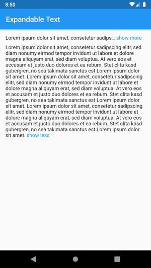
The expandable_text package provides a Flutter widget that displays only the initial lines of a text, with a clickable link to reveal the full content. It's ideal for managing long text snippets in a clean, user-friendly way. The widget supports smooth animations when expanding or collapsing and works across all major platforms including Android, iOS, Web, macOS, Windows, and Linux. It enhances readability by preventing excessive vertical space usage while maintaining accessibility.
Use cases
Displaying long descriptions in lists
Showing truncated reviews or comments
Improving UI performance with large text blocks
Creating interactive content sections
Reducing screen clutter in chat interfaces
Key features
Smooth expand/collapse animations
Customizable number of visible lines
Configurable expand/collapse text
Supports rich text and styling
Cross-platform compatibility
Easy integration with existing widgets
Suitable for
Apps with lengthy text content
User interfaces requiring dynamic text expansion
Developers seeking lightweight text management
Projects needing responsive text layout
UI/UX designers focused on minimalism
Considerations
May require additional styling for consistent appearance
Performance impact with very large texts
Limited customization for complex layouts
Not suitable for non-interactive text display
Requires careful handling of text overflow
Original README
Original README snapshot from the linked source repository. Visit the repository for the latest content.
This Flutter package includes the widget ExpandableText which you can use to initially only show a
defined number of lines of a probably long text. The widget appends a configurable text link which
lets the user expand the full text, or collapse it again.
This example shows a message that was posted by a user.
The username is always visible right before the text and tapping on it opens the user profile.
The text is truncated after two lines and can be expanded by tapping on the link show more at the end or the text itself.
After the text was expanded it cannot be collapsed again as no collapseText was provided.
URLs, @mentions and #hashtags in the text are styled differently and can be tapped to open the browser or the user profile.
Expand and collapse animation (animation, animationDuration, animationCurve)
Optional link to collapse the expanded text (collapseText)
Configure the style of the link (linkStyle / linkColor)
Control whether the ellipsis is part of the link (linkEllipsis)
Optional prefix text with style and tap callback (prefixText, prefixStyle, onPrefixTap)
Text with tappable and styled links (onUrlTap, urlStyle)
Text with tappable and styled @mentions (onMentionTap, mentionStyle)
Text with tappable and styled #hashtags (onHashtagTap, hashtagStyle)
Configure the number of visible lines of the collapsed text (maxLines)
Control the default expanded state (expanded, onLinkTap)
Callback for expanded changed event (onExpandedChanged)
Tap on the text to expand or collapse the text (expandOnTextTap, collapseOnTextTap)
Bugs and feature requests
Have a bug or a feature request? Please first search for existing and closed issues.
If your problem or idea is not addressed yet, please open a new issue.
Copyright & License
Code copyright 2020–2022 Florian Weinaug.
Code released under the MIT license.