Package selection guidance compiled from public package information, community data, and project usage.
fdottedline is a lightweight Flutter package that simplifies the creation of dotted lines in UI designs. It provides an easy-to-use widget for drawing dashed or dotted lines with customizable spacing, color, and thickness. Ideal for separators, dividers, or decorative elements, it integrates seamlessly into Flutter applications without requiring complex custom painting. The package is particularly useful for developers seeking a clean, efficient solution for visual line decoration.
Use cases
Creating UI dividers
Designing form section separators
Adding decorative line elements
Building custom list item borders
Implementing horizontal/vertical dotted guides
Key features
Simple API for dotted lines
Customizable dot size and spacing
Supports both horizontal and vertical orientation
Lightweight and performant
Easy integration with existing widgets
Suitable for
UI designers seeking quick line decorations
Developers building forms or lists
Projects requiring minimal custom painting
Flutter beginners exploring visual effects
Apps with minimalist design aesthetics
Considerations
Limited to basic dotted line styles
No support for advanced stroke patterns
Not suitable for complex path rendering
Does not include animated line features
Platform-specific behavior may vary
Original README
Original README snapshot from the linked source repository. Visit the repository for the latest content.
fdottedline
Use the easiest way to create a dotted line view 👀!
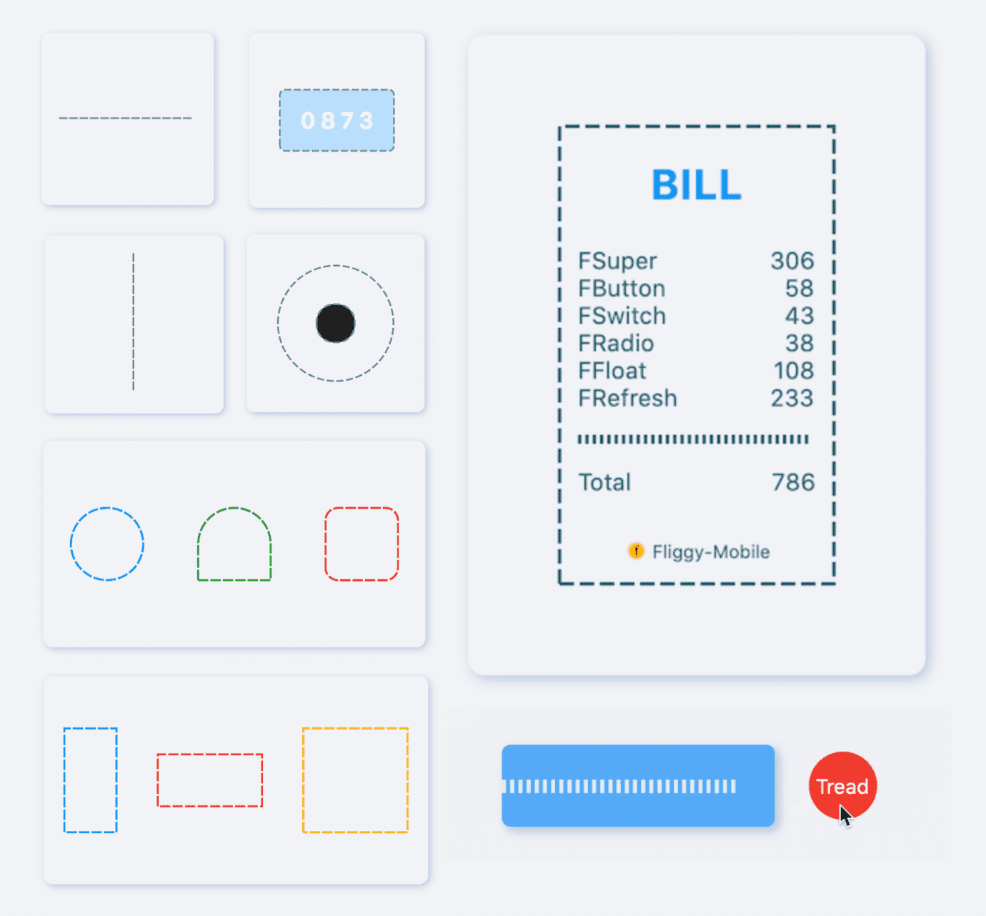
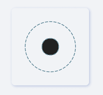
[FDottedLine] provides developers with the ability to create dashed lines. It also supports creating a dashed border for a [Widget]. Support for controlling the thickness, spacing, and corners of the dotted border.
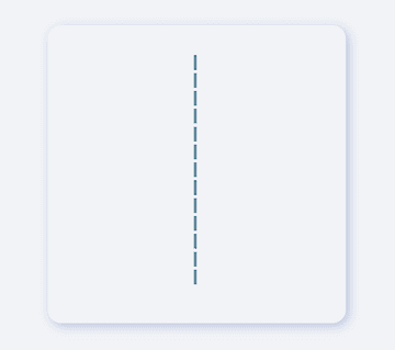
Supports dotted lines in both horizontal and vertical directions
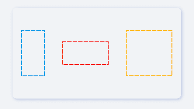
Support to create dashed shapes
Provide super easy way to add dotted border to Widget
Support creating flexible dotted corner effects
⚙️ Parameter & Interface
🔩 FDottedLine param
Param
Type
Necessary
Default
desc
color
Color
false
Colors.black
Dotted line color
height
double
false
null
height. If there is only [height] and no [width], you will get a dotted line in the vertical direction.If there are both [width] and [height], you will get a dotted border.
width
double
false
null
width. If there is only [width] and no [height], you will get a dotted line in the horizontal direction.If there are both [width] and [height], you will get a dotted border.
strokeWidth
double
false
1.0
The thickness of the dotted line
dottedLength
double
false
5.0
The length of each small segment in the dotted line
space
double
false
3.0
The distance between each segment in the dotted line
corner
FDottedLineCorner
false
null
The corners of the dotted border. See [FDottedLineCorner] for details
child
Widget
false
null
If [child] is set, [FDottedLine] will serve as the dotted border of [child].At this time, [width] and [height] will no longer be valid.
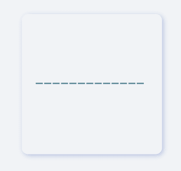
It is very simple to create a horizontal dotted line through FDottedLine.
The developer only needs to set the width parameter, but not the height parameter, which is all the developer needs to do for this.
If you want to control the thickness of the dotted line, set strokeWidth.
Through the dottedLength and space parameters, developers can freely control the length of each small segment in the dotted line and the distance between them.
In the past, it was very difficult to add a dotted border to a Widget.
Because the official did not provide us with a good solution. But now, FDottedLine makes things easier than ever. Developers only need to use their Widget as a child of FDottedLine.
This also means that through the nesting of FDottedLine, many super interesting views can be created.
💡 More Demo
See what FDottedLine can do!
When there is such a simple way to create a dotted line, developers can freely build more wonderful views.
More about the application of FDottedLine , look forward to the exploration of developers 🔆.
😃 How to use?
Add dependencies in the project pubspec.yaml file:
🌐 pub dependency
dependencies:fdottedline:^<versionnumber>
⚠️ Attention,please go to [pub] (https://pub.dev/packages/fdottedline) to get the latest version number of FDottedLine
🖥 Git dependency
dependencies:fdottedline:git:url:'git@github.com:Fliggy-Mobile/fdottedline.git'ref:'<Branch number or tag number>'
⚠️ Attention,please refer to [FDottedLine] (https://github.com/Fliggy-Mobile/fdottedline) official project for branch number or tag.
💡 License
Copyright2020-present FliggyAndroidTeam <alitrip_android@list.alibaba-inc.com>.
Licensed under the ApacheLicense, Version2.0 (the "License");
you may not use this file except in compliance with the License.
You may obtain a copy of the License at following link.
http://www.apache.org/licenses/LICENSE-2.0Unlessrequired by applicable law or agreed to in writing, software
distributed under the Licenseis distributed on an "AS IS" BASIS,
WITHOUT WARRANTIES OR CONDITIONS OF ANY KIND, either express or implied.
See the Licensefor the specific language governing permissions and
limitations under the License.