Search packages, repositories and app categories

filling_slider cover
Package detailsv0.0.3

filling_slider

Flutter package that allows you to create a IOS design sider component.

AndroidiOSWebmacOSWindowsLinux
30-day downloads
164
Likes
51
Pub points
160

Install package

flutter pub add filling_slider

Package Overview

Package selection guidance compiled from public package information, community data, and project usage.

A Flutter package that enables the creation of an iOS-style slider component with smooth filling animations. Designed to mimic native iOS sliders, it provides a visually appealing and interactive way to select values within a range. The package supports multiple platforms including Android, iOS, Web, macOS, Windows, and Linux, ensuring consistent UI across devices. It is lightweight and easy to integrate, making it ideal for apps aiming for a modern, Apple-inspired design language.

Use cases

  • iOS-style value selection
  • Modern UI design in cross-platform apps
  • Interactive form inputs
  • Visual feedback for progress or settings
  • Custom slider components

Key features

  • Smooth filling animation
  • iOS design aesthetic
  • Cross-platform compatibility
  • Simple integration
  • Customizable appearance

Suitable for

  • Design-focused Flutter developers
  • Apps targeting iOS users
  • UI/UX enhancement projects
  • Form controls with visual appeal
  • Cross-platform mobile and desktop apps

Considerations

  • Limited to slider-specific functionality
  • May require additional styling for non-iOS themes
  • Not suitable for complex interactive widgets
  • Depends on platform-specific rendering behavior
  • Best used in contexts where iOS-like design is desired
Original README

Original README snapshot from the linked source repository. Visit the repository for the latest content.

Filling Slider

pub.dev points pub.dev likes pub.dev popularity
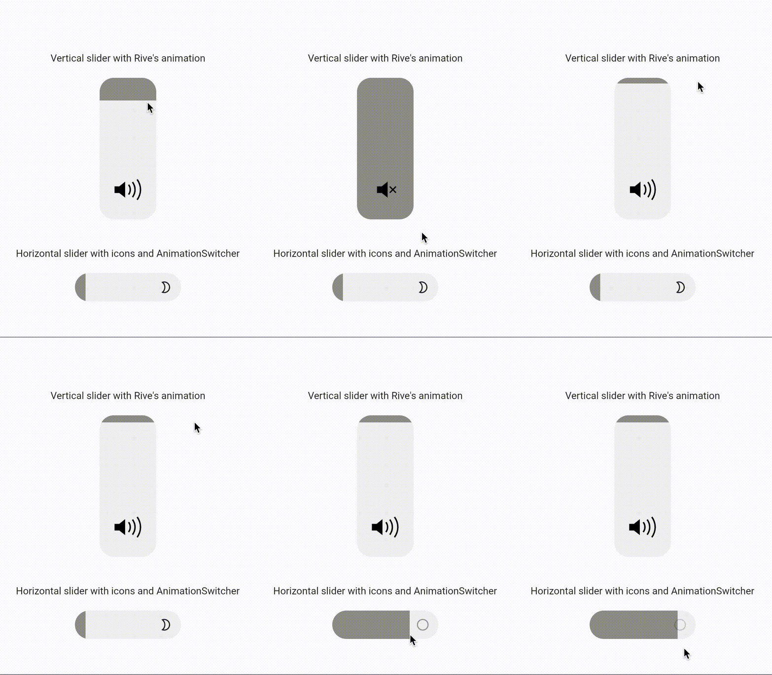
This is IOS-like slider widget

Demo

Example gif

How to use

Simple vertical slider
FillingSlider()
Simple horizontal slider
FillingSlider(
  direction: FillingSliderDirection.horizontal
)

Props

You can set initial value of slider in range [0.0, 1.0]

double initialValue
Visual Props

You can change size, direction and color of slider

double width
double height
Color color
Color fillColor
SliderDirection direction
Callbacks Props

There are 2 methods to respond to a change in the value of the slider

Function onChange - Notifies about all slider changes
Function onFinish - Notifies about the end of changes
Child Props
Widget child
Function childBuilder

Categories

Source repository

Projects using this package

No data available yet.