Search packages, repositories and app categories

find_dropdown cover
Package detailsv1.0.0

find_dropdown

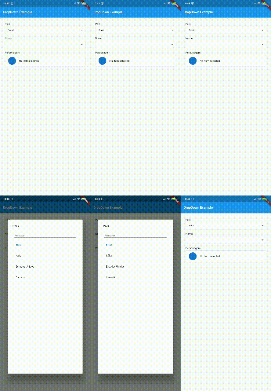
Simple and robust FindDropdown with item search feature, making it possible to use an offline item list or filtering URL for easy customization.

30-day downloads
143
Likes
82
Pub points
70

Install package

flutter pub add find_dropdown

Package Overview

Package selection guidance compiled from public package information, community data, and project usage.

FindDropdown is a lightweight and reliable Flutter package that provides a searchable dropdown widget, enabling users to filter items from an offline list or a remote URL. It supports customizable search behavior and integrates seamlessly into forms or selection interfaces. The package is designed for simplicity and performance, offering smooth user experience with minimal setup. Ideal for applications requiring efficient item selection with real-time filtering.

Use cases

  • Form inputs with searchable options
  • Offline data selection
  • Dynamic filtering from URLs
  • User-friendly dropdown menus
  • Customizable search logic

Key features

  • Real-time search functionality
  • Supports offline and online data sources
  • Easy customization of UI and behavior
  • Lightweight and performant
  • Built-in debounce for search efficiency

Suitable for

  • Developers building forms with large option lists
  • Apps needing fast, responsive dropdowns
  • Projects requiring offline-first design
  • Teams prioritizing simple integration

Considerations

  • Requires manual handling of async data fetching
  • Limited built-in styling options
  • No native support for complex nested data
  • May need additional validation for edge cases
  • Not optimized for extremely large datasets without pagination

Original README

Original README snapshot from the linked source repository. Visit the repository for the latest content.

Buy Me A Coffee

FindDropdown package - [ver em português]

Simple and robust FindDropdown with item search feature, making it possible to use an offline item list or filtering URL for easy customization.

ATTENTION

If you use rxdart in your project in a version lower than 0.23.x, use version 0.1.7+1 of this package. Otherwise, you can use the most current version!

Versions

Null Safety Version: 1.0.0 or more

Non Null Safety Version: 0.2.3 or less

RxDart 0.23.x or less: 0.1.7+1

packages.yaml

find_dropdown: <lastest version>

Import

import 'package:find_dropdown/find_dropdown.dart';

Simple implementation

FindDropdown(
  items: ["Brasil", "Itália", "Estados Unidos", "Canadá"],
  label: "País",
  onChanged: (String item) => print(item),
  selectedItem: "Brasil",
);

Multiple selectable items

FindDropdown<String>.multiSelect(
  items: ["Brasil", "Itália", "Estados Unidos", "Canadá"],
  label: "País",
  onChanged: (List<String> items) => print(items),
  selectedItems: ["Brasil"],
);

Validation

FindDropdown(
  items: ["Brasil", "Itália", "Estados Unidos", "Canadá"],
  label: "País",
  onChanged: (String item) => print(item),
  selectedItem: "Brasil",
  validate: (String item) {
    if (item == null)
      return "Required field";
    else if (item == "Brasil")
      return "Invalid item";
    else
      return null; //return null to "no error"
  },
);

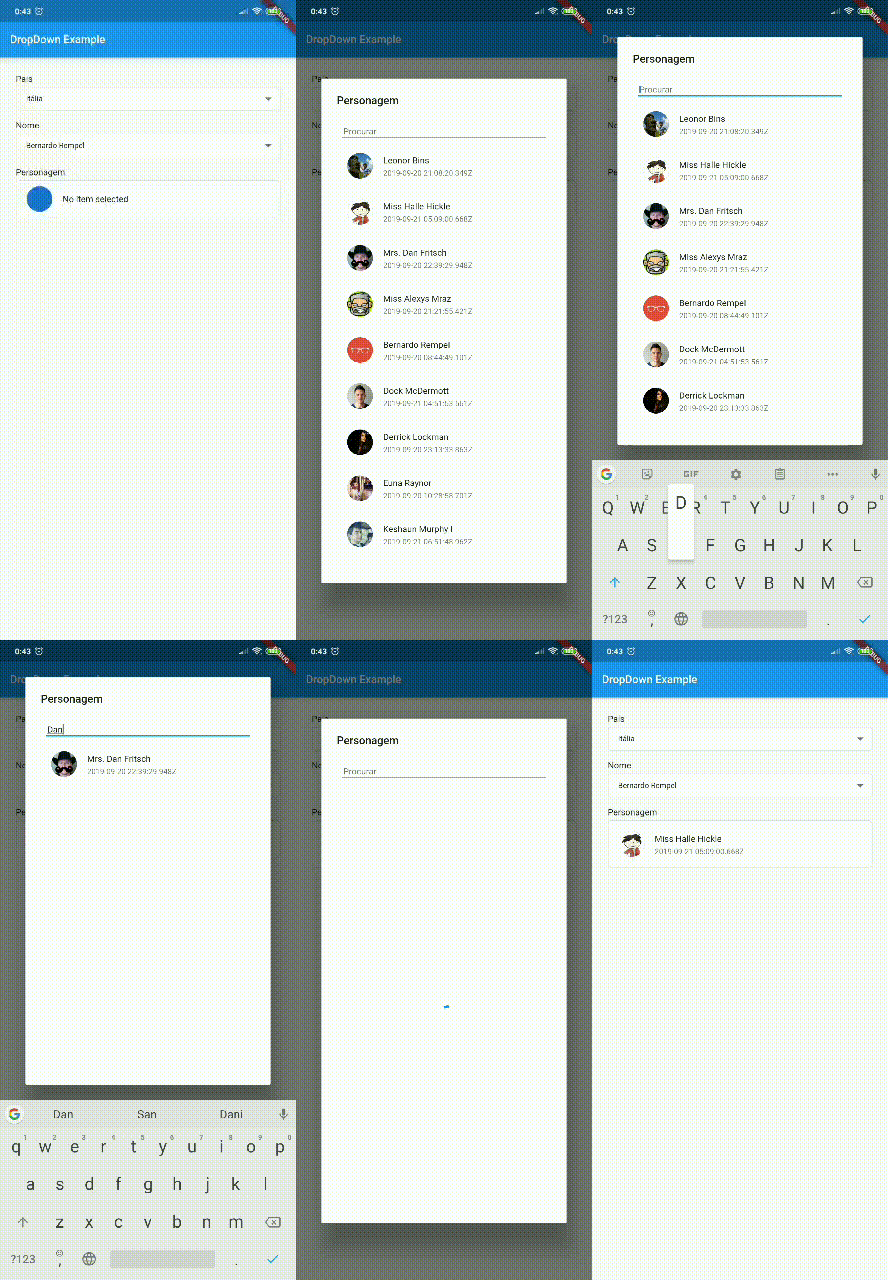
Endpoint implementation (using Dio package)

FindDropdown<UserModel>(
  label: "Nome",
  onFind: (String filter) async {
    var response = await Dio().get(
        "http://5d85ccfb1e61af001471bf60.mockapi.io/user",
        queryParameters: {"filter": filter},
    );
    var models = UserModel.fromJsonList(response.data);
    return models;
  },
  onChanged: (UserModel data) {
    print(data);
  },
);

Clear selected items

var countriesKey = GlobalKey<FindDropdownState>();

Column(
  children: [
    FindDropdown<String>(
      key: countriesKey,
      items: ["Brasil", "Itália", "Estados Unidos", "Canadá"],
      label: "País",
      selectedItem: "Brasil",
      showSearchBox: false,
      onChanged: (selectedItem) => print("country: $selectedItem"),
    ),
    RaisedButton(
      child: Text('Limpar Países'),
      color: Theme.of(context).primaryColor,
      textColor: Theme.of(context).primaryIconTheme.color,
      onPressed: () => countriesKey.currentState?.clear(),
    ),
  ],
)

Change selected items

var countriesKey = GlobalKey<FindDropdownState>();

Column(
  children: [
    FindDropdown<UserModel>(
      label: "Nome",
      onFind: (String filter) => getData(filter),
      searchBoxDecoration: InputDecoration(
        hintText: "Search",
        border: OutlineInputBorder(),
      ),
      onChanged: (UserModel data) {
        print(data);
        countriesKey.currentState.setSelectedItem("Brasil");
      },
    ),
    FindDropdown<String>(
      key: countriesKey,
      items: ["Brasil", "Itália", "Estados Unidos", "Canadá"],
      label: "País",
      selectedItem: "Brasil",
      showSearchBox: false,
      onChanged: (selectedItem) => print("country: $selectedItem"),
    ),
  ],
)
MORE EXAMPLES

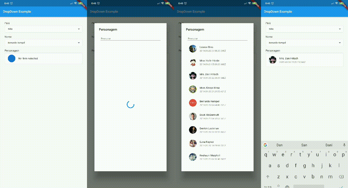
Layout customization

You can customize the layout of the FindDropdown and its items. EXAMPLE

To customize the FindDropdown, we have the dropdownBuilder property, which takes a function with the parameters:

  • BuildContext context: current context;
  • T item: Current item, where T is the type passed in the FindDropdown constructor.

To customize the items, we have the dropdownItemBuilder property, which takes a function with the parameters:

  • BuildContext context: current context;
  • T item: Current item, where T is the type passed in the FindDropdown constructor.
  • bool isSelected: Boolean that tells you if the current item is selected.

Attention

To use a template as an item type, you need to implement toString, equals and hashcode, as shown below:

class UserModel {
  final String id;
  final DateTime createdAt;
  final String name;
  final String avatar;

  UserModel({this.id, this.createdAt, this.name, this.avatar});

  @override
  String toString() => name;

  @override
  operator ==(o) => o is UserModel && o.id == id;

  @override
  int get hashCode => id.hashCode^name.hashCode^createdAt.hashCode;

}

Categories

Dependencies

Dependency list 1 items

Source repository

Projects using this package

No data available yet.