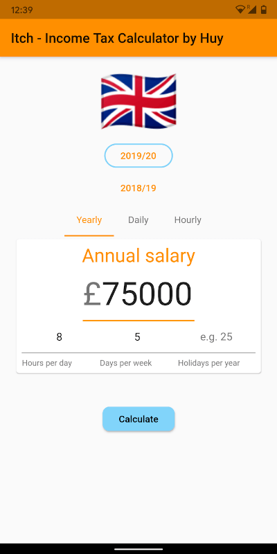
Original README snapshot from the linked source repository. Visit the repository for the latest content.
Fitted TextField Container
A Container that automatically resizes it's width to fit the containing TextField's text value.
Read the short blog: https://medium.com/@huyffs/fitted-textfield-container-for-flutter-c9c63644441c
Usage
FittedTextFieldContainer
| Param |
Type |
Default |
Description |
child |
TextField |
* required |
The TextField to fit |
calculator |
CalculateFunction |
FittedTextFieldCalculator.fitVisible |
A function to calculate the width. The default function fits the visible content & decorations (i.e. it collapses to the content/label's width when hint text disappears) |
builder |
Widget Function(BuildContext context, TextField child) |
null |
A builder that can be used to build complex layouts. The child TextField is provided to the build function |
Example
FittedTextFieldContainer(
    child: TextField(
        controller: someTextEditingController,
        textAlign: TextAlign.right,
        decoration: InputDecoration(
            prefixText: "£",
            labelText: "Amount",
        ),
    ),
)
AnimatedFittedTextFieldContainer
All params from FittedTextFieldContainer plus the following
| Param |
Type |
Default |
Description |
growCurve |
Curve |
Curves.easeOutCirc |
The curve to use in the grow animation |
growDuration |
Duration |
Duration(milliseconds: 300) |
Duration to animate the container's width when TextField grows |
shrinkCurve |
Curve |
Curves.easeInCirc |
The curve to use in the shrink animation |
shrinkDuration |
Duration |
Duration(milliseconds: 600) |
Duration to animate the container's width when TextField shrinks |
Example
AnimatedFittedTextFieldContainer(
    growDuration: Duration(milliseconds: 300),
    shrinkDuration: Duration(milliseconds: 600),
    growCurve: Curves.easeOutCirc,
    shrinkCurve: Curves.easeInCirc,
    child: TextField(
        controller: someTextEditingController,
        textAlign: TextAlign.right,
        decoration: InputDecoration(
            prefixText: "£",
            labelText: "Amount",
        ),
    ),
)
FittedTextFieldMeasurer
A class that takes a TextField and TextStyle and returns the following measurements:
textField The fitted textfieldtextStyle The fitted textfield's style or the default styletextWidth Width of the text contentlabelWidth Width of the labelhintWidth Width of the hint textfixedWidths Width of fixed elements (prefixText, suffixText, contentPadding and cursorWidth)
CalculateFunction
This function takes measured values and returns a width value.
Signature:
double CalculateFunction(FittedTextFieldMeasurer)
Example:
FittedTextFieldContainer(
    calculator: (m) =>
        m.fixedWidths +
        max(m.labelWidth, max(m.hintWidth, m.textWidth)),
    child: TextField(
        controller: someTextEditingController,
        textAlign: TextAlign.right,
        decoration: InputDecoration(
            hintText: "Width of hint text",
        ),
    ),
);
Predefined functions
A few calculators are provided for common use-cases
fitAll fits content, label and hint textsfitVisible fits the visible content & decorations (i.e. it collapses to the content/label's width when hint text disappears)fitVisibleWithPadding(double padding) in addition to fitting visible content it adds a fixed padding valuefitVisibleWithRange(double min, double max) in addition to fitting visible content it enforces a minimum and (optional) maximum width
Example:
Fit all
FittedTextFieldContainer(
    calculator: FittedTextFieldCalculator.fitAll,
    child: ...
);
Fit visible with minimum
FittedTextFieldContainer(
    calculator: FittedTextFieldCalculator.fitVisibleWithRange(120),
    child: ...
);
Fit visible with maximum
FittedTextFieldContainer(
    calculator: FittedTextFieldCalculator.fitVisibleWithRange(0, 180),
    child: ...
);
Using the builder
AnimatedFittedTextFieldContainer(
    child: TextField(
        controller: someTextEditingController,
        textAlign: TextAlign.right,
        decoration: InputDecoration(
            labelText: "Twinkle twinkle",
        ),
    ),
    builder: (context, child) => Container(
        child: Stack(
            overflow: Overflow.visible,
            children: <Widget>[
                child,
                Positioned(
                    top: 0,
                    right: -22,
                    child: _aniWholePoundCtl.text.isEmpty
                        ? Icon(Icons.star_border)
                        : Icon(Icons.star, color: Colors.amber),
                ),
            ],
        ),
    ),
)
Contribute
Pull requests are welcome!
Licence
MIT License
Copyright (c) 2020 Huy Dinh