Search packages, repositories and app categories

flexi_productimage_slider cover
Package detailsv1.1.1

flexi_productimage_slider

An image slider to represent your products..:)

AndroidiOSWebmacOSWindowsLinux
30-day downloads
97
Likes
30
Pub points
100

Install package

flutter pub add flexi_productimage_slider

Package Overview

Package selection guidance compiled from public package information, community data, and project usage.

Flexi ProductImage Slider is a Flutter package designed to display product images in a smooth, customizable slider. Ideal for e-commerce apps, it supports multiple platforms including Android, iOS, Web, macOS, Windows, and Linux. The slider offers responsive design and intuitive navigation, enhancing the user experience when browsing products. With minimal setup via `flutter pub add`, developers can quickly integrate an engaging image carousel into their applications. It's particularly useful for showcasing product variations, such as different colors or angles.

Use cases

  • E-commerce product galleries
  • Showcasing product variants
  • Mobile and web storefronts
  • Product detail pages
  • Interactive image carousels

Key features

  • Customizable slide transitions
  • Responsive design across devices
  • Easy integration with Flutter
  • Support for multiple platforms
  • Smooth touch-based navigation

Suitable for

  • E-commerce app developers
  • Product-focused UI designers
  • Cross-platform mobile and web projects
  • Developers seeking lightweight image sliders
  • Apps requiring interactive product displays

Considerations

  • Limited built-in image editing tools
  • No automatic autoplay by default
  • Requires manual configuration for advanced styling
  • Best suited for static image collections
  • Dependent on external image sources

Original README

Original README snapshot from the linked source repository. Visit the repository for the latest content.

flexi_productimage_slider

An image slider to represents your products..:)

Features

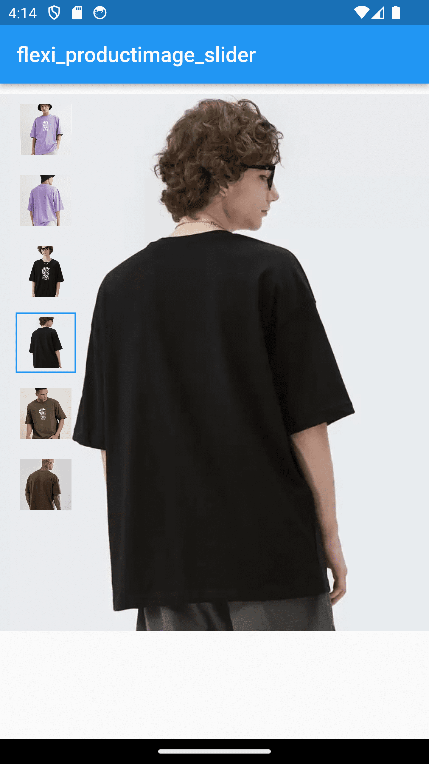
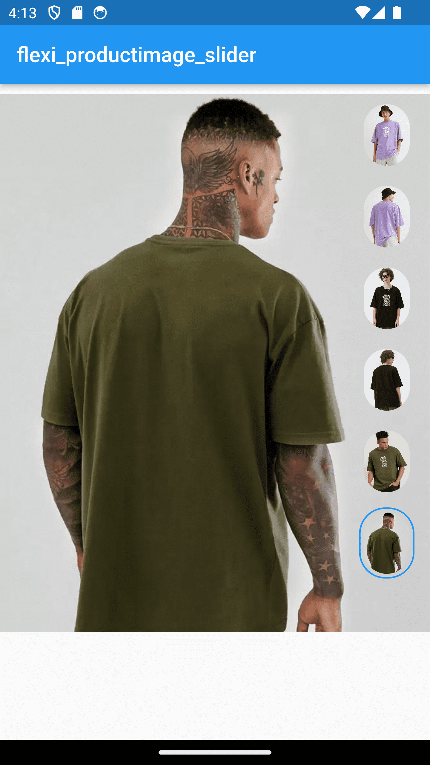
  • Slide your products with thumbnail
  • set your thumbnail in any shapes, color, corner radius, size , alignment etc. as per your requirements
  • perform your action on click on image

Installation

In your pubspec.yaml file within your Flutter Project:

dependencies:
  flexi_productimage_slider: 1.1.0

import 'package:flexi_productimage_slider/flexi_productimage_slider.dart';

    flexiProductimageSlider(
    
        //required fields
        arrayImages: const [
        "https://i.ibb.co/ZLFHX3F/1.png",
        "https://i.ibb.co/JKJvs5S/2.png",
        "https://i.ibb.co/LCzV7b3/3.png",
        "https://i.ibb.co/L8JHn1L/4.png",
        "https://i.ibb.co/7RWNCXH/5.png",
        "https://i.ibb.co/bBsh5Pm/6.png",
        ],
        
        // optional fields
        
        //set where you want to set your thumbnail
        sliderStyle: SliderStyle.nextToSlider,//.overSlider, .nextToSlider
        
        // set you slider height like 1.0,1.5,2.0 etc...
        aspectRatio: 0.8,
        
        //set content mode of image
        boxFit: BoxFit.cover,

        //set this if you want to set any default image index when it loads
        selectedImagePosition: 0,
        
        //set your thumbnail alignment 
        thumbnailAlignment: ThumbnailAlignment.bottom,//.right , .left, .bottom

        //set how selected thumbnail border displayed
        thumbnailBorderType: ThumbnailBorderType.all,//.bottom, .all

        //set selected thumbnail border width
        thumbnailBorderWidth: 1.5,//double value
        
        //set thumbnail corner radius
        thumbnailBorderRadius: 10,
        
        //set your thumbnail height & width
        //NOTE : if you set ThumbnailShape.circle then set thumbnail width height same
        thumbnailWidth: 50,
        thumbnailHeight: 65,
        
        //set color of current image thumbnail border
        thumbnailBorderColor: Colors.blue,
        
        //make you action when user click on image
        onTap: (index){
           print("selected index : $index");

           //for zooming effect on click use gallery_zoom_slides
           //https://pub.dev/packages/gallery_zoom_slides
           Navigator.push(context, MaterialPageRoute(builder: (context)=>
                galleryZoomSlides(                
                        //required fields
                        arrayImages: arrayImages,
                        
                        //Optional fields
                        zoomTheme: ZoomTheme.theme3,//.theme1, .theme2, .theme3
                        selectedImagePosition: index,
                        selectedThumbnailColor: Colors.blue,
                  )
                  )
                );
           
        },
    ),

...


NOTE : Images taken only for demo purpose

Categories

Dependencies

Dependency list 1 items

Source repository

Projects using this package

No data available yet.