Search packages, repositories and app categories

flicked_cards cover
Package detailsv0.0.3

flicked_cards

A gesture driven customizable and extensible card widget

AndroidiOSWebmacOSWindowsLinux
30-day downloads
33
Likes
82
Pub points
145

Install package

flutter pub add flicked_cards

Package Overview

Package selection guidance compiled from public package information, community data, and project usage.

Flicked Cards is a gesture-driven, customizable, and extensible card widget for Flutter that enables interactive card flipping and swiping animations. Built with smooth transitions and responsive gestures, it allows developers to create engaging user interfaces where cards can be flipped or dismissed with intuitive touch interactions. The package supports multiple platforms including Android, iOS, Web, macOS, Windows, and Linux, making it ideal for cross-platform applications requiring dynamic card-based navigation or content presentation.

Use cases

  • Interactive card sliders
  • Swipe-to-dismiss interfaces
  • Gesture-driven content exploration
  • Card flip animations in dashboards
  • User onboarding flows with swipeable cards

Key features

  • Gesture-driven card interactions
  • Customizable flip and swipe animations
  • Extensible design for custom behaviors
  • Cross-platform compatibility
  • Support for multiple interaction states
  • Configurable transition durations

Suitable for

  • Developers building interactive card UIs
  • Apps requiring swipe or flip gestures
  • Designers seeking animated card experiences
  • Cross-platform mobile and web apps
  • Prototyping interactive layouts

Considerations

  • May require performance tuning for large card lists
  • Customization may involve deeper Dart knowledge
  • Limited built-in themes compared to other packages
  • Best suited for moderate card counts due to animation overhead

Original README

Original README snapshot from the linked source repository. Visit the repository for the latest content.

flicked_cards

Build Status Codecov Pub Package MIT License

A gesture driven card swipping widget supporting custom animations.

Features

  • Awesome default animations provided out of the box
  • Progress through cards swipping both direction or in a single direction
  • Extensible through custom provided animations
  • Support piling or popping (depending on animation spec)

Examples

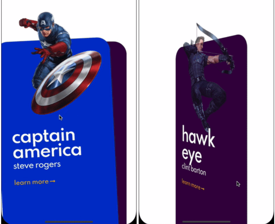
Here are some of the animation provided out of the box, take a look at the example to see all.

Cards used in these examples where taken from Brocodev

Example usage

FlickedCards(
  count: Superhero.marvelHeroes.length,
  animationStyle: FlipAnimation(),
  onSwiped: (idx, dir) => print('>>> $dir $idx'),
  builder: (index, progress, context) {
    final superHeroe = Superhero.marvelHeroes[index];
    return Container(
      child: Center(
        child: SuperheroCard(
            superhero: superHeroe,
            factorChange: 1 - progress),
      ),
    );
  },
)

Custom animations

flicked_cards provides an easy way to create custom animations but it is required to have a basic understanding of how cards can be layed out and how to position them depending on the drag progress and some of the properties in AnimationConfig.

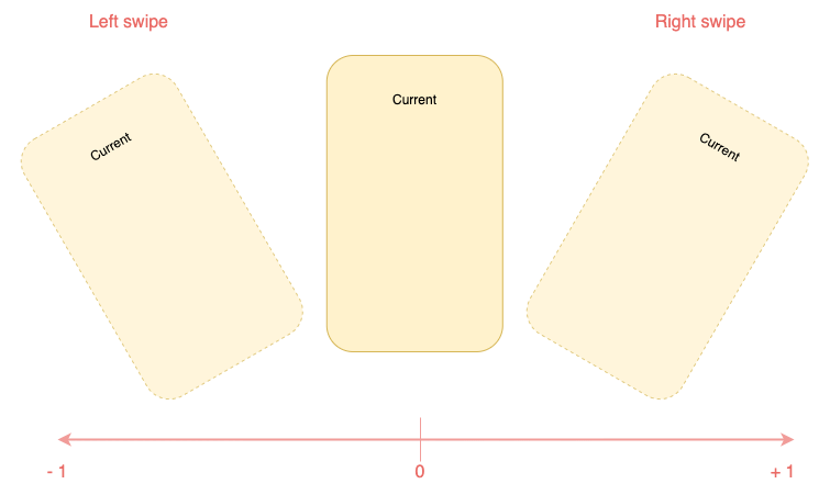
Animations will be provided a progress value in the range (-1, 1) you should try to make you animation symmetric around 0 when posible. Like this:

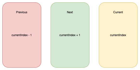
You will have to reason about relative card indices:

Interface for animations

All animations will need to implement CardAnimation which basically defines:

  • animation of a particular card depending on swipe progress required
  • opacity of a particular card depending on swipe progress optional
  • where to apply transformations on cards (Fractional Offset)
typedef SwipeAnimation = Matrix4 Function(double progress);
typedef OpacityAnimation = double Function(double progress);

abstract class CardAnimation {
  AnimationConfig get config;
  LayoutConfig get layoutConfig;

  SwipeAnimation animationForCard({required int relativeIndex});

  OpacityAnimation opacityForCard({required int relativeIndex}) {
    return (_) => 1;
  }

  FractionalOffset fractionalOffsetForCard({required int relativeIndex});
}

Additionally to make this process a bit easier, 2 extra abstract classes that implement CardAnimation which are:

  • SymmetricCardAnimation
  • AsymmetricCardAnimation

Carousel animation is an example of a SymmetricCardAnimation take a look here

If struggling to make the animationlook at how the animations provided out of the box where implemented: here

Card layouts

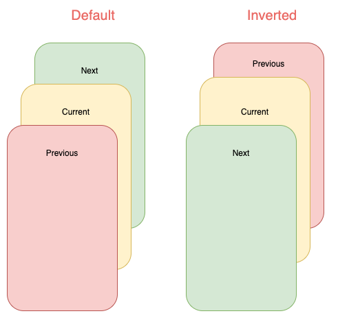
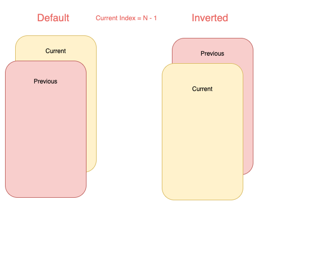
Internally cards are placed in Stack widget so an animation can choose to work with a single or both of the following layouts:

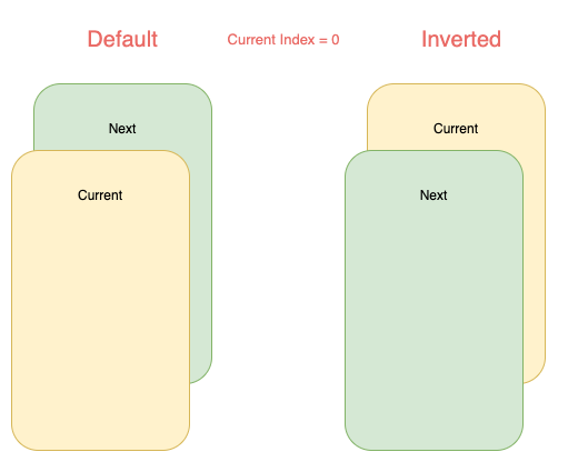
Note that depending on the index some of cards will not be displayed:

Categories

Source repository

Projects using this package

No data available yet.