Search packages, repositories and app categories

flip_board cover
Package detailsv1.0.0

flip_board

FlipBoards are compositions of FlipWidgets, a widget that animates content change with a flipping animation. Includes FlipFraseBoard, FlipMatrix, FlipClock and others.

AndroidiOSWebmacOSWindowsLinux
30-day downloads
1.4K
Likes
115
Pub points
150

Install package

flutter pub add flip_board

Package Overview

Package selection guidance compiled from public package information, community data, and project usage.

FlipBoard is a Flutter package that enables animated content transitions using flipping animations. It provides reusable widgets like FlipFraseBoard, FlipMatrix, and FlipClock, each designed to smoothly animate changes in their displayed content. Built with Flutter's animation system, it supports multiple platforms including Android, iOS, Web, macOS, Windows, and Linux. The package is ideal for creating engaging UIs where visual feedback during state changes enhances user experience.

Use cases

  • Animated digital clocks
  • Dynamic text displays
  • Interactive data grids
  • User interface transitions
  • Game score counters
  • Visual feedback in forms

Key features

  • Smooth flipping animations
  • Pre-built specialized boards
  • Cross-platform compatibility
  • Easy integration with Flutter
  • Customizable flip direction and speed
  • Reactive content updates

Suitable for

  • Developers building interactive dashboards
  • Designers seeking dynamic UI elements
  • Apps requiring visual state transitions
  • Educational or gaming applications
  • Real-time data visualization tools

Considerations

  • May impact performance on low-end devices
  • Limited customization beyond flip effects
  • Requires understanding of Flutter's widget lifecycle
  • Not suitable for simple static content
  • Animation may distract in minimalistic designs
  • Depends on Flutter's animation framework stability

Original README

Original README snapshot from the linked source repository. Visit the repository for the latest content.

Flip Board

pub package license

Widgets to build displays that resemble Mechanical Flip Boards.

The basic component is a stateful FlipWidget that renders flip transitions for a stream of items and an itemBuilder.

The package also includes other widgets that compose this basic component in useful Flip Boards:

Flip Widget

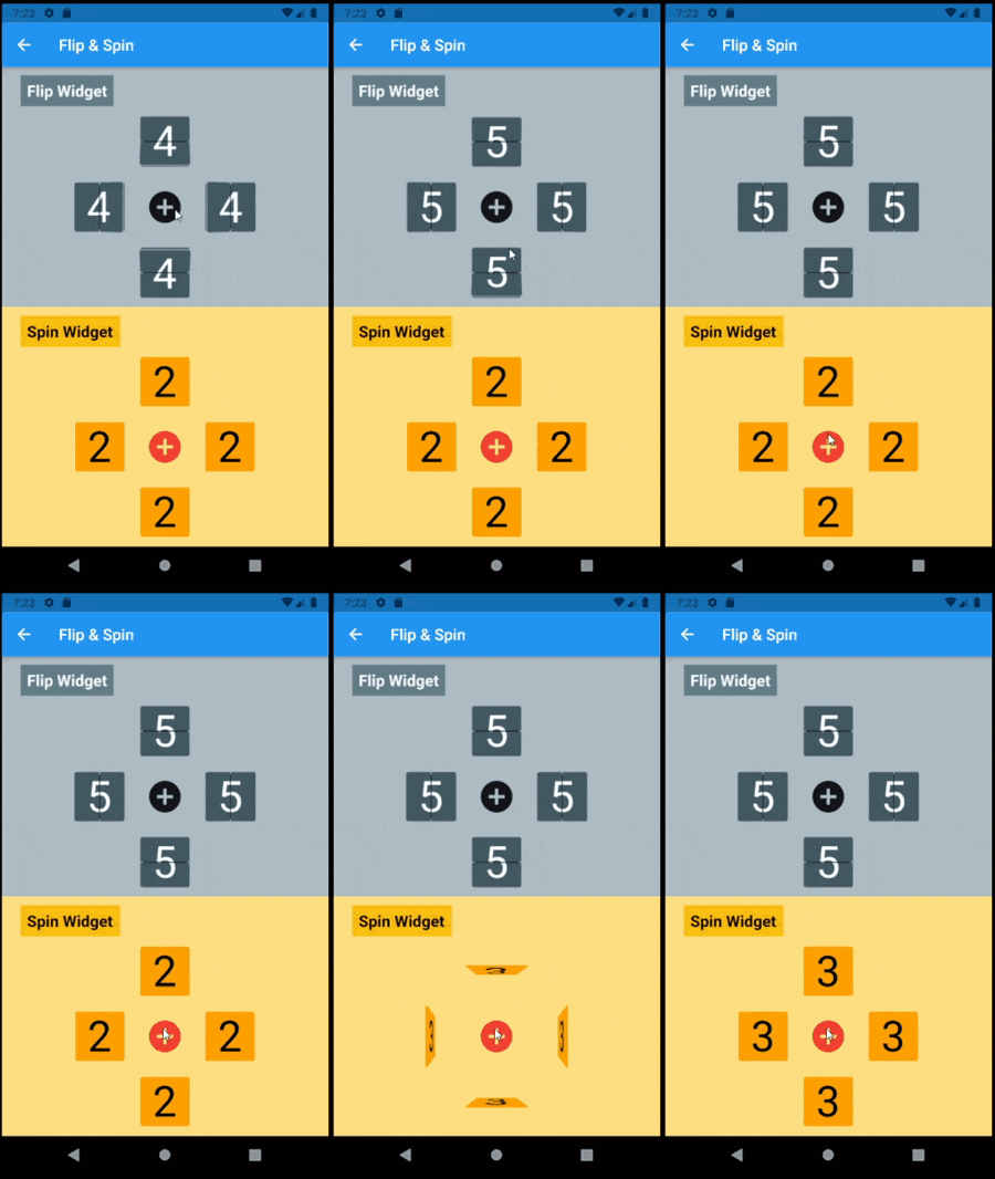
The most distinctive characteristic of a FlipWidget is its flip type to define the type of movement that will animate items rendering, either FlipType.middleFlip or FlipType.spinFlip.

This widget renders flip animations in a configured Axis and AxisDirection, animating the transition to each new item received in the given item stream. It is commonly used to display digits and letters but can actually render any widget you build through the given itemBuilder.

It is constructed with four required parameters (besides many optional parameters):

  • flipType: either FlipType.middleFlip or FlipType.spinFlip
  • itemStream: stream of items to be flipped as they are received
  • itemBuilder: builder to create a widget out of each item
  • flipDirection: AxisDirection to animate new items flip

Please check the class documentation to see all options.

Middle Flip

When we think of Mechanical Flip Boards as we used to see in airports and sport score boards we think on a Vertical MiddleFlip Widget or, most likely, on a composition (row) of them.

Its construction could look like:

FlipWidget({
  flipType: FlipType.middleFlip,
  itemStream: _stream,
  itemBuilder: _itemBuilder,
  flipDirection: AxisDirection.down,
});
Spin Flip

With FlipType.spinFlip this widget will render a Flip Card animation when new items arrive in the stream.

It has a similiar constructor, something like:

FlipWidget({
  flipType: FlipType.spinFlip,
  itemStream: _stream,
  itemBuilder: _itemBuilder,
  flipDirection: AxisDirection.right,
});

Example page that shows both types and all flipping directions (full code in examples folder):

  @override
  Widget build(BuildContext context) =>
    Center(
      child: Column(
        mainAxisAlignment: MainAxisAlignment.center,
        children: [
          _flipWheel,
          _spinWheel,
        ],
      ),
    );

  Widget get _flipWheel =>
    Center(
      child: Column(
        mainAxisSize: MainAxisSize.min,
        children: [
          _wheelTitle('Flip Widget'),
          _flipWidget(AxisDirection.up),
          Row(
            mainAxisSize: MainAxisSize.min,
            children: [
              _flipWidget(AxisDirection.left),
              _button,
              _flipWidget(AxisDirection.right),
            ],
          ),
          _flipWidget(AxisDirection.down),
        ],
      ),
    );

  Widget _flipWidget(AxisDirection direction) =>
    FlipWidget(
      flipType: FlipType.middleFlip,
      itemStream: _flipController.stream,
      itemBuilder: _itemBuilder,
      initialValue: _nextFlipValue,
      flipDirection: direction,
      hingeWidth: 1.0,
      hingeLength: 56.0,
      hingeColor: Colors.black,
    );

  Widget _itemBuilder(BuildContext context, int? value) =>
    Container(
      width: 64.0,
      height: 64.0,
      alignment: Alignment.center,
      decoration: BoxDecoration(
        borderRadius: const BorderRadius.all(Radius.circular(4.0)),
        border: Border.all(),
      ),
      child: Text(
        (value ?? 0).toString(),
        style: TextStyle(fontSize: 54.0),
      ),
    );

  void _flip() => _flipController.add(++_nextFlipValue % 10);

Flip Boards

Basic FlipWidgets are usually composed in a layout, this package provides a few configurable compositions of FlipWidgets of the same type and orientation, sometimes varying some elements direction within that axis orientation.

All these composed widgets are described below and explored in the examples folder.

Flip Matrix Board

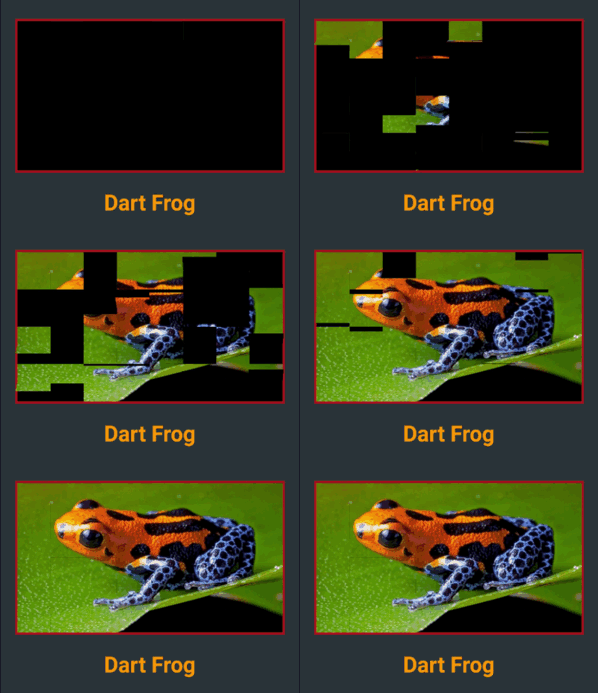
There two classes of FlipMatrixBoard that animate the display in a matrix of FlipWidgets. The first class displays a single child, an image in the given example. The second class animates the display of a stream of items, also given as a stream of images in the example below.

The board is configured with the number of rows and columns, flipping orientation and animation speed and delays parameters.

  • FlipMatrixBoardSingleChild

    Widget get _flipImage =>
      Container(
        decoration: BoxDecoration(
          border: Border.all(width: 3.0, color: Colors.red[900]!),
        ),
        child: FlipMatrixBoardSingleChild.assetImage(
          imageName: 'assets/horizontal/dart-frog.jpg',
          backgroundColor: Colors.black,
          axis: Axis.vertical,
          width: 364.0,
          height: 205.0,
          columnCount: 8,
          rowCount: 4,
        ),
      );
  • FlipMatrixBoardStream

    Widget get _flipWidget =>
      Container(
        decoration: BoxDecoration(border: Border.all(color: Colors.blue)),
        child: FlipMatrixBoardStream<String>(
          itemStream: _controller.stream,
          itemBuilder: _itemBuilder,
          axis: Axis.vertical,
          width: 375.0,
          height: 200.0,
          columnCount: 8,
          rowCount: 4,
        ),
      );

Flip Clock

FlipClock will default to Theme colors but can be further customized through constructor parameters.

The default flip direction is AxisDirection.down and the default animation curve is a custom curve that acceletares like gravity and bounces back at the end (like a mechanical bang).

In the example below some colors are inherited by a parent ThemeData from the amber color scheme. While some colors are defined in the constructor invocation:

  Widget _flipClock(ColorScheme colors) =>
    Container(
      decoration: BoxDecoration(
        color: colors.onPrimary,
        borderRadius: const BorderRadius.all(Radius.circular(8.0)),
      ),
      padding: const EdgeInsets.all(16.0),
      child: FlipClock(
        digitSize: 54.0,
        width: 46.0,
        height: 62.0,
        separatorColor: colors.primary,
        hingeColor: Colors.black,
        showBorder: true,
      ),
    );

Flip Countdown Clock

FlipCountdownClock is similar, it requires a duration parameter and may be configured with an onDone callback function.

Countdown default flip direction is AxisDirection.up, the opposite of FlipClock, with no panel bang animation.

In the following example most colors are configured with constructor parameters:

  Widget _flipCountdown(ColorScheme colors) => 
    Container(
      decoration: BoxDecoration(
        color: colors.secondary,
        borderRadius: BorderRadius.circular(8.0),
      ),
      padding: const EdgeInsets.all(24.0),
      child: FlipCountdownClock(
        duration: const Duration(minutes: 1),
        digitSize: 54.0,
        width: 46.0,
        height: 62.0,
        digitColor: colors.surface,
        backgroundColor: colors.onSurface,
        separatorColor: colors.onSurface,
        borderColor: colors.primary,
        hingeColor: colors.surface,
        borderRadius: const BorderRadius.all(Radius.circular(8.0)),
        onDone: () => print('Buzzzz!'),
      ),
    );

Flip Frase Board

This composed widget displays a Frase Board that will animate each letter up to the the given frase letters.

Flip type, initial and end colors, delays and more are all customized at constructor level. Check the class documentation for a run over all configurations.

The provided example looks like this:

This page displays a variety of frase boards, one of them would be constructed like this:

  Widget _flipFraseBoard(FlipType type, Axis axis, String frase) =>
    FlipFraseBoard(
      flipType: type,
      axis: axis,
      startLetter: 'A',
      endFrase: frase,
      fontSize: 30.0,
      hingeWidth: 0.6,
      hingeColor: Colors.black,
      borderColor: Colors.black,
      endColors: _flipEndColors,
      letterSpacing: 2.0,
    );

Game

We created a simple game to use a FlipWidget in a more complex context. Check the code in the example folder to see the complete implementation.

Uhaaa! Flip Game

Flip cards untill you make all three cards match the same painting.

There are two valid actions:

  • a first tap on a card: will flip that card
  • a second consecutive tap on a card: wil flip the other two cards
Can you win? Good luck!

Categories

Dependencies

Dependency list 1 items

Source repository

Projects using this package