Search packages, repositories and app categories

floating_chat_button cover
Package detailsv1.1.0

floating_chat_button

A floating button which can be dragged around the screen and can display messages to the user

AndroidiOSWebmacOSWindowsLinux
30-day downloads
235
Likes
56
Pub points
150

Install package

flutter pub add floating_chat_button

Package Overview

Package selection guidance compiled from public package information, community data, and project usage.

A Flutter package that provides a draggable floating button for displaying messages to users. The button can be freely moved across the screen, making it ideal for interactive chat interfaces or in-app notifications. It supports multiple platforms including Android, iOS, Web, macOS, Windows, and Linux, ensuring consistent behavior across devices. Designed for simplicity and usability, it enhances user engagement by offering a persistent, accessible communication element.

Use cases

  • In-app messaging systems
  • User support chat widgets
  • Interactive UI elements
  • Real-time notification displays
  • Mobile-first chat interfaces

Key features

  • Draggable interface
  • Cross-platform compatibility
  • Message display capability
  • Customizable positioning
  • Responsive design
  • Easy integration with Flutter

Suitable for

  • Developers building chat apps
  • UI designers seeking interactive elements
  • Apps requiring persistent user notifications
  • Cross-platform mobile applications
  • Simple yet effective communication tools

Considerations

  • May require additional styling for complex layouts
  • Performance impact on low-end devices
  • Limited to basic message rendering
  • Not suitable for high-volume chat streams
  • Requires careful placement to avoid UI clutter
Original README

Original README snapshot from the linked source repository. Visit the repository for the latest content.

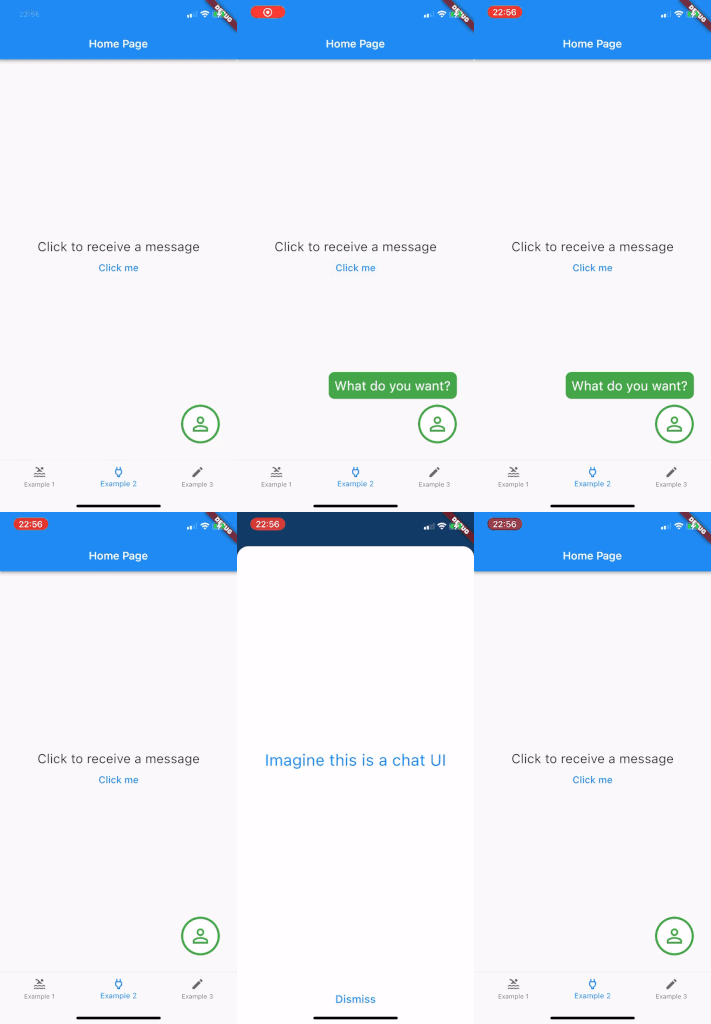
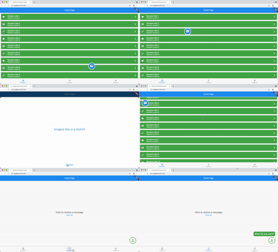
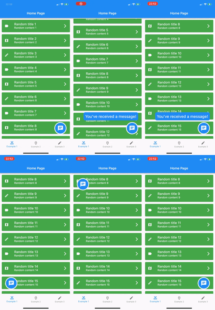
Show a draggable floating chat icon button and show messages on screens

Features

A widget for displaying a chat icon (or custom widget) on top of a background widget.

It can show and hide messages or display a message that is passed in its constructor.

Alt text Alt text Alt text

Getting started

Add it as the body of a scaffold (or other full screen view) and then supply the widget that should be shown under the chat widget as the background parameter.

Alternately, use a stack view to position the chat widget and leave the background as null.

The FloatingChatIcon will default to a blue circle with white chat icon and the messageWidget will default to a blue rounded rectangle with white text. All of these colours can be configured or custom widgets can be passed to chatIconWidget, messageWidget or messageTextWidget.

The ShowMessageParameters allows you to show the message passed to the constructor after a given delayDuration, for the amount of time specified in durationToShowMessage and at a random frequency (eg "Only show this message 50% of the time that the widget is instantiated") with showMessageFrequency.

Usage

@override
  Widget build(BuildContext context) {
    return Scaffold(
      appBar: AppBar(
        title: Text(widget.title),
      ),
      body: FloatingChatButton(
          background: BackgroundWidget(),
          onTap: (_) {
            _showBottomSheet(context);
          },
          messageText: "I like this package",
      )
    );
  }

Categories

Source repository

Projects using this package

No data available yet.