
Search packages, repositories and app categories

floating_menu_panel cover
Package detailsv0.0.2

floating_menu_panel

Floating menu panel

AndroidiOSWebmacOSWindowsLinux
30-day downloads
42
Likes
29
Pub points
130

Install package

flutter pub add floating_menu_panel

Package Overview

Package selection guidance compiled from public package information, community data, and project usage.

A Flutter package that provides a floating menu panel, offering an interactive and customizable floating action interface. It enables users to access multiple actions through a compact, animated panel that can be expanded or collapsed. Ideal for apps requiring quick access to common functions without cluttering the UI. The panel supports various configurations, including positioning, animation, and custom child widgets. Compatible across all major platforms, it enhances usability in mobile and desktop applications.

Use cases

  • Quick access to app actions
  • Enhancing user navigation
  • Reducing UI clutter
  • Customizable action panels
  • Mobile and desktop app integration

Key features

  • Animated expansion and collapse
  • Customizable position and size
  • Support for multiple child widgets
  • Cross-platform compatibility
  • Configurable animations
  • Easy integration with existing UI

Suitable for

  • Mobile and desktop applications
  • Apps needing gesture-based menus
  • UI designers seeking interactive elements
  • Developers wanting lightweight solutions
  • Projects with space-constrained interfaces

Considerations

  • May require careful placement to avoid overlap
  • Animation performance on lower-end devices
  • Limited customization compared to full custom widgets
  • Not ideal for complex nested menus
  • Requires attention to accessibility standards
Original README

Original README snapshot from the linked source repository. Visit the repository for the latest content.

floating_menu_panel

Floating menu panel

Basic:

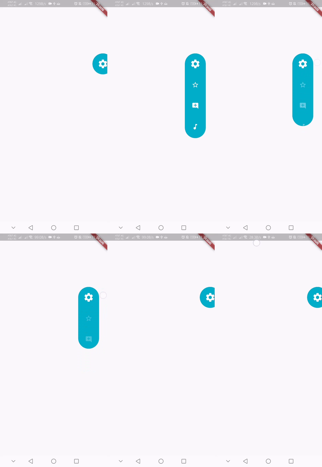
This is what you needs to get the widget working. Import Widget -> Add 'FloatingMenuPanel' at the bottom of your stack widget. Add icons inside the "buttons" list.

import 'package:floating_menu_panel/floating_menu_panel.dart'; // Import Floating Menu Panel

return MaterialApp(
      home: Scaffold(
        body: Stack(
          children: [
            FloatingMenuPanel(
              onPressed: (index) {
                print('SELECT__: $index');
              },
              buttons: [
                Icons.star_border_outlined,
                Icons.add_comment,
                Icons.music_note
              ],
            ),
          ],
        ),
      ),
    );

alt Floating Menu Panel

All Properties:

These are all the properties you can customize of the floating panel.

    import 'package:floating_menu_panel/floating_menu_panel.dart'; // Import Floating Menu Panel
    
    Stack(
        children: [
            ...
    
            // Add Float Box Panel at the bottom of the 'stack' widget.
            FloatingMenuPanel(
                positionTop: 0.0, // Initial Top Position
                positionLeft: 0.0, // Initial Left Position
                backgroundColor: Color(0xFFEDEDED), // Color of the panel
                contentColor: Colors.black, // Color of the icons
                panelShape: PanelShape.rectangle, // 'PanelShape.rectangle' or 'PanelShape.rounded', border radius property doesn't work in the rounded shape
                borderRadius: BorderRadius.circular(8.0), // Border radius of the panel
                dockType: DockType.inside, // 'DockType.inside' or 'DockType.outside', weather to dock the panel outside or inside the edge of the screen
                dockOffset: 5.0, // Offset the dock from the edge depending on the 'dockType' property
                panelAnimDuration: 300, // Duration for panel open and close animation
                panelAnimCurve: Curves.easeOut, // Curve for panel open and close animation
                dockAnimDuration: 300, // Auto dock to the edge of screen - animation duration
                dockAnimCurve: Curves.easeOut, // Auto dock animation curve
                panelOpenOffset: 20.0, // Offset from the edge of screen when panel is open
                panelIcon: Icons.menu, // Panel open/close icon
                size: 70.0, // Size of single button in the panel
                iconSize: 24.0, // Size of icons
                borderWidth: 1.0, // Width of panel border
                borderColor: Colors.black, // Color of panel border
                onPressed: (index) {
                    print("Clicked on item: $index");
                }
                buttons: [
                    // Add Icons to the buttons list.
                    Icons.message,
                    Icons.photo_camera,
                    Icons.video_library
                ]
            );
        ]
    );

Categories

Source repository

Projects using this package

No data available yet.