Search packages, repositories and app categories

flutter_advanced_segment cover
Package detailsv3.2.0

flutter_advanced_segment

An advanced segment widget, that can be fully customized with bunch of properties, just try it and enjoy!

AndroidiOSWebmacOSWindowsLinux
30-day downloads
7.1K
Likes
118
Pub points
150

Install package

flutter pub add flutter_advanced_segment

Package Overview

Package selection guidance compiled from public package information, community data, and project usage.

A highly customizable segment widget for Flutter, designed to enhance tabbed navigation with extensive styling and configuration options. It supports all major platforms including Android, iOS, Web, macOS, Windows, and Linux. Developers can tailor the appearance and behavior of segments with numerous properties, enabling seamless integration into diverse UI designs. Ideal for creating intuitive, interactive interfaces with smooth transitions and responsive feedback.

Use cases

  • Custom tab navigation
  • Form field grouping
  • Dynamic content switching
  • User preference selectors
  • Interactive dashboard filters
  • Multi-state selection controls

Key features

  • Fully customizable appearance
  • Cross-platform compatibility
  • Smooth transition animations
  • Extensive property configuration
  • Support for both horizontal and vertical layouts
  • Responsive design adaptability

Suitable for

  • Developers building complex UIs
  • Designers needing flexible tab components
  • Apps requiring dynamic segment interactions
  • Projects with strict UI consistency needs
  • Teams using Flutter for multi-platform apps

Considerations

  • May require additional styling knowledge
  • Performance impact with many segments
  • Limited built-in themes
  • Not optimized for very large datasets
  • Requires careful state management
  • Potential complexity in nested implementations

Original README

Original README snapshot from the linked source repository. Visit the repository for the latest content.

flutter_advanced_segment

An advanced segment widget, that can be fully customized with bunch of properties, just try it and enjoy!

APP_ICON

Flutter Advanced Segment Flutter Advanced Segment

Examples

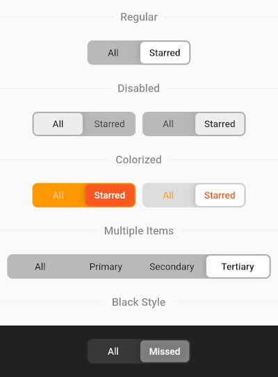
Regular Segment
final _controller = ValueNotifier('all');
//...
AdvancedSegment(
  controller: _controller,
  segments: const {
    'all': 'All',
    'starred': 'Starred',
  },
),
Colorized Segment
AdvancedSegment(
  controller: _controller,
  segments: const {'all': 'All', 'starred': 'Starred'},
  decoration: BoxDecoration(
    color: const Color(0xFFFF6B35),
    borderRadius: BorderRadius.circular(4),
  ),
  sliderColor: const Color(0xFFD63B0E),
  activeStyle: const TextStyle(
    color: Colors.white,
    fontWeight: FontWeight.w600,
  ),
  inactiveStyle: TextStyle(
    color: Colors.white.withValues(alpha: 0.7),
  ),
),
Gradient Decoration
AdvancedSegment(
  controller: _controller,
  segments: const {'all': 'All', 'starred': 'Starred'},
  decoration: BoxDecoration(
    gradient: const LinearGradient(
      colors: [Color(0xFFFF2D55), Color(0xFFFF9500)],
    ),
    borderRadius: BorderRadius.circular(16),
  ),
  sliderColor: Colors.white,
  activeStyle: const TextStyle(
    color: Color(0xFFFF2D55),
    fontWeight: FontWeight.w700,
  ),
  inactiveStyle: TextStyle(
    color: Colors.white.withValues(alpha: 0.85),
  ),
),
Custom Slider Decoration
AdvancedSegment(
  controller: _controller,
  segments: const {'all': 'All', 'starred': 'Starred'},
  decoration: BoxDecoration(
    color: const Color(0xFF2C2C2E),
    borderRadius: BorderRadius.circular(50),
  ),
  sliderDecoration: BoxDecoration(
    color: const Color(0xFFBF5AF2),
    borderRadius: BorderRadius.circular(50),
    border: Border.all(
      color: const Color(0xFFDA8FFF),
      width: 1.5,
    ),
  ),
  activeStyle: const TextStyle(
    color: Colors.white,
    fontWeight: FontWeight.w700,
  ),
  inactiveStyle: TextStyle(
    color: Colors.white.withValues(alpha: 0.5),
  ),
),

AdvancedSegment Parameters

Parameter Description Type Default
controller Controls segments selection ValueNotifier
segments Map of presented segments Map<K, V> required
activeStyle Active segment text style TextStyle fontWeight: FontWeight.w600
inactiveStyle Inactive segment text style TextStyle
decoration Layout decoration (color, border, borderRadius, gradient, etc.) BoxDecoration color: 0x42000000, borderRadius: 8.0
sliderColor Color of the slider thumb Color Colors.white
sliderOffset Gap between slider and layout double 2.0
itemPadding Padding of each item EdgeInsets EdgeInsets.symmetric(h: 15, v: 10)
animationDuration Selection animation duration Duration Duration(milliseconds: 250)
shadow Slider shadow List<BoxShadow> BoxShadow(blurRadius: 8.0)
sliderDecoration Custom slider decoration (overrides sliderColor, borderRadius, shadow) BoxDecoration
enableDrag Whether drag gesture is enabled bool true

Categories

Source repository

Projects using this package

No data available yet.