Package selection guidance compiled from public package information, community data, and project usage.
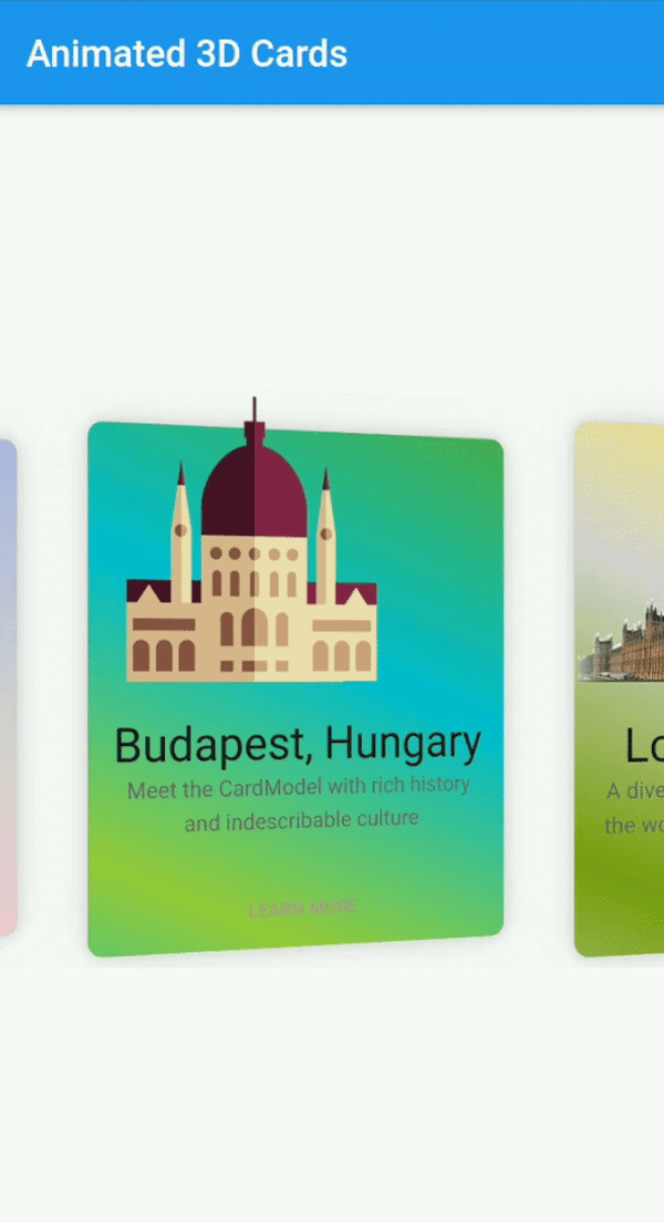
Flutter Animated Cards is a customizable widget for creating visually engaging cards with 3D animations, designed to enhance user interaction on both Android and iOS. It supports smooth transitions and dynamic effects, making it ideal for modern app interfaces. The package is lightweight and easy to integrate, offering developers flexibility in design and behavior. With its focus on animation quality and cross-platform compatibility, it brings depth and interactivity to card-based layouts.
Use cases
Interactive product displays
Animated navigation cards
Gamified UI elements
Dynamic content carousels
Onboarding screens
Key features
3D card animations
Fully customizable appearance
Cross-platform support (Android & iOS)
Smooth transition effects
Easy integration via pub
Responsive design handling
Suitable for
UI designers seeking visual flair
Developers building interactive dashboards
Apps requiring engaging onboarding experiences
E-commerce apps with product cards
Prototyping animated interfaces
Considerations
May impact performance on low-end devices
Requires careful optimization for complex animations
Limited documentation beyond basic usage
Not suitable for static or minimalistic designs
Best used with moderate animation complexity
Original README
Original README snapshot from the linked source repository. Visit the repository for the latest content.
flutter_animated_cards
A Fully customizable animated cards widget that has feature of 3D animation and much more. This widget works on both Android & iOS.
Installation
Add following dependency in pubspec.yaml file. And add this import to your file.
// Add AnimatedCards to the widget tree
child: FlutterAnimatedCards(
list: _cardList,
model: _cardModel,
),
Card Model
classCardModel{
finalString title; /// requiredfinalString imagePath; /// required i.e "assets/images/image.png"finalString description; /// (Optional)finalColor color; /// (Optional) add this parameter if you want to have different color on each cardfinalList<Color> colorList; /// (Optional) add this parameter if you want to apply different gradient on each card
}
FlutterAnimatedCards made through model class
If you add Color parameter in your model class and assign each list item a new different color then your widget look like this.
Cards with ModelColor
Cards with Model Gradient
1-
   CardModel(
           title: 'Colors, Vibrant',
           description:'Gardening is how I relax. It\'s another form of creating and playing with colors.',
           color: Color(0xfff9d9e2),  // add color of your choice, add different colors in every list item
           imagePath: "assets/images/colors.png"),

2-
   CardModel(
          title: 'Budapest, Hungary',
          description:'Meet the CardModel with rich history and indescribable culture',
          colorList: [Color(0xFF4CAF50),  // add gradient of your choice, add different gradient in every list item
            Color(0xFF00BCD4),
            Color(0xFF99ca3d)],
          imagePath: "assets/images/city_image.png"),
FlutterAnimatedCards without passing any color in model class
This is another way to give colors or gradient to your card. Now you need to add 'cardWithSingleColor' or 'cardWithGradientColors' as shown below
Cards with Single Color
Cards with Single Gradient
1-
child: FlutterAnimatedCards(
list: _cardList,
model: _cardModel,
cardWithSingleColor: Color(0xfff9d9e2), // you are not asked to add this parameter, but you can this if you want to display your cards withany other single color. By default cards will appear as it is shown in Screenshot
),
2-
child: FlutterAnimatedCards(
list: _cardList,
model: _cardModel,
cardWithGradientColors: [Color(0xffacb6e5), // this parameter is needs to be added to add gradient, there is no default gradient available in lib
Color(0xFFD5D2D2),
Color(0xFFfbc7d4)],
),
Custom Usage
There are several options that allow for more control:
Properties
Description
model
This is the required parameter. You need to pass a model class somehow similar to the one shown in example, you can add more arguments in your class but 'name', 'description', 'image' is necessary
list
This is also the required parameter. You need to pass a list of your model class, this list can not be null or empty
cardHeight
set card height according to your requirement.
cardWidth
set card width according to your requirement.
isRotatingCards
by default it's 'true', you can set it 'false' if you don't want to add 3D rotation in your cards.
cardWithSingleColor
if you want to give all your cards one single color, use this property. You can also give each card a different color through model class
cardWithGradientColors
it takes List as a parameter, this property allows you to apply the same gradient on all of your cards. You can also give each card a different gradient through model class
moreText
by default I have set it to 'LEARN MORE', but you can change it to any text according to your choice.
onMoreBtnPressed
this is a click event, currently it performs nothing you can use it according to your choice.