Package selection guidance compiled from public package information, community data, and project usage.
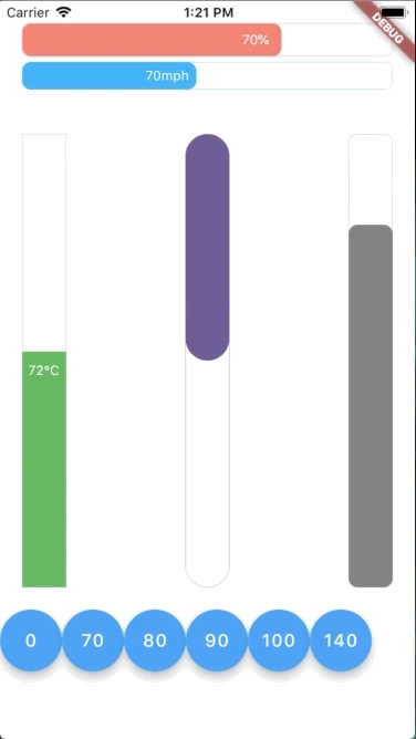
A vibrant Flutter package that delivers animated progress bars in both horizontal and vertical orientations. Designed with a reactive style, it smoothly updates progress values and supports real-time visual feedback across all major platforms. Ideal for loading indicators, task completion tracking, or any UI element requiring dynamic progress visualization. The package is lightweight, customizable, and integrates seamlessly into Flutter apps.
Use cases
Loading screens
Task completion indicators
Form progress tracking
Interactive tutorials
Game progress bars
Key features
Horizontal and vertical orientation support
Reactive animation updates
Colorful and customizable design
Cross-platform compatibility
Smooth transition animations
Simple integration via pub
Suitable for
Developers building interactive UIs
Apps needing visual progress feedback
Designers seeking animated indicators
Cross-platform Flutter projects
Users wanting minimal setup with rich visuals
Considerations
May require additional styling for dark mode
Performance impact on high-frequency updates
Limited customization beyond basic properties
Not optimized for extremely large progress values
Depends on Flutter's animation engine stability
Original README
Original README snapshot from the linked source repository. Visit the repository for the latest content.
Flutter Animation Progress Bar
This colorful Flutter widget package aims to show an animation progress bar in reactive style. It also supports both vertical and horizontal bar.
Flutter Create Contest
This package is also a submission to Flutter Create contest. The basic rule of this contest is to measure the total Dart file size less or equal 5KB.
After unzipping the compressed file, run following command to update dependencies:
In this table, you can find all attributes provided by this package:
Attribute
Default value
Description
currentValue
0
Set the current value for progress bar. This value should be in stateful so that whenever setState() has been called, the progress bar will trigger an animation from latest currentValue to new currentValue
maxValue
100
Max value to be displayed as progress bar. Current value can be greater than max value
size
30
The bar height if direction in Axis.horizontal. The bar width if direction in Axis.vertical
animatedDuration
const Duration(milliseconds: 300)
Set the duration for an animation cycle
direction
Axis.horizontal
The bar can be in Axis.horizontal or Axis.vertical direction
verticalDirection
VerticalDirection.down
With vertical direction, the bar can be VerticalDirection.up or VerticalDirection.down direction
borderRadius
8
Set the bar border radius
border
null
Set the bar border style by BoxBorder
backgroundColor
const Color(0x00FFFFFF)
Set the bar background color
progressColor
const Color(0xFFFA7268)
Set the bar progressing color
progressGradient
null
Set the bar progressing gradient. Overrides progressColor
changeColorValue
null
Set a value that progress color should be changed to [0---blue----[70]-red-100]
changeProgressColor
const Color(0xFF5F4B8B)
Color that progressing color will be changed to, whenever currentValue greater than changeColorValue
displayText
null
Text to display belonging with currentValue. Examples: % -> 20% °F -> 80°F