Package selection guidance compiled from public package information, community data, and project usage.
A Flutter package that simplifies the creation of breadcrumb navigation components. It provides a clean, reusable widget to display hierarchical navigation paths, enhancing user experience by showing the current location within an app's structure. Ideal for apps with deep navigation trees, it supports customization and integrates seamlessly with Flutter’s routing system. The package is cross-platform, working on Android, iOS, Web, macOS, Windows, and Linux.
Use cases
Displaying navigation hierarchy in complex apps
Improving user orientation in multi-level interfaces
Enhancing UX in admin dashboards
Supporting breadcrumb trails in e-commerce sites
Simplifying navigation in documentation portals
Key features
Easy integration with Flutter routing
Customizable appearance and styling
Cross-platform compatibility
Supports dynamic path updates
Lightweight and dependency-free
Suitable for
Developers building complex navigation flows
UI/UX designers focusing on user guidance
Apps requiring hierarchical navigation
Web and mobile applications with deep nesting
Teams prioritizing consistent navigation patterns
Considerations
Requires manual path management for dynamic routes
Limited built-in interaction beyond display
No automatic route detection from navigator stack
Best suited for static or predictable navigation structures
May need additional logic for interactive breadcrumbs
Original README
Original README snapshot from the linked source repository. Visit the repository for the latest content.
flutter_breadcrumb
Flutter Widget that can easily create Breadcrumb in Flutter.
A breadcrumb or breadcrumb trail is a graphical control element frequently used as a navigational aid in user interfaces and on web pages. It allows users to keep track and maintain awareness of their locations within applications, documents, or websites.
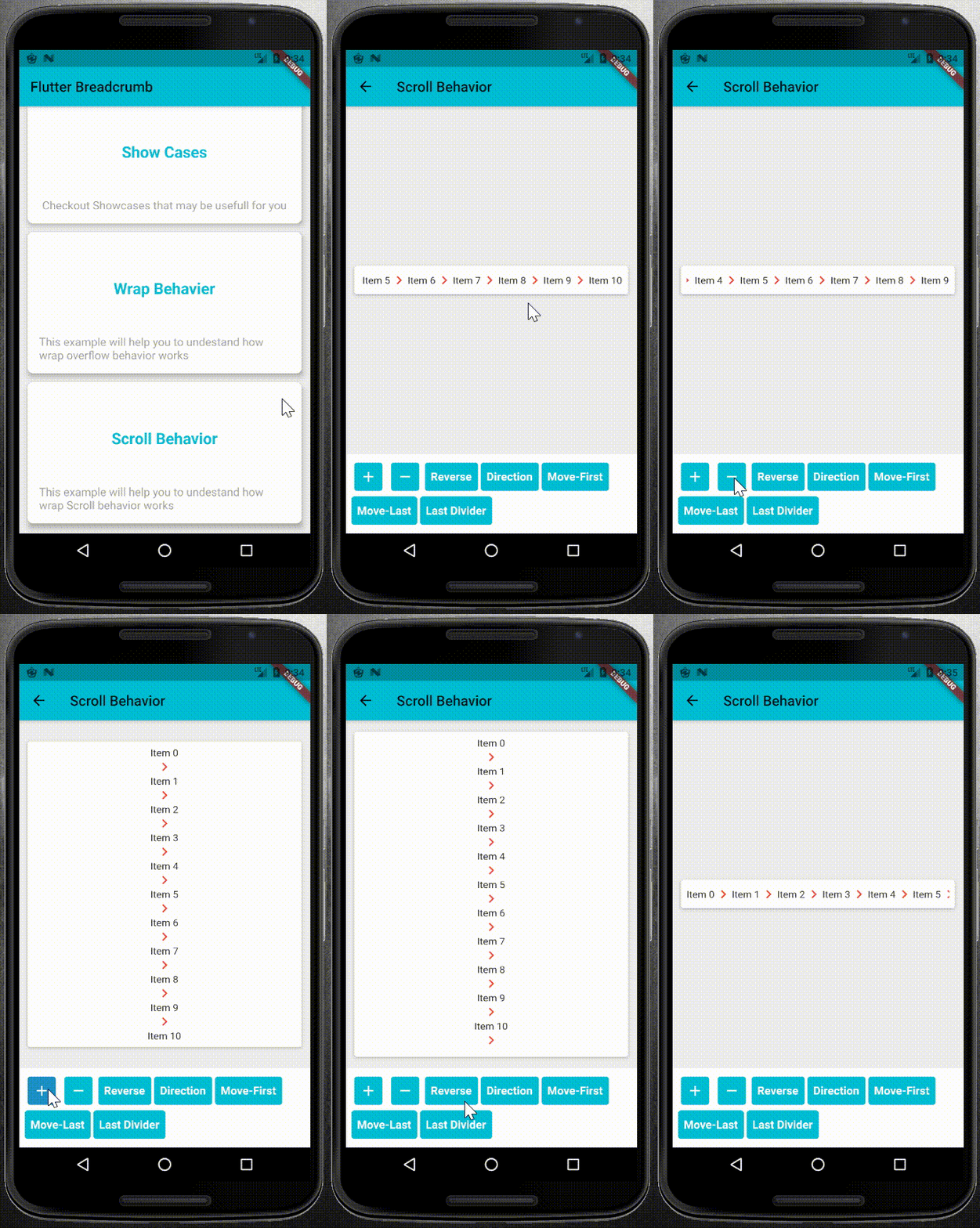
Show Cases
Show Case
Wrap Behavior
Scroll Behavior
Getting Start
1. Add it to Your pubspec.yaml file as dependency:
select a right overflow behavior for your BreadCrumb widget.
1. WrapOverflow behavior: you can use this behavior when you want to your widget, wrap whenever it uses all of the main Side sizes:
BreadCrumb(
	items: <BreadCrumbItem>[
		//add your BreadCrumbItem here
	],
	divider: Icon(Icons.chevron_right),
	overflow: WrapOverflow(
		keepLastDivider: false,
		direction: Axis.horizontal,
	),
)
2. ScrollableOverflow behavior: use it whenever you want to content your widget scroll if it needed.
BreadCrumb(
	items: <BreadCrumbItem>[
		//add your BreadCrumbItem here
	],
	divider: Icon(Icons.chevron_right),
	overflow: ScrollableOverflow(
		keepLastDivider: false,
		reverse: false,
		direction: Axis.horizontal,
	),
)
3. Custom Overflow behavior: you can easily create your own overflow behavior. the only thing you need is to create a class and extends it from the BreadCrumbOverflow class and overwrite its dependencies.
* override widgetItems method to create List<Widget> with items and divider parameters.
* override build method to create your own widget behavior. for example wrap behavior uses Wrap widget. and you can use widgetItems method in your build method to create List<Widget> items.
Contribution and Support
Feel free for Contributing. your Pull Requests are welcome.