Search packages, repositories and app categories

flutter_carousel_intro cover
Package detailsv1.0.13

flutter_carousel_intro

The FlutterCarouselIntro is an amazing package that makes it easy to build and implement animated onboarding screens in Flutter applications.

AndroidiOSWebmacOSWindowsLinux
30-day downloads
74
Likes
33
Pub points
150

Install package

flutter pub add flutter_carousel_intro

Package Overview

Package selection guidance compiled from public package information, community data, and project usage.

FlutterCarouselIntro is a Flutter package designed to simplify the creation of animated onboarding screens. It provides a clean, customizable carousel interface for guiding users through app features with smooth transitions and engaging visuals. Ideal for introducing new users to key functionalities, it supports multiple platforms including Android, iOS, Web, macOS, Windows, and Linux. The package integrates easily via pub add and offers built-in animations and swipe gestures for an interactive experience.

Use cases

  • Onboarding tutorials
  • App feature walkthroughs
  • User onboarding flows
  • First-time user experiences
  • Product launch introductions

Key features

  • Animated slide transitions
  • Swipe gesture support
  • Customizable UI
  • Multi-platform compatibility
  • Easy integration with pub
  • Built-in animation presets

Suitable for

  • New app developers
  • Onboarding screen designers
  • Cross-platform apps
  • Interactive user guides
  • Minimalist UI projects

Considerations

  • Limited customization beyond basic styling
  • Depends on external animation libraries
  • May require additional state management
  • Not ideal for complex navigation flows
  • Best suited for simple, linear onboarding

Original README

Original README snapshot from the linked source repository. Visit the repository for the latest content.

English | Português

flutter_carousel_intro

by: Eliezer António

see in Flutter Gems: https://fluttergems.dev/packages/flutter_carousel_intro

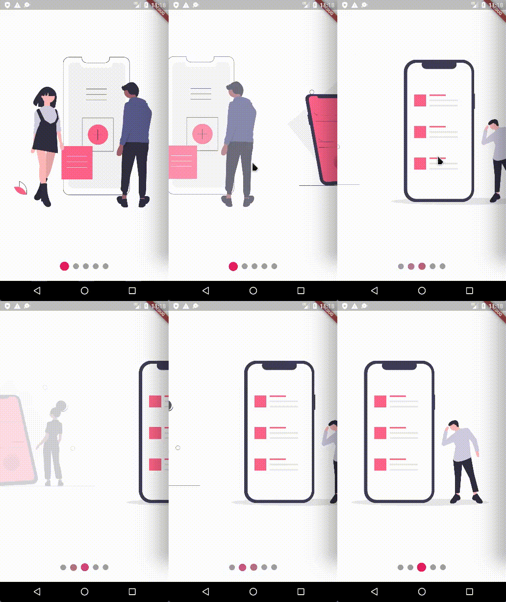
Swipe the carousel to the current clicked indicator

Current Features

  • [X] Custom child widgets
  • [X] Slide
  • [X] Rotate transition
  • [X] Auto play
  • [X] Horizontal transition
  • [X] Vertical transition
  • [X] Swipe the carousel to the current clicked indicator
  • [X] Infinite loop (repeat) — works for both autoplay and manual swipe
  • [X] Built-in navigation buttons — Skip, Next and Done, fully customizable

Supported Platforms

  • Flutter Android
  • Flutter iOS
  • Flutter web
  • Flutter desktop

Preview

Installation

Add flutter_carousel_intro: ^1.0.13 to your pubspec.yaml dependencies. And import it:

import 'package:flutter_carousel_intro/flutter_carousel_intro.dart';

How to use

FlutterCarouselIntro(  
       slides: [
          SliderItem(
            title: 'Title 1',
            subtitle: const Text('Lorem Ipsum is simply dummy text'),
            widget: SvgPicture.asset("assets/slide-1.svg"),
          ),
          SliderItem(
            title: 'Title 2',
            subtitle: const Text('Lorem Ipsum is simply dummy text'),
            widget: SvgPicture.asset("assets/slide-2.svg"),
          ),
          SliderItem(
            title: 'Title 3',
            subtitle: const Text('Lorem Ipsum is simply dummy text'),
            widget: SvgPicture.asset("assets/slide-3.svg"),
          ),
          SliderItem(
            title: 'Title 4',
            subtitle: const Text('Lorem Ipsum is simply dummy text'),
            widget: SvgPicture.asset("assets/slide-4.svg"),
          ),
          SliderItem(
            title: 'Title 5',
            subtitle: const Text('Lorem Ipsum is simply dummy text'),
            widget: SvgPicture.asset("assets/slide-5.svg"),
          ),
          SliderItem(
            title: 'Title 5',
            widget: SvgPicture.asset("assets/slide-6.svg"),
            subtitle: ElevatedButton(
              onPressed: () {},
              child: const Text("skip"),
            ),
          ),
        ],
    );
All SliderItem parameters

  String? title,
  TextStyle? titleTextStyle,
  TextAlign? titleTextAlign,
  Widget? subtitle,
  

Infinite loop (repeat)

Set repeat: true to turn the carousel into an infinite loop. It works independently of autoPlay — the user can also swipe past the last slide and wrap back to the first.

FlutterCarouselIntro(
  autoPlay: true,
  repeat: true,
  slides: [...],
);

Under the hood the PageView becomes infinite and the indicator is synchronized via modulo, so the dots always reflect the current slide.

Built-in navigation buttons (Skip / Next / Done)

For onboarding flows you no longer need to assemble the buttons by hand. FlutterCarouselIntro ships with opt-in Skip, Next and Done buttons:

FlutterCarouselIntro(
  showNextButton: true,
  onSkip: () => Navigator.of(context).pushReplacementNamed('/home'),
  onDone: () => Navigator.of(context).pushReplacementNamed('/home'),
  skipLabel: const Text('Skip'),
  nextLabel: const Text('Next'),
  doneLabel: const Text('Done'),
  slides: [...],
);

Behavior:

  • Skip is shown whenever onSkip != null.
  • Next is shown when showNextButton: true; tapping it advances the page.
  • On the last slide, Next is automatically replaced by Done (when onDone is provided).
  • In repeat: true mode there is no last slide, so Next is always visible and Done is never triggered.
All navigation button parameters
VoidCallback? onSkip;
VoidCallback? onDone;
bool showNextButton;              // default: false

Widget? skipLabel;                // default: Text('Skip')
Widget? nextLabel;                // default: Text('Next')
Widget? doneLabel;                // default: Text('Done')

ButtonStyle? navigationButtonStyle;

// Full overrides — replace the button widget entirely
NavigationButtonBuilder? skipButtonBuilder;
NavigationButtonBuilder? nextButtonBuilder;
NavigationButtonBuilder? doneButtonBuilder;

// Positioning
AlignmentGeometry skipButtonAlignment;   // default: Alignment.topRight
AlignmentGeometry nextButtonAlignment;   // default: Alignment.bottomRight
EdgeInsetsGeometry navigationButtonsPadding; // default: EdgeInsets.all(16)

NavigationButtonBuilder is Widget Function(BuildContext context, VoidCallback onPressed), giving you full control over the rendered widget while the package still wires the tap handler (advance / skip / done) for you:

FlutterCarouselIntro(
  showNextButton: true,
  onDone: _finish,
  nextButtonBuilder: (context, onPressed) => FilledButton.icon(
    onPressed: onPressed,
    icon: const Icon(Icons.arrow_forward),
    label: const Text('Continue'),
  ),
  doneButtonBuilder: (context, onPressed) => FilledButton(
    onPressed: onPressed,
    child: const Text("Let's go"),
  ),
  slides: [...],
);

General Example

class MySlideShow extends StatelessWidget {
  const MySlideShow({Key? key}) : super(key: key);
  @override
  Widget build(BuildContext context) {
    return FlutterCarouselIntro(
        animatedRotateX: false,
        animatedRotateZ: true,
        scale: true,
        autoPlay: true,
        repeat: true,
        animatedOpacity: false,
        autoPlaySlideDuration: const Duration(seconds: 2),
        autoPlaySlideDurationTransition: const Duration(milliseconds: 1100),
        primaryColor: Colors.pink,
        secondaryColor: Colors.grey,
        scrollDirection: Axis.horizontal,
        indicatorAlign: IndicatorAlign.bottom,
        indicatorEffect: IndicatorEffects.jumping,
        showIndicators: true,
        showNextButton: true,
        onSkip: () => debugPrint('Skip tapped'),
        onDone: () => debugPrint('Done tapped'),
        skipLabel: const Text('Skip'),
        nextLabel: const Text('Next'),
        doneLabel: const Text('Done'),
         slides: [
          SliderItem(
            title: 'Title 1',
            subtitle: const Text('Lorem Ipsum is simply dummy text'),
            widget: SvgPicture.asset("assets/slide-1.svg"),
          ),
          SliderItem(
            title: 'Title 2',
            subtitle: const Text('Lorem Ipsum is simply dummy text'),
            widget: SvgPicture.asset("assets/slide-2.svg"),
          ),
          SliderItem(
            title: 'Title 3',
            subtitle: const Text('Lorem Ipsum is simply dummy text'),
            widget: SvgPicture.asset("assets/slide-3.svg"),
          ),
          SliderItem(
            title: 'Title 4',
            subtitle: const Text('Lorem Ipsum is simply dummy text'),
            widget: SvgPicture.asset("assets/slide-4.svg"),
          ),
          SliderItem(
            title: 'Title 5',
            subtitle: const Text('Lorem Ipsum is simply dummy text'),
            widget: SvgPicture.asset("assets/slide-5.svg"),
          ),
          SliderItem(
            title: 'Title 5',
            widget: SvgPicture.asset("assets/slide-6.svg"),
            subtitle: ElevatedButton(
              onPressed: () {},
              child: const Text("skip"),
            ),
          ),
        ],
      );
  }
}

Gif

Normal Example:

Animated Opacity

normal

animatedOpacity: true

Animated Scale

scale: true

Animated Rotation on the X Axis

animatedRotateX: true

Animated Rotation on the Z Axis

animatedRotateZ: true

Contributions

Feel free to contribute to this project.

If you find a bug or want a feature, but don't know how to fix/implement it, please fill an issue.
If you fixed a bug or implemented a feature, please send a pull request.


My Packages

Flutter Responsivity Widget

Categories

Dependencies

Dependency list 1 items

Source repository

Projects using this package

No data available yet.