Search packages, repositories and app categories

flutter_circular_progress_indicator cover
Package detailsv0.0.3

flutter_circular_progress_indicator

Flutter Beautiful Loading

AndroidiOSWebmacOSWindowsLinux
30-day downloads
34
Likes
6
Pub points
125

Install package

flutter pub add flutter_circular_progress_indicator

Package Overview

Package selection guidance compiled from public package information, community data, and project usage.

A visually appealing circular progress indicator for Flutter applications, designed to enhance user experience during loading states. It offers smooth animations and customizable styling, making it ideal for indicating progress in tasks like data fetching or file uploads. The package is lightweight and compatible across all major platforms, including mobile, web, and desktop. Its simple integration via pub.dev makes it accessible for developers seeking a polished loading component without complex setup.

Use cases

  • Loading indicators in forms
  • Data fetching progress
  • File upload/download tracking
  • App splash screens
  • Authentication flow progress
  • Background task monitoring

Key features

  • Smooth animated circular design
  • Customizable colors and stroke width
  • Easy integration with Flutter
  • Cross-platform compatibility
  • Supports both determinate and indeterminate modes
  • Lightweight and performant

Suitable for

  • Developers seeking attractive loading UI
  • Apps requiring consistent progress feedback
  • Projects targeting multiple platforms
  • UI-focused Flutter applications
  • Simple yet elegant loading components

Considerations

  • Limited to circular shape only
  • No built-in text labels (requires custom widget wrapping)
  • May require additional styling for brand alignment
  • Not suitable for non-circular progress needs
  • Depends on external GitHub repository for updates

Original README

Original README snapshot from the linked source repository. Visit the repository for the latest content.

Load your data more beautiful.

Fixed Bugs

V 0.0.2 : setState error fixed

Installation

You just need to add flutter_circular_progress_indicator as a dependency in your pubspec.yaml file.

dependencies:
  flutter_circular_progress_indicator: ^0.0.2

Getting started

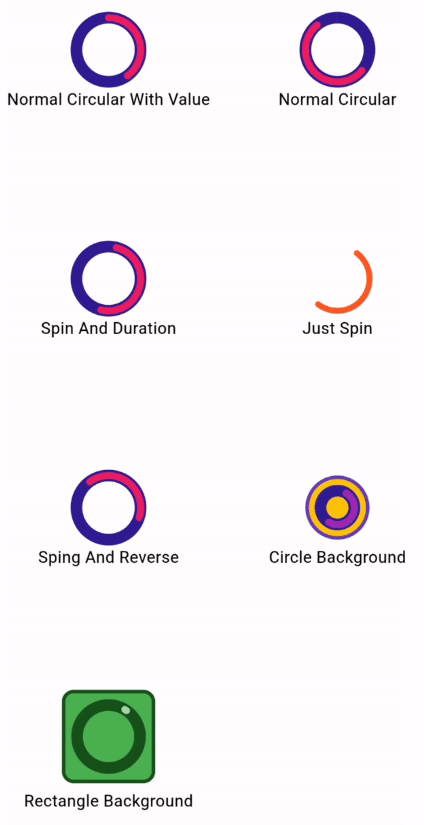
All features you can use :

complete

Usage

normal_circular

CircularProgressInd().normalCircular(
                      height: 55,
                      width: 55,
                      valueColor: Colors.pink,
                      secondaryColor: Colors.deepPurple[900],
                      secondaryWidth: 10,
                      valueWidth: 6);

spin_duration

CircularProgressInd().normalCircular(
                      height: 55,
                      width: 55,
                      isSpining: true,
                      spinDuration: Duration(seconds: 3),
                      valueColor: Colors.pink,
                      secondaryColor: Colors.deepPurple[900],
                      secondaryWidth: 10,
                      valueWidth: 6);

spin

CircularProgressInd().normalCircular(
                    height: 55,
                    width: 55,
                    valueColor: Colors.deepOrange,
                    valueWidth: 5,
                    isSpining: true,
                  );

spin_reverse

CircularProgressInd().normalCircular(
                      height: 55,
                      width: 55,
                      value: .4,
                      isSpining: true,
                      hasSpinReverse: true,
                      valueColor: Colors.pink,
                      secondaryColor: Colors.deepPurple[900],
                      secondaryWidth: 10,
                      valueWidth: 6);

circle_background

CircularProgressInd().normalCircular(
                      height: 55,
                      width: 55,
                      isSpining: true,
                      secondaryColor: Colors.deepPurple[900],
                      secondaryWidth: 10,
                      backgroundColor: Colors.amber,
                      padding: EdgeInsets.all(10),
                      backgroundBorder:
                          Border.all(color: Colors.deepPurple, width: 3),
                      valueWidth: 6);

rectangle_background

 CircularProgressInd().normalCircular(
                      height: 80,
                      width: 80,
                      isSpining: true,
                      value: .01,
                      secondaryColor: const Color.fromARGB(255, 23, 82, 27),
                      secondaryWidth: 10,
                      backgroundShape: BoxShape.rectangle,
                      backgroundRadius: 10,
                      backgroundColor: Colors.green,
                      padding: EdgeInsets.all(10),
                      valueColor: Colors.green[200],
                      backgroundBorder: Border.all(
                          color: const Color.fromARGB(255, 23, 82, 27),
                          width: 3),
                      valueWidth: 6);

Categories

Source repository

Projects using this package

No data available yet.