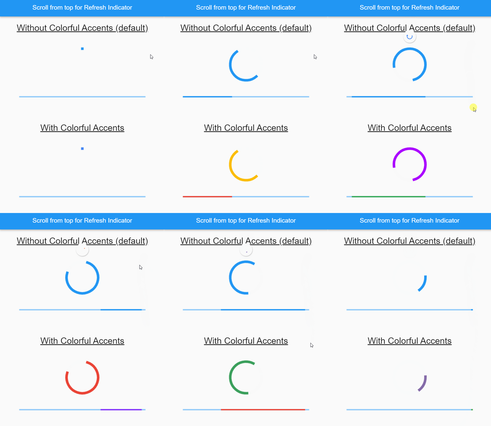
A customizable animated progress indicator package for Flutter that enhances the default CircularProgressIndicator and LinearProgressIndicator with vibrant Google-inspired color accents. It provides a visually appealing alternative for loading states, offering smooth animations and dynamic color transitions. Ideal for modern UIs seeking a fresh, engaging look without sacrificing performance or ease of integration. The package supports both circular and linear progress indicators with minimal setup.
Use cases
- Enhancing loading screens
- Improving user feedback in forms
- Visualizing app state transitions
- Creating engaging onboarding experiences
- Adding flair to data loading indicators
Key features
- Google color accent themes
- Smooth animated transitions
- Support for circular and linear indicators
- Minimal configuration required
- Customizable colors and speeds
Suitable for
- Developers seeking modern UI elements
- Apps with high visual design standards
- Projects requiring engaging loading animations
- Design-focused Flutter applications
- Teams wanting quick progress indicator upgrades
Considerations
- Limited platform-specific customization
- May not suit minimalist design aesthetics
- Requires understanding of basic Flutter widget concepts
- Not optimized for extremely high-performance loops
- Depends on external GitHub repository for updates