Package selection guidance compiled from public package information, community data, and project usage.
A Flutter package that enables developers to create and display customizable context menus across multiple platforms. It provides a consistent way to present action options when users long-press or right-click on widgets, enhancing user interaction in apps. The package supports all major platforms including Android, iOS, Web, macOS, Windows, and Linux, ensuring broad compatibility. With flexible customization options, it allows developers to tailor menu appearance and behavior to match app design. Ideal for adding intuitive, platform-aware contextual actions.
Use cases
Adding right-click menus in desktop apps
Implementing long-press actions on mobile
Creating interactive UIs with contextual choices
Enhancing productivity tools with quick actions
Supporting multi-platform applications
Key features
Cross-platform support
Customizable menu items
Easy integration with existing widgets
Responsive to long press and right click
Configurable styling and layout
Suitable for
Developers building desktop or mobile apps with rich interactions
Teams targeting multiple platforms
Apps requiring contextual user actions
Considerations
Requires careful handling of gesture conflicts
May need additional styling for consistency
Not suitable for simple one-off actions
Original README
Original README snapshot from the linked source repository. Visit the repository for the latest content.
Flutter Context Menu
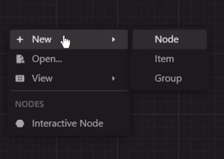
A Flutter library that provides a flexible and customizable solution for creating and displaying context menus in Flutter applications. It allows you to easily add context menus to your UI, providing users with a convenient way to access additional options and actions specific to the selected item or area.
ContextMenu: The package includes a highly customizable context menu system that can be
easily integrated into your Flutter application. It provides a seamless and intuitive user
experience, enhancing the usability of your app.
Hierarchical Structure: The context menu supports a hierarchical structure with submenu
functionality. This enables you to create nested menus, providing a clear and organized
representation of options and suboptions.
Selection Handling: The package includes built-in selection handling for context menu items.
It allows you to define callback functions for individual menu items, enabling you to execute
specific actions or logic when an item is selected.
Customization Options: Customize the appearance and behavior of the context menu to match your
app's design and requirements. Modify the style, positioning, animation, and interaction of the
menu to create a cohesive user interface.
Built-in Components: The package includes built-in components, such as MenuItem,
MenuDivider, and MenuHeader, that can be used in your context menu.
Cross Platform Support: The package is compatible with multiple platforms, including Android,
iOS, Web, and Desktop.
Theme: By default, the context menu and its items uses the MaterialApp's theme data for
styling. However, you can customize the appearance and behavior of the context menu by modifying
the theme data. Or individually by specifying a BoxDecoration in the boxDecoration property of
the ContextMenu.
Custom Entries: You can create your own context menu entries by subclassing the
ContextMenuEntry class. This allows you to customize the appearance, behavior, and functionality
of the context menu items.
Learn More
More info: Full documentation will be provided, inshallah 🙏