Original README snapshot from the linked source repository. Visit the repository for the latest content.
Flutter Custom Carousel
A widget for creating fully custom, animated scrollable lists. It manages all of
the tricky logic surrounding scroll interactions and physics, and leaves the
visual presentation of items up to you.

Includes an example app (shown above) with a variety of commented demos to learn
from or customize.
Platforms / devices
Currently, this widget is designed for touch input. On desktop, scroll wheel
input can fight with the settling scroll physics. Specifying different physics
can resolve this at the cost of settling (aka snapping).
You can also enable scrolling via mouse dragging on desktop by setting a
scrollBehavior. Check main.dart in the example to see it in use.
Similarly, the included examples target mobile handsets in portrait view to keep
them concise. They include only basic responsiveness.
Basics
Simply pass in a list of children, and define an effectsBuilder function.
effectsBuilder accepts a child and its current relative scroll position (see
scrollRatio below), and returns the child wrapped with widgets that apply
the desired effects.
CustomCarousel(
children: [card1, card2, etc],
effectsBuilder: (index, scrollRatio, child) =>
Transform.translate(
offset: Offset(0, scrollRatio * 250) ,
child: child
),
)
You can further refine visuals by specifying how many children to display before
and after the selection, whether to loop the list, a default alignment, and how
to depth sort children.
Adjust interactions by changing the scroll direction, physics, & speed, enabling
tap to select, or specifying handlers for when the selected item changes, or
when it settles into position.
scrollRatio
The scrollRatio value ranges from -1 to +1, where 0 is the settled position of
the selected item.
The following animation displays the scrollRatio for each item as it scrolls.
It also highlights the "selected" item (white background), and the "settled"
item (thick outline).
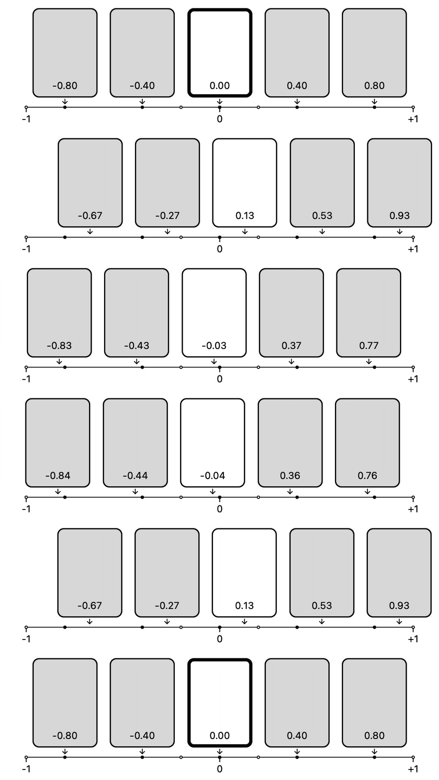
Try watching a single item at a time to see how the ratio relates to selection,
settling, and items entering / exiting the visible list. Note that the specific
values are dependent on factors like itemsBefore / itemsAfter.
ScrollControllers and ScrollPhysics
To facilitate item-oriented navigation and looping content CustomCarousel
requires that you use CustomCarouselScrollController. This controller also
provides useful features such as jumpToItem, animateToItem, nextItem, and
previousItem, as well as smart defaults for animation durations and curves.
Similarly, CustomCarousel defaults to CustomCarouselScrollPhysics, which
enables "settling" onto selected items (aka snapping). Adjust the behavior of
the physics by setting the sticky and stiffness properties. You can use
other scroll physics (such as BouncingScrollPhysics) if you don't want this
functionality.
Using with Flutter Animate
You can also use Flutter Animate to
define the effectsBuilder, leveraging it's broad collection of effects, such
as fading, moving, blurs, shadows, shimmers, color effects, 2.5d flips, and
more.
For example, the simple vertical scroller from above would look like this:
CustomCarousel(
children: [card1, card2, etc],
effectsBuilder: CustomCarousel.effectsBuilderFromAnimate(
effects: EffectList().moveY(begin: -250, end: 250),
),
)
A number of the included examples demonstrate this approach in more depth. See
the docs for CustomCarousel.effectsBuilderFromAnimate() for more info.
API reference
For full documentation, see the
API reference.
Installation
Grab it from
pub.dev.
