Search packages, repositories and app categories

flutter_custom_dialog cover
Package detailsv1.3.0

flutter_custom_dialog

Semantic dialog | Made In YY.inc | Welcome to contribute

30-day downloads
281
Likes
213
Pub points
60

Install package

flutter pub add flutter_custom_dialog

Package Overview

Package selection guidance compiled from public package information, community data, and project usage.

A semantic dialog package for Flutter, developed by YY.inc, designed to provide accessible and customizable dialog components. It emphasizes proper semantics for improved screen reader support and user experience. The package is open-source and welcomes contributions from the community. Built with Flutter's widget system, it enables developers to create consistent, reusable dialogs with minimal boilerplate. Ideal for apps requiring inclusive UI design and structured dialog interactions.

Use cases

  • Accessibility-focused applications
  • Reusable dialog components
  • Screen reader compatible interfaces
  • Custom modal dialogs
  • Open-source collaborative development

Key features

  • Semantic accessibility
  • Customizable dialog content
  • Open-source contribution model
  • Minimal boilerplate
  • Cross-platform compatibility

Suitable for

  • Developers prioritizing accessibility
  • Teams building reusable UI components
  • Open-source contributors
  • Flutter projects with complex dialog needs

Considerations

  • Requires understanding of Flutter semantics
  • Limited platform-specific customization
  • No built-in animations
  • Community-driven updates
  • Depends on external maintenance

Original README

Original README snapshot from the linked source repository. Visit the repository for the latest content.

✨ flutter_custom_dialog

pub package

[Language ~~] English | 中文文档

Global dialog function encapsulation, with a semantic way to fill the content inside the dialog, the current function provided

  1. Support for a few semantic component methods to populate the component content inside dialog
  2. Support for customizing semantic components for developers to freely populate component content inside dialog
  3. Support setting dialog background color, foreground color, position, animation, click the external disappear and other functions, see the details below
  4. Support no Context call dialog, see below

🎖 Installing

1、install

dependencies:
  flutter_custom_dialog: ^1.3.0

2、import

import 'package:flutter_custom_dialog/flutter_custom_dialog.dart';

🎖 Example

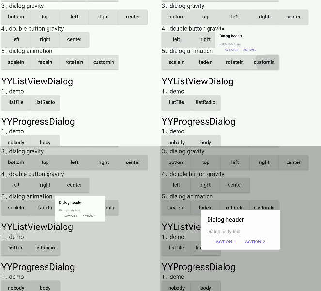
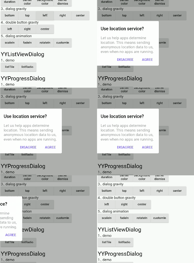
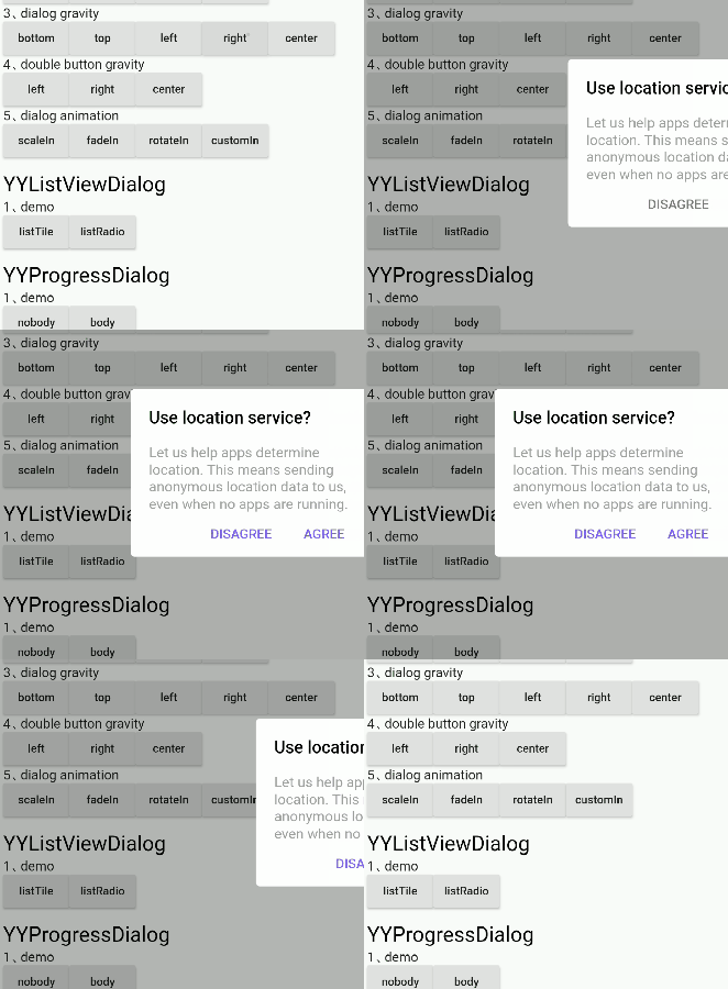
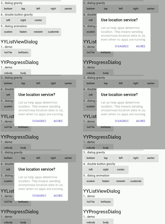
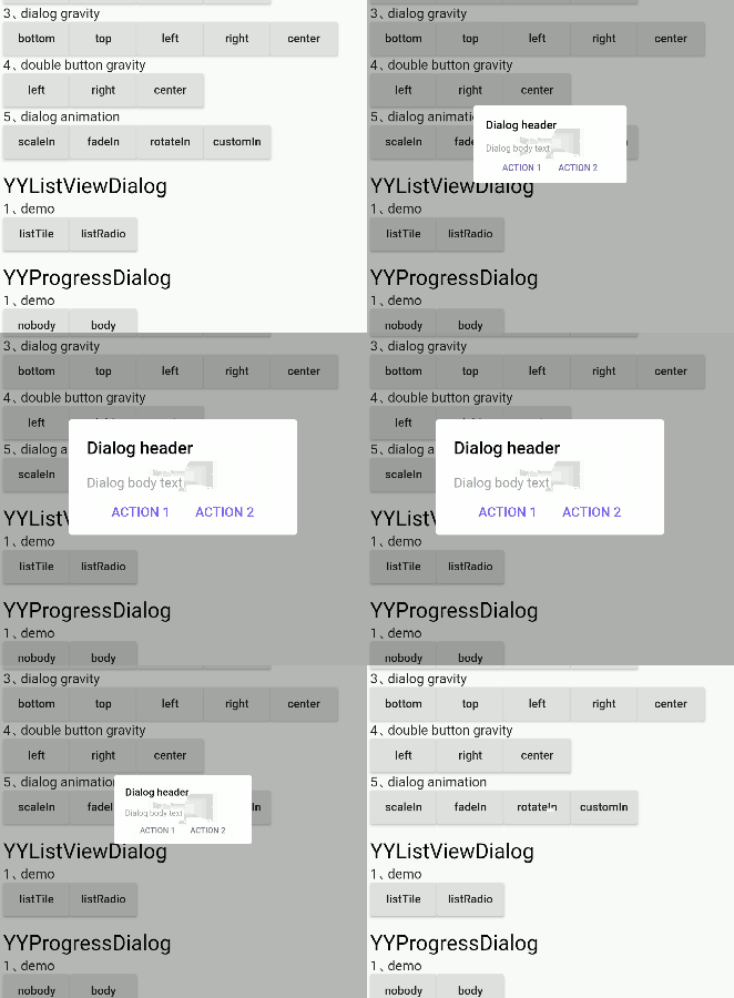
dialog_demo


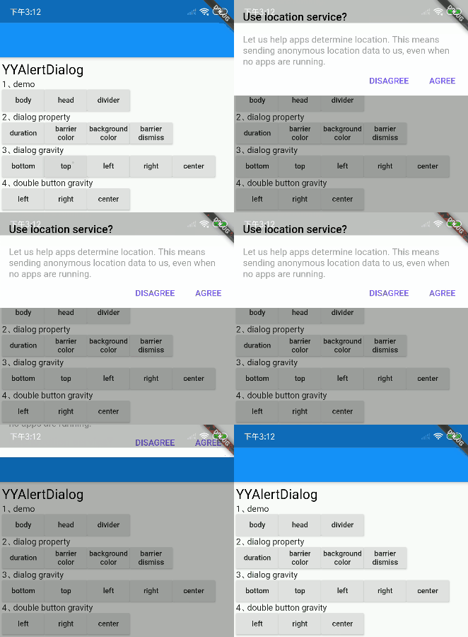
divider
✅

body
✅

head&body
✅

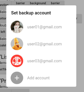
listTile
✅

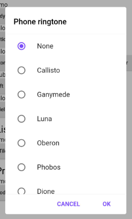
ListRadio
✅

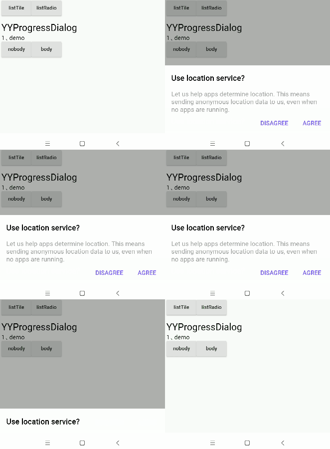
progress
✅

progress&body
✅

bottom sheet
✅

notice
✅

pop menu
✅ Support for custom locations

dialog_gravity


bottom
✅

top
✅

left
✅

right
✅

center
✅

left bottom
✅

left top
✅

right bottom
✅

right top
✅

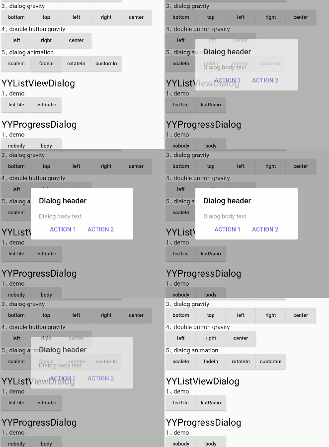
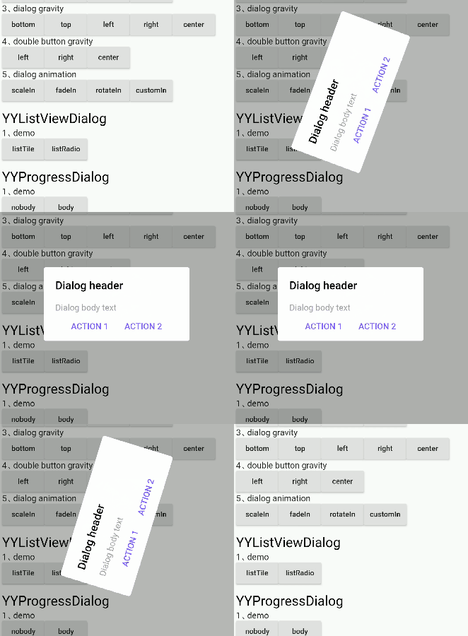
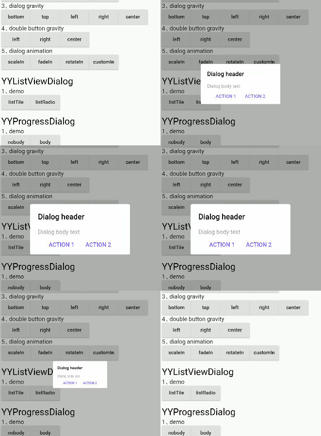
dialog_animation


scaleIn
✅

fadeIn
✅

rotateIn
✅

customIn
✅ Support for custom animations

⚡ Dialog Property

dialog property Settings can be called through the method of member variables, as detailed in the following table

YYDialog YYNoticeDialog() {
  return YYDialog().build()
    ..width = 120
    ..height = 110
    ..backgroundColor = Colors.black.withOpacity(0.8)
    ..borderRadius = 10.0
    ..showCallBack = () {
      print("showCallBack invoke");
    }
    ..dismissCallBack = () {
      print("dismissCallBack invoke");
    }
    ..widget(Padding(
      padding: EdgeInsets.only(top: 21),
      child: Image.asset(
        'images/success.png',
        width: 38,
        height: 38,
      ),
    ))
    ..widget(Padding(
      padding: EdgeInsets.only(top: 10),
      child: Text(
        "Success",
        style: TextStyle(
          fontSize: 15,
          color: Colors.white,
        ),
      ),
    ))
    ..animatedFunc = (child, animation) {
      return ScaleTransition(
        child: child,
        scale: Tween(begin: 0.0, end: 1.0).animate(animation),
      );
    }
    ..show();
}

Supported attributes

property description default
width Dialog width 0
height Dialog height Adaptive component height
duration Dialog animation time 250 ms
gravity Where the dialog appears center
gravityAnimationEnable The dialog appears with the default animation available false
margin The margin of a dialog EdgeInsets.all(0.0)
barrierColor Dialog barrierColor 30% of black
decoration Dialog decoration null
backgroundColor Dialog backgroundColor white
borderRadius Dialog borderRadius 0.0
constraints Dialog constraints no constraints
animatedFunc Animation of dialog Emerge from the middle
showCallBack dialog show callbacks not
dismissCallBack dialog dismiss callbacks not
barrierDismissible Whether to click to pop up the external disappear true
useRootNavigator Whether to use root navigation true
  • After setting gravity, set gravityAnimationEnable = true if animation is needed
  • If the decoration property is set, the backgroundColor and borderRadius are not in effect; they are mutually exclusive

Supported method

method description
show[x,y] show dialog
dismiss dismiss dialog
isShowing Is the dialog showing

⚡ Semantic Widget

The contents of the components inside the dialog are encapsulated by semantic functions in advance to quickly build the dialog, as shown in the following table

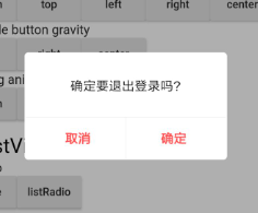
YYDialog YYAlertDialogWithDivider(BuildContext context) {
  return YYDialog().build(context)
    ..width = 220
    ..borderRadius = 4.0
    ..text(
      padding: EdgeInsets.all(25.0),
      alignment: Alignment.center,
      text: "确定要退出登录吗?",
      color: Colors.black,
      fontSize: 14.0,
      fontWeight: FontWeight.w500,
    )
    ..divider()
    ..doubleButton(
      padding: EdgeInsets.only(top: 10.0),
      gravity: Gravity.center,
      withDivider: true,
      text1: "取消",
      color1: Colors.redAccent,
      fontSize1: 14.0,
      fontWeight1: FontWeight.bold,
      onTap1: () {
        print("取消");
      },
      text2: "确定",
      color2: Colors.redAccent,
      fontSize2: 14.0,
      fontWeight2: FontWeight.bold,
      onTap2: () {
        print("确定");
      },
    )
    ..show();
}

Semantic components supported

method description
text text widget
doubleButton two-button widget
listViewOfListTile listTile widget
listViewOfRadioButton listRadio widget
divider divider widget
widget custom semantic widget

⚡ Custom Widget

Customize dialog interior component content

  • Since the existing semantic components only assist in the rapid UI construction, they are far from meeting the requirements in actual project development
  • So it provides the ability to insert custom semantic components into dialog

Insert the component into the dialog through 'widget()'

YYDialog YYDialogDemo(BuildContext context) {
  return YYDialog().build(context)
    ..width = 220
    ..height = 500
    ..widget(
      Padding(
        padding: EdgeInsets.all(0.0),
        child: Align(
          alignment: Alignment.centerLeft,
          child: Text(
            "",
            style: TextStyle(
              color: Colors.black,
              fontSize: 14.0,
              fontWeight: FontWeight.w100,
            ),
          ),
        ),
      ),
    )
    ..show();
}

⚡ Without the Context to invoke

  • Application scenario: after the network request comes back, there is no Context to refer to in the callback, at this time, the Context needs to be initialized in advance, and then the dialog can be called without the Context

1、init

Call static methods before show dialog YYDialog.init(context);

class AppHome extends StatelessWidget {
  Widget build(BuildContext context) {
    //1、init context
    YYDialog.init(context);
    //2、Subsequent use may not be required context
    ......
  }
}

2、use

direct use YYDialog,Note that it must be called build()

YYDialog YYAlertDialogBody() {
  return YYDialog().build()
    ..width = 240
    ..text(
      text: "Hello YYDialog",
      color: Colors.grey[700],
    )
    ..show();
}

🔥🔥 Attention

1、dismiss

  • Do not use 'Navigator.pop(context)' to make the popover disappear, or you will close your page
  • This problem has been solved internally in YYDialog, and you can simply call 'dismiss()' supplied internally
var yyDialog = YYDialog();
yyDialog?.dismiss();

Bugs/Requests

  • If your application has problems, please submit your code and effect to Issue.
  • Pull request are also welcome.

About

  • QQ:510402535
  • QQ群:798874340
  • e-mail:xyj510402535@qq.com
  • g-mail:xyj51042535@gmail.com
  • Blog:http://blog.csdn.net/qq_30379689
  • Github:https://github.com/AndroidHensen

License

Apache License 2.0

Categories

Source repository

Projects using this package