Package selection guidance compiled from public package information, community data, and project usage.
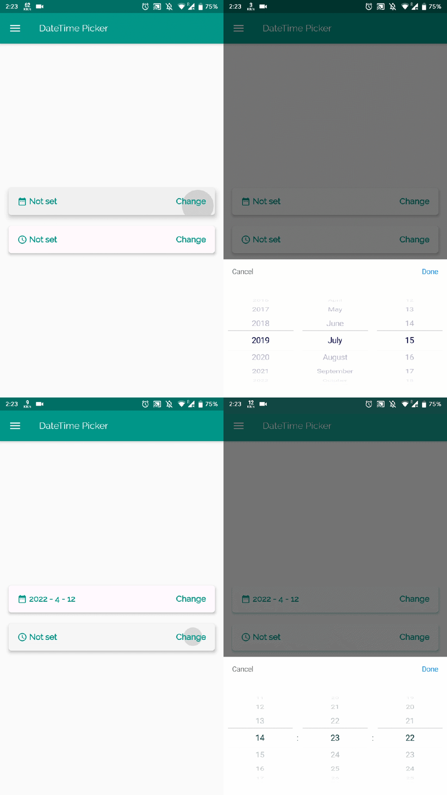
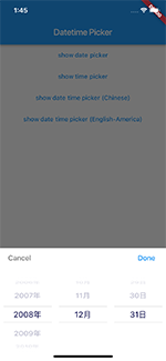
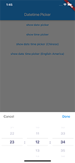
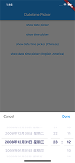
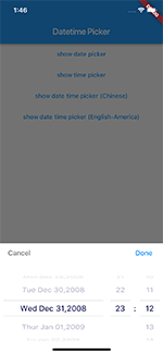
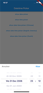
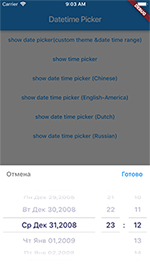
A Flutter package that provides a customizable date and time picker supporting English, Dutch, and Chinese languages. It allows users to select dates, times, or both, with options for customizing the picker's appearance and content. Ideal for apps requiring localized datetime input with flexible UI design. The package is open-source and maintained on GitHub, offering developers full control over the picker's behavior and presentation.
Use cases
Form inputs requiring date selection
Time-based scheduling features
Multilingual app interfaces
Customizable UI components
Date and time range pickers
Localized user experiences
Key features
Supports multiple languages (English, Dutch, Chinese)
Customizable picker content and styling
Selectable date, time, or combined date-time modes
Open-source with public repository
Easy integration via pub.dev
Cross-platform compatibility
Suitable for
Developers building multilingual apps
Apps needing localized date/time inputs
UI designers wanting flexible pickers
Projects requiring lightweight datetime selection
Teams using Flutter for mobile and web
Considerations
No platform-specific customization options listed
Limited documentation beyond basic usage
Requires manual setup for advanced customizations
Not explicitly designed for accessibility
May need additional dependencies for complex layouts
Original README
Original README snapshot from the linked source repository. Visit the repository for the latest content.
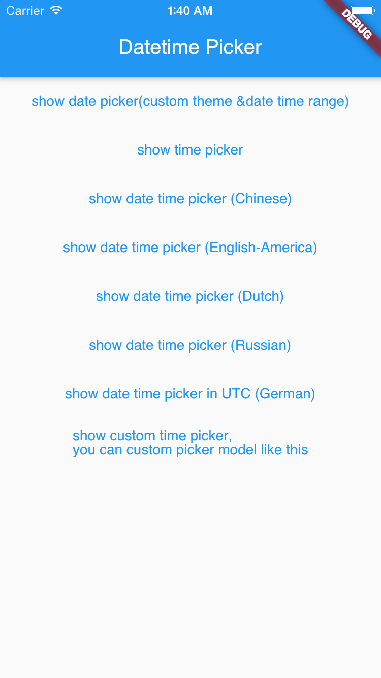
If you want to customize your own style of date time picker, there is a class called CommonPickerModel, every type of date time picker is extended from this class, you can refer to other picker model (eg. DatePickerModel), and write your custom one, then pass this model to showPicker method, so that your own date time picker will appear, it’s easy, and will perfectly meet your demand