
Overview
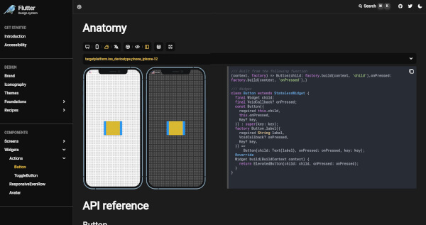
Flutter Design is a comprehensive framework designed to streamline the creation and management of design systems within Flutter applications. It provides tools for component-driven UI development, enabling teams to build, test, and document reusable UI components efficiently. With support across all major platforms, it enhances consistency, accelerates development, and promotes collaboration between designers and developers. The framework integrates seamlessly into existing workflows, making it ideal for scalable, maintainable UI architecture.
Use cases
- Building reusable UI component libraries
- Creating design system documentation
- Enabling team collaboration between designers and developers
- Accelerating UI development with pre-built components
- Testing UI components in isolation
- Maintaining visual consistency across apps
Key features
- Component-driven UI development
- Cross-platform support (Android, iOS, Web, macOS, Windows, Linux)
- Built-in tools for design system bootstrapping
- Isolated component testing
- Documentation generation for UI components
- Seamless integration with Flutter workflows
Suitable for
- Design teams building shared UI libraries
- Developers working on large-scale Flutter apps
- Teams adopting component-driven design practices
- Frontend engineers focused on UI consistency
- Product teams needing rapid UI iteration
Considerations
- Requires initial setup for design system structure
- Best suited for projects with established design guidelines
- May require additional configuration for complex component states
- Not intended for simple one-off UI screens
- Depends on consistent design token usage across the project