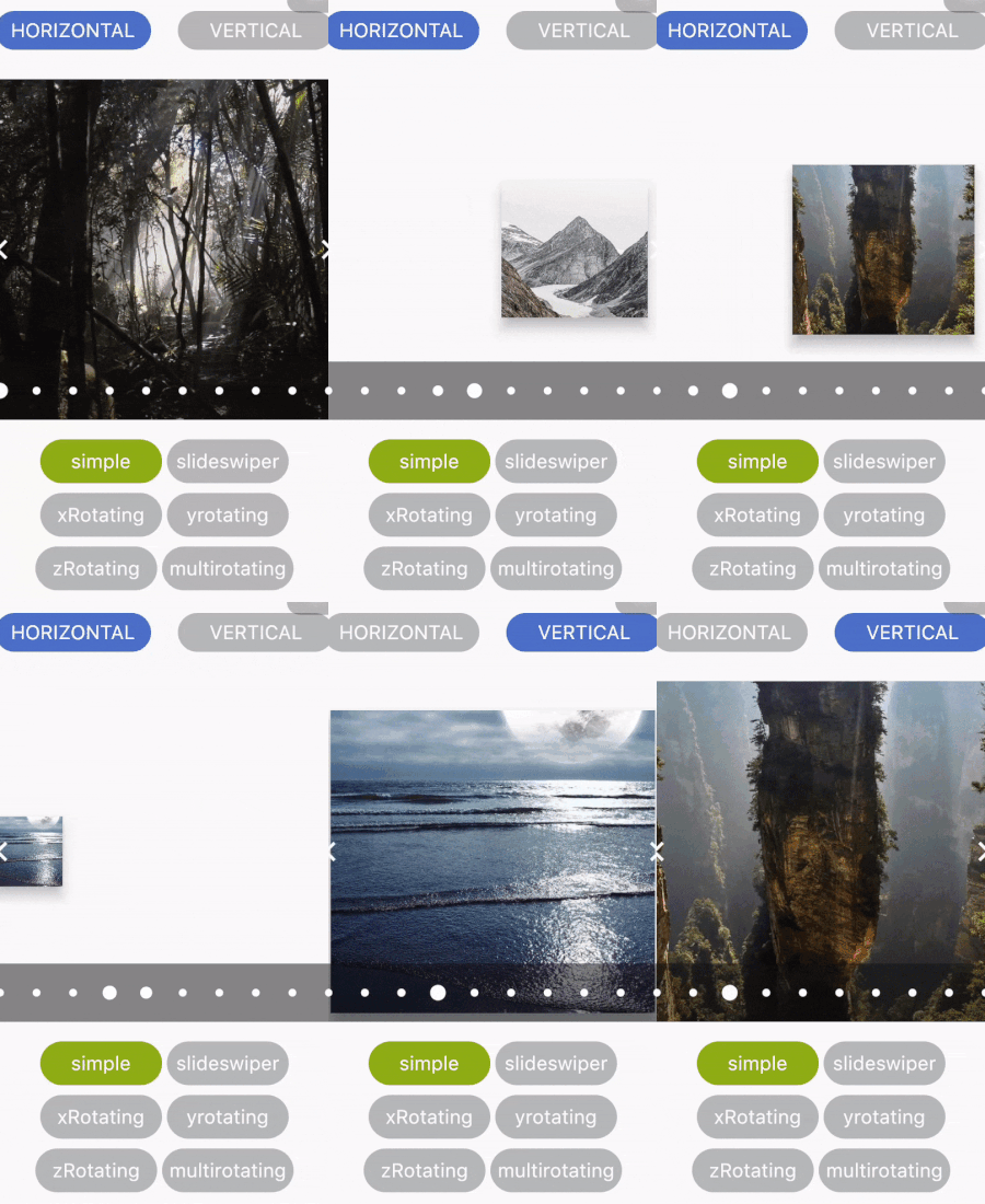
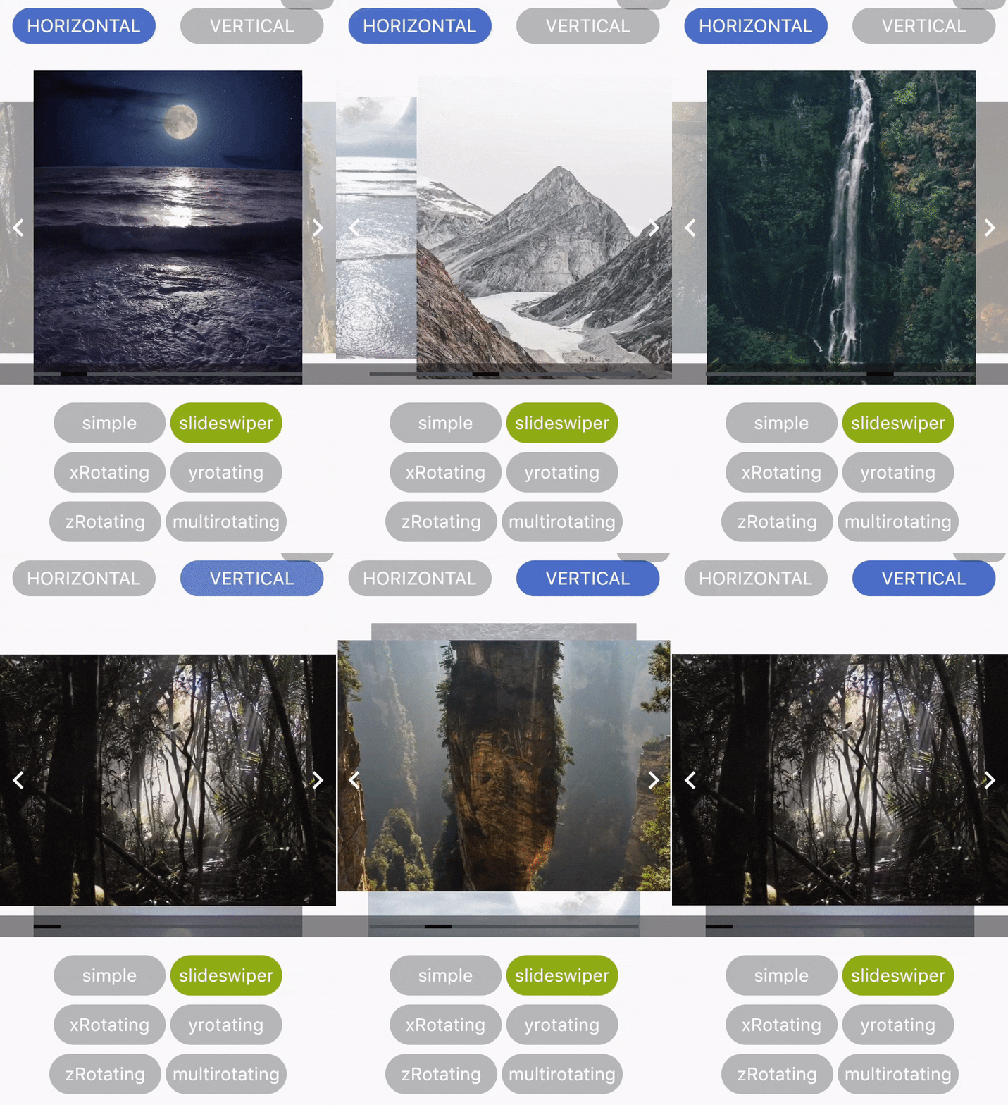
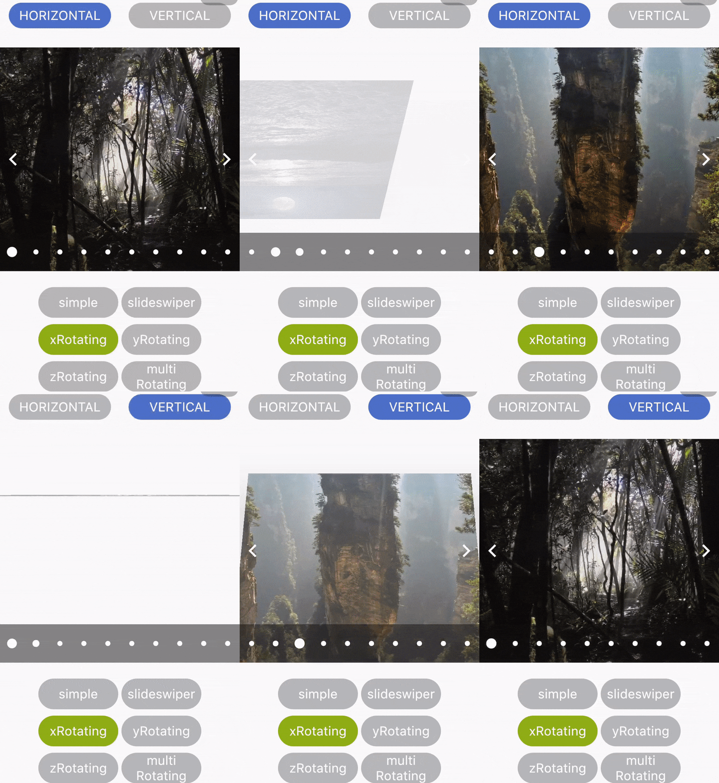
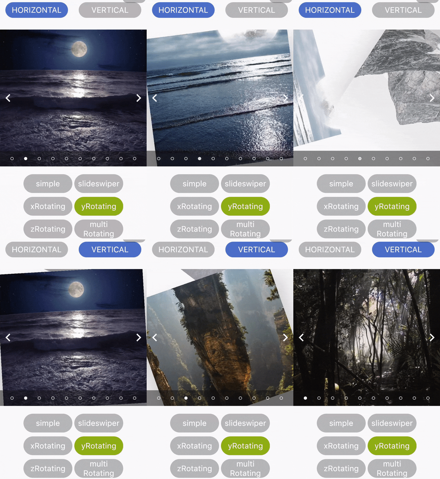
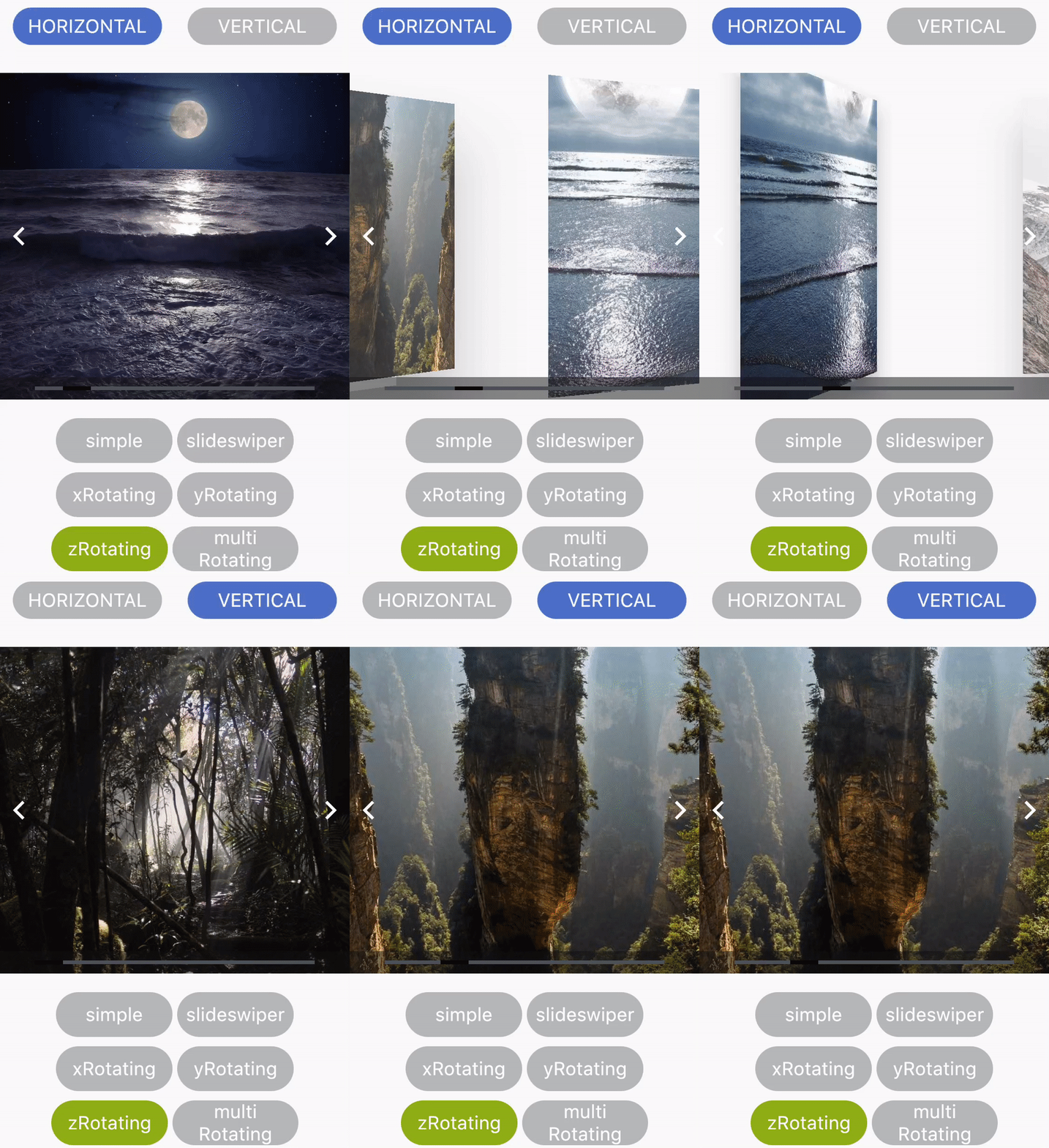
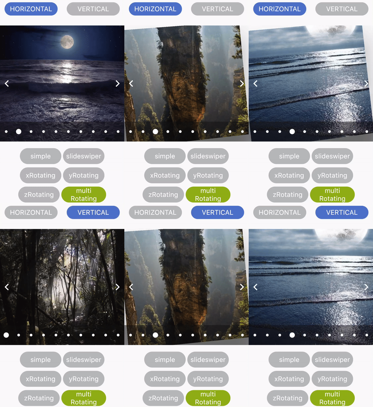
A versatile Flutter package for creating multiple types of carousels with customizable configurations. It supports various carousel styles, including standard, cover flow, and interactive layouts, enabling smooth scrolling and responsive design. Ideal for showcasing images, products, or content in a visually engaging way. The package is lightweight and easy to integrate, offering flexibility through configurable animations, indicators, and swipe gestures. Designed for developers seeking dynamic, reusable carousel components without complex setup.
Use cases
- Displaying image galleries
- Showcasing product listings
- Creating interactive content sliders
- Building onboarding screens
- Presenting featured items in apps
- Enhancing user engagement with visual transitions
Key features
- Multiple carousel types (standard, cover flow)
- Customizable animations and transitions
- Built-in pagination indicators
- Swipe gesture support
- Responsive layout handling
- Easy integration with minimal configuration
Suitable for
- Mobile app developers
- UI/UX designers
- E-commerce applications
- Content-rich applications
- Interactive prototypes
- Apps requiring dynamic content display
Considerations
- Limited platform-specific customization
- No built-in autoplay control
- Requires manual handling of large datasets
- May need additional styling for complex layouts
- Not optimized for very high-performance scenarios
- Depends on external repository for updates