Original README snapshot from the linked source repository. Visit the repository for the latest content.
flutter_picker_plus


A powerful and customizable picker widget for Flutter applications. Continuation of the popular flutter_picker package with enhanced features and modern Flutter support.
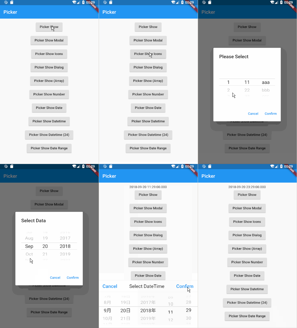
✨ Features
- 🎯 Multiple Picker Types: Number, DateTime, Array, and custom data pickers
- 🌐 Internationalization: Support for 20+ languages including RTL languages
- 🎨 Highly Customizable: Flexible styling, colors, and layouts
- 🔗 Linkage Support: Create dependent picker columns
- 📱 Multiple Display Modes: Modal, dialog, and embedded pickers
- 🎭 Custom Adapters: Extend functionality with your own data adapters
- 🛡️ Null Safety: Full null safety support
- ⚡ Performance Optimized: Handles large datasets efficiently
🚀 Installation
Add this to your package's pubspec.yaml file:
dependencies:
  flutter_picker_plus: ^1.5.6
📋 Requirements
- Flutter: 3.32.0 or higher
- Dart: 3.0.0 or higher
For Flutter version history and migration guides, see the Flutter Release Notes.
🌍 Supported Languages
Arabic • Bengali • Chinese • English • French • German • Greek • Hindi • Indonesian • Italian • Japanese • Korean • Portuguese • Romanian • Russian • Spanish • Turkish • Urdu • Javanese • Vietnamese • Slovenian
Supporting 20+ languages including the most widely spoken languages worldwide.
📖 Quick Start
Basic String Picker
import 'package:flutter_picker_plus/flutter_picker_plus.dart';

void showBasicPicker(BuildContext context) {
  Picker(
    adapter: PickerDataAdapter<String>(
      pickerData: ['Option 1', 'Option 2', 'Option 3']
    ),
    title: const Text('Select an Option'),
    onConfirm: (Picker picker, List<int> value) {
      print('Selected: ${picker.getSelectedValues()}');
    },
  ).showModal(context);
}
Number Picker
void showNumberPicker(BuildContext context) {
  Picker(
    adapter: NumberPickerAdapter(data: [
      const NumberPickerColumn(begin: 0, end: 100, jump: 5),
      const NumberPickerColumn(begin: 0, end: 60),
    ]),
    delimiter: [
      PickerDelimiter(
        child: Container(
          width: 30.0,
          alignment: Alignment.center,
          child: const Text(':'),
        ),
        column: 1,
      ),
    ],
    title: const Text('Select Time'),
    onConfirm: (Picker picker, List<int> value) {
      print('Selected: ${picker.getSelectedValues()}');
    },
  ).showModal(context);
}
Date Time Picker
void showDateTimePicker(BuildContext context) {
  Picker(
    adapter: DateTimePickerAdapter(
      type: PickerDateTimeType.kYMDHM,
      value: DateTime.now(),
      minValue: DateTime(1950),
      maxValue: DateTime(2050),
    ),
    title: const Text('Select Date & Time'),
    onConfirm: (Picker picker, List<int> value) {
      final dateTime = (picker.adapter as DateTimePickerAdapter).value;
      print('Selected: $dateTime');
    },
  ).showModal(context);
}
🎛️ Advanced Usage
Multi-Column Array Picker
void showArrayPicker(BuildContext context) {
  Picker(
    adapter: PickerDataAdapter<String>(
      pickerData: [
        ['Morning', 'Afternoon', 'Evening'],
        ['Coffee', 'Tea', 'Juice'],
        ['Small', 'Medium', 'Large'],
      ],
      isArray: true,
    ),
    title: const Text('Customize Your Order'),
    onConfirm: (Picker picker, List<int> value) {
      print('Selected: ${picker.getSelectedValues()}');
    },
  ).showModal(context);
}
Hierarchical (Linkage) Picker
void showLinkagePicker(BuildContext context) {
  final data = {
    'Fruits': {
      'Citrus': ['Orange', 'Lemon', 'Lime'],
      'Berries': ['Strawberry', 'Blueberry', 'Raspberry'],
    },
    'Vegetables': {
      'Root': ['Carrot', 'Potato', 'Onion'],
      'Leafy': ['Lettuce', 'Spinach', 'Kale'],
    },
  };

  Picker(
    adapter: PickerDataAdapter<String>(pickerData: [data]),
    title: const Text('Select Food Category'),
    onConfirm: (Picker picker, List<int> value) {
      print('Selected: ${picker.getSelectedValues()}');
    },
  ).showModal(context);
}
Custom Styling
void showStyledPicker(BuildContext context) {
  Picker(
    adapter: PickerDataAdapter<String>(
      pickerData: ['Red', 'Green', 'Blue', 'Yellow'],
    ),
    backgroundColor: Colors.grey.shade100,
    headerColor: Colors.blue,
    containerColor: Colors.white,
    textStyle: const TextStyle(color: Colors.black87, fontSize: 18),
    cancelTextStyle: const TextStyle(color: Colors.red),
    confirmTextStyle: const TextStyle(color: Colors.blue),
    itemExtent: 50.0,
    diameterRatio: 2.0,
    title: const Text('Pick a Color'),
    onConfirm: (Picker picker, List<int> value) {
      print('Selected: ${picker.getSelectedValues()}');
    },
  ).showModal(context);
}
🔧 API Reference
Picker Class
| Property |
Type |
Description |
adapter |
PickerAdapter |
Data adapter for the picker |
title |
Widget? |
Title widget displayed at the top |
cancelText |
String? |
Cancel button text (default: localized) |
confirmText |
String? |
Confirm button text (default: localized) |
backgroundColor |
Color? |
Background color of the picker |
headerColor |
Color? |
Header background color |
textStyle |
TextStyle? |
Style for picker items |
hideHeader |
bool |
Hide the header buttons (default: false) |
delimiter |
List<PickerDelimiter>? |
Delimiters between columns |
Available Adapters
PickerDataAdapter: For string/custom dataNumberPickerAdapter: For numeric rangesDateTimePickerAdapter: For date and time selection
Display Methods
showModal(context): Show as modal bottom sheetshowDialog(context): Show as dialogshow(state): Show with custom state (deprecated)makePicker(): Return picker widget for embedding
🎨 Customization Options
Localization
The picker automatically adapts to your app's locale. You can also register custom languages:
PickerLocalizations.registerCustomLanguage(
'custom',
cancelText: 'Cancel',
confirmText: 'OK',
ampm: ['AM', 'PM'],
months: ['Jan', 'Feb', 'Mar', ],
);
Custom Item Builder
Picker(
adapter: adapter,
itemBuilder: (context, text, child, selected, column, index) {
return Container(
padding: const EdgeInsets.symmetric(horizontal: 16.0),
decoration: BoxDecoration(
color: selected ? Colors.blue.shade100 : null,
borderRadius: BorderRadius.circular(8.0),
),
child: child,
);
},
)
🤝 Contributing
Contributions are welcome! Please feel free to submit a Pull Request. For major changes, please open an issue first to discuss what you would like to change.
📄 License
This project is licensed under the BSD-3-Clause License - see the LICENSE file for details.
🙏 Acknowledgments
This package is a continuation of the original flutter_picker package with additional features and improvements.
For more examples and detailed documentation, check out the example app.
