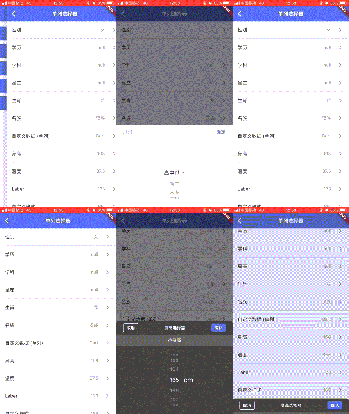
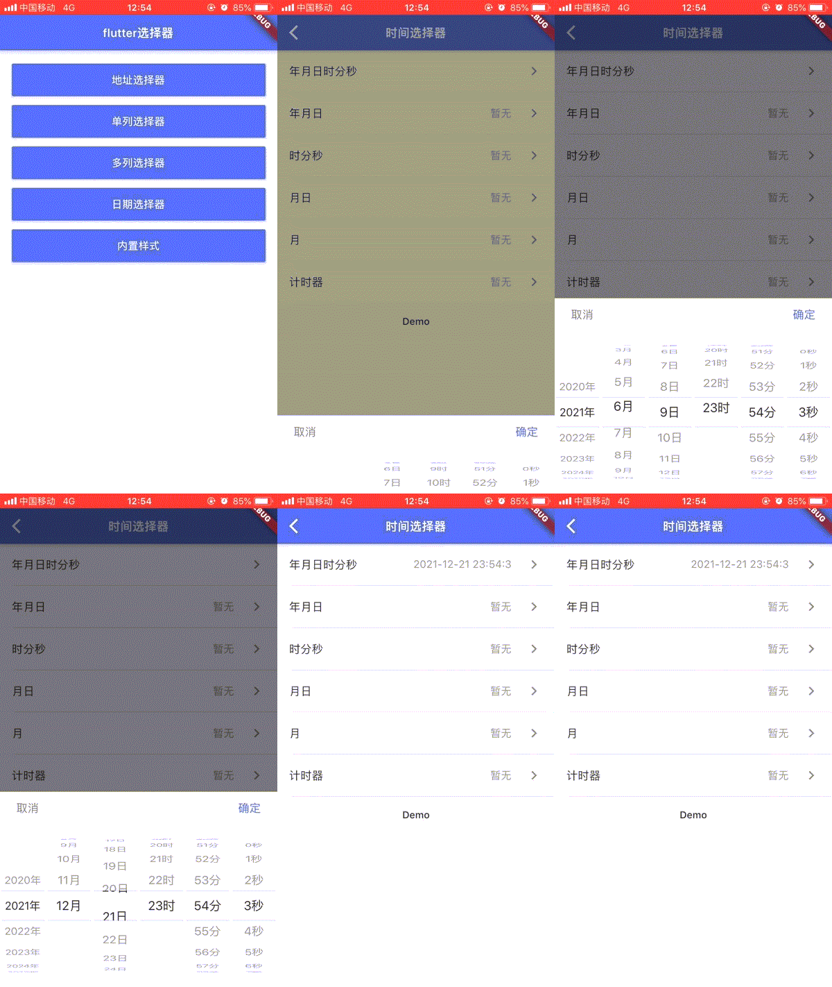
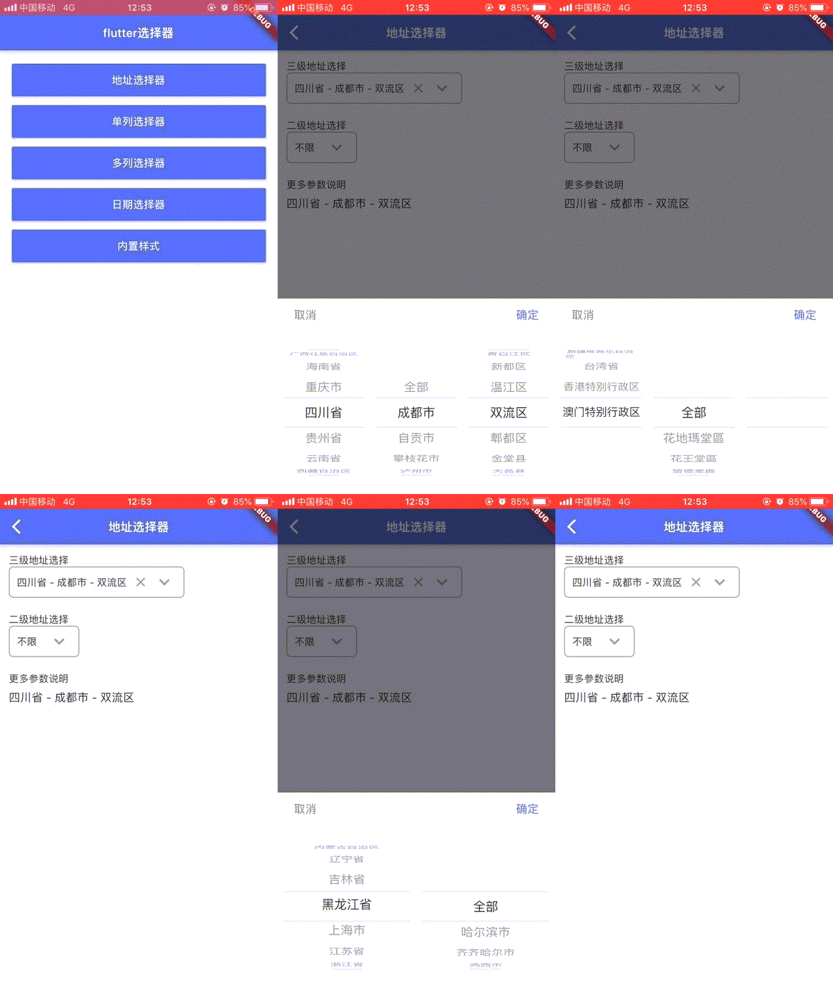
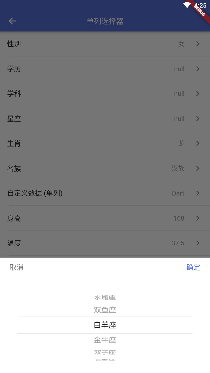
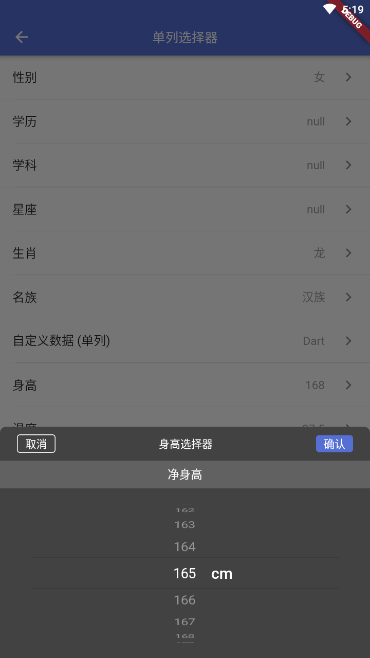
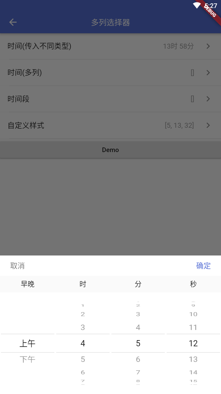
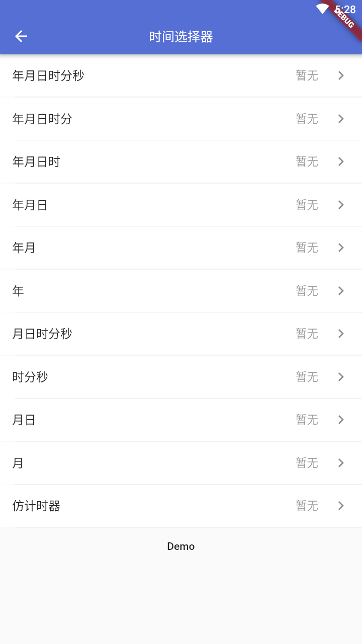
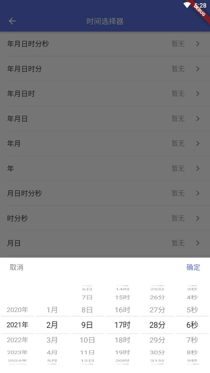
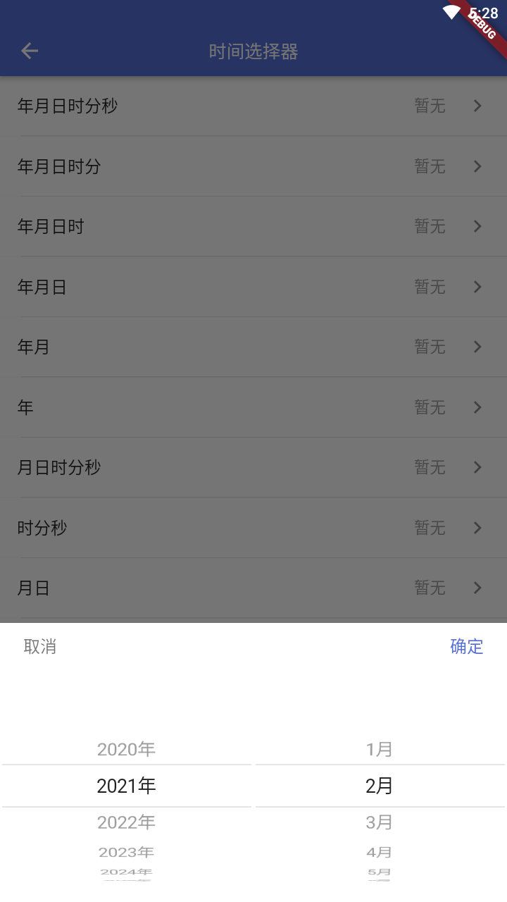
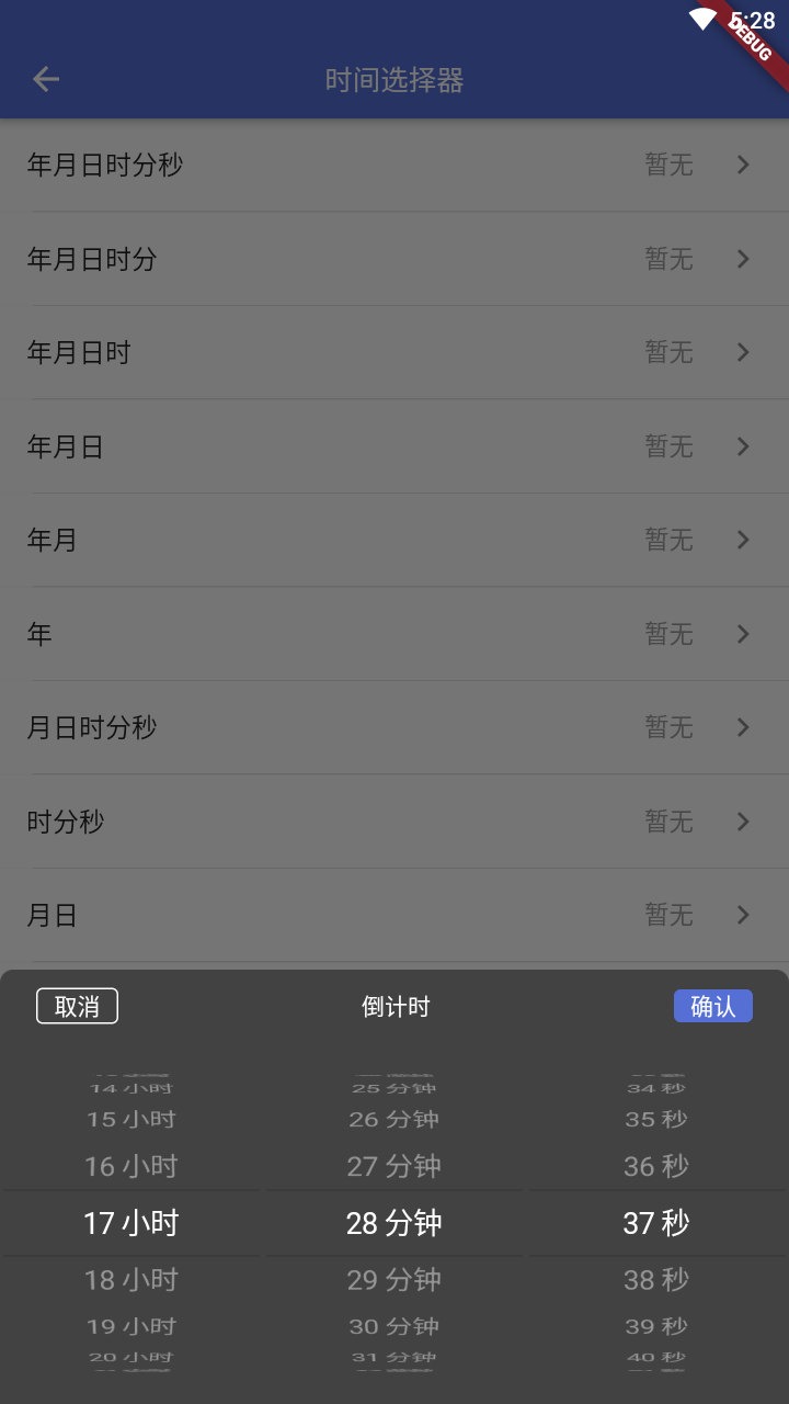
Flutter selector library, including date and time selector, single item selector (gender, occupation, education, constellation), city address selector, etc.
Package selection guidance compiled from public package information, community data, and project usage.
Flutter Pickers is a versatile Flutter library offering customizable pickers for selecting dates, times, single items (like gender, occupation, education, and zodiac signs), and city addresses. It provides intuitive, native-like UI components across multiple platforms, enhancing user experience in forms and data entry. The library supports Android, iOS, Web, macOS, Windows, and Linux, making it ideal for cross-platform applications requiring robust selection interfaces. With clean, modular design and easy integration via pub.dev, it simplifies complex picker implementations.
Use cases
Form inputs with date/time selection
User profile setup with dropdown choices
Address or location input with hierarchical cities
Multi-platform app data collection
Customizable single-item selection
Enhancing UX in mobile and web forms
Key features
Pre-built date and time pickers
Single item selectors for common categories
City and address hierarchy picker
Cross-platform compatibility
Easy integration with pub.dev
Customizable themes and styles
Suitable for
Developers building form-heavy apps
Cross-platform Flutter projects
Apps needing intuitive data selection
UX-focused interface design
Teams wanting reusable picker components
Mobile and web applications with localization needs
Considerations
Requires additional styling for non-default themes
Limited to predefined picker types
May need custom logic for complex validation
Not optimized for very large datasets
Depends on external dependencies for full functionality
Some features may require platform-specific configuration
Original README
Original README snapshot from the linked source repository. Visit the repository for the latest content.