Search packages, repositories and app categories

flutter_rounded_progress_bar cover
Package detailsv0.3.2

flutter_rounded_progress_bar

Rounded Progressbar in Flutter that customize color and border.

AndroidiOSWebmacOSWindowsLinux
30-day downloads
598
Likes
92
Pub points
140

Install package

flutter pub add flutter_rounded_progress_bar

Package Overview

Package selection guidance compiled from public package information, community data, and project usage.

A Flutter package that provides a customizable rounded progress bar with support for color and border adjustments. It is designed to enhance user interfaces with smooth, modern progress indicators suitable for loading states, task completion, or any scenario requiring visual feedback. The component works across all major platforms including Android, iOS, Web, macOS, Windows, and Linux, ensuring consistent appearance and behavior. Its simplicity and flexibility make it ideal for developers seeking an elegant alternative to standard linear progress bars.

Use cases

  • Loading indicators
  • Task completion tracking
  • Form progress visualization
  • Dashboard metrics
  • Onboarding flows

Key features

  • Customizable colors
  • Adjustable border radius
  • Platform-agnostic design
  • Smooth animations
  • Easy integration
  • Configurable stroke width

Suitable for

  • UI designers seeking modern aesthetics
  • Developers building cross-platform apps
  • Apps requiring visual progress feedback
  • Simple yet polished loading screens
  • Projects with minimal dependencies

Considerations

  • Limited to basic progress functionality
  • No built-in text labels
  • Requires manual handling of dynamic updates
  • Not suitable for complex progress scenarios
  • No support for gradient fills

Original README

Original README snapshot from the linked source repository. Visit the repository for the latest content.

Flutter Rounded Progressbar

Custom Progressbar

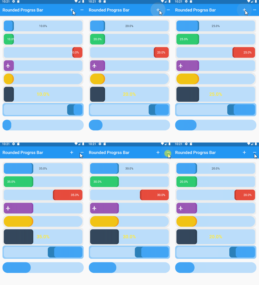
Screenshot

Installing

add dependency in pubspec.yaml

dependencies:
  flutter_rounded_progress_bar: 0.2.0

Usage

simple rounded progress bar.

RoundedProgressBar(
    childLeft: Text("$percent%",
        style: TextStyle(color: Colors.white)),
    percent: percent,
    theme: RoundedProgressBarTheme.green)

Screenshot

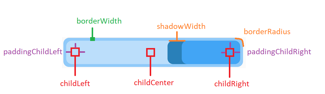
Structure

Support Widget 3 position as childCenter , childLeft , childRight Screenshot

customize

use RoundedProgressBarStyle class

RoundedProgressBar(
    style: RoundedProgressBarStyle(
        widthShadow: 30, colorBorder: Colors.blue[200]),
    percent: percent,
    reverse: true,
),
RoundedProgressBar(
    style: RoundedProgressBarStyle(
        borderWidth: 0, 
        widthShadow: 0),
    margin: EdgeInsets.symmetric(vertical: 16),
    borderRadius: BorderRadius.circular(24),
    percent: percent,
),       

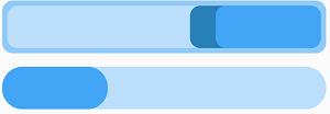
Screenshot

duration animation.

RoundedProgressBar(
    milliseconds:1000,
     percent: percent,
     theme: RoundedProgressBarTheme.yellow,
     borderRadius: BorderRadius.circular(24)),

Screenshot

Theme

RoundedProgressBarTheme.blue, 
RoundedProgressBarTheme.red
RoundedProgressBarTheme.green
RoundedProgressBarTheme.purple
RoundedProgressBarTheme.yellow 
RoundedProgressBarTheme.midnight

Icon Rounded Progressbar

Simple using icon.

IconRoundedProgressBar(
    icon: Padding(
        padding: EdgeInsets.all(8), child: Icon(Icons.person)),
    theme: RoundedProgressBarTheme.green,
    margin: EdgeInsets.symmetric(vertical: 16),
    borderRadius: BorderRadius.circular(6),
    percent: percent,
),

Screenshot

Custom background and icon.

IconRoundedProgressBar(
    widthIconSection: 70,
    icon: Padding(
        padding: EdgeInsets.all(8),
        child: Icon(Icons.airline_seat_flat, color: Colors.white)),
    style: RoundedProgressBarStyle(
        colorBackgroundIcon: Color(0xffc0392b),
        colorProgress: Color(0xffe74c3c),
        colorProgressDark: Color(0xffc0392b),
        colorBorder: Color(0xff2c3e50),
        backgroundProgress: Color(0xff4a627a),
        borderWidth: 4,
        widthShadow: 6),
    margin: EdgeInsets.symmetric(vertical: 16),
    borderRadius: BorderRadius.circular(6),
    percent: percent,
),

Screenshot

Categories

Source repository

Projects using this package