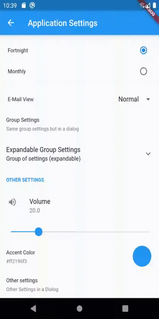
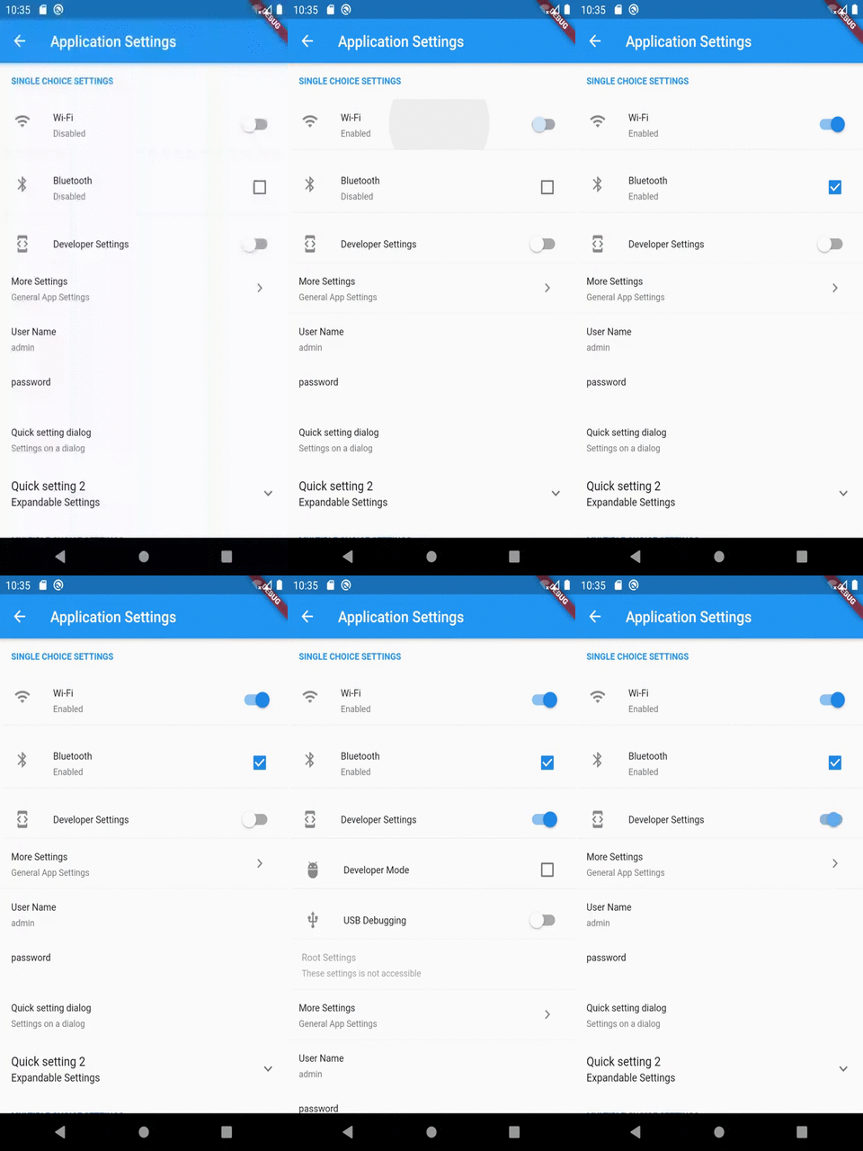
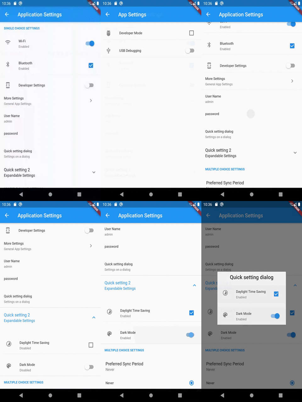
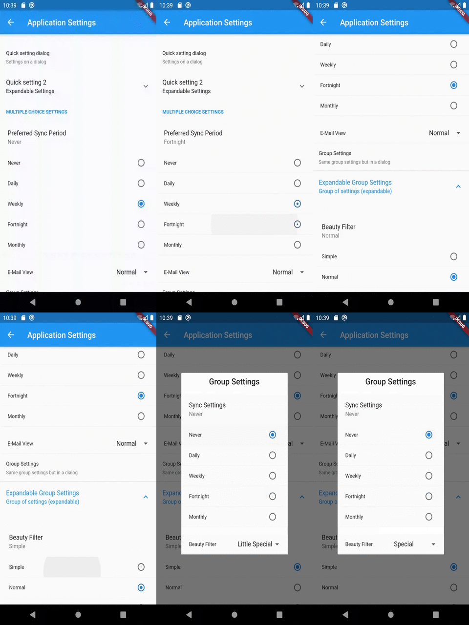
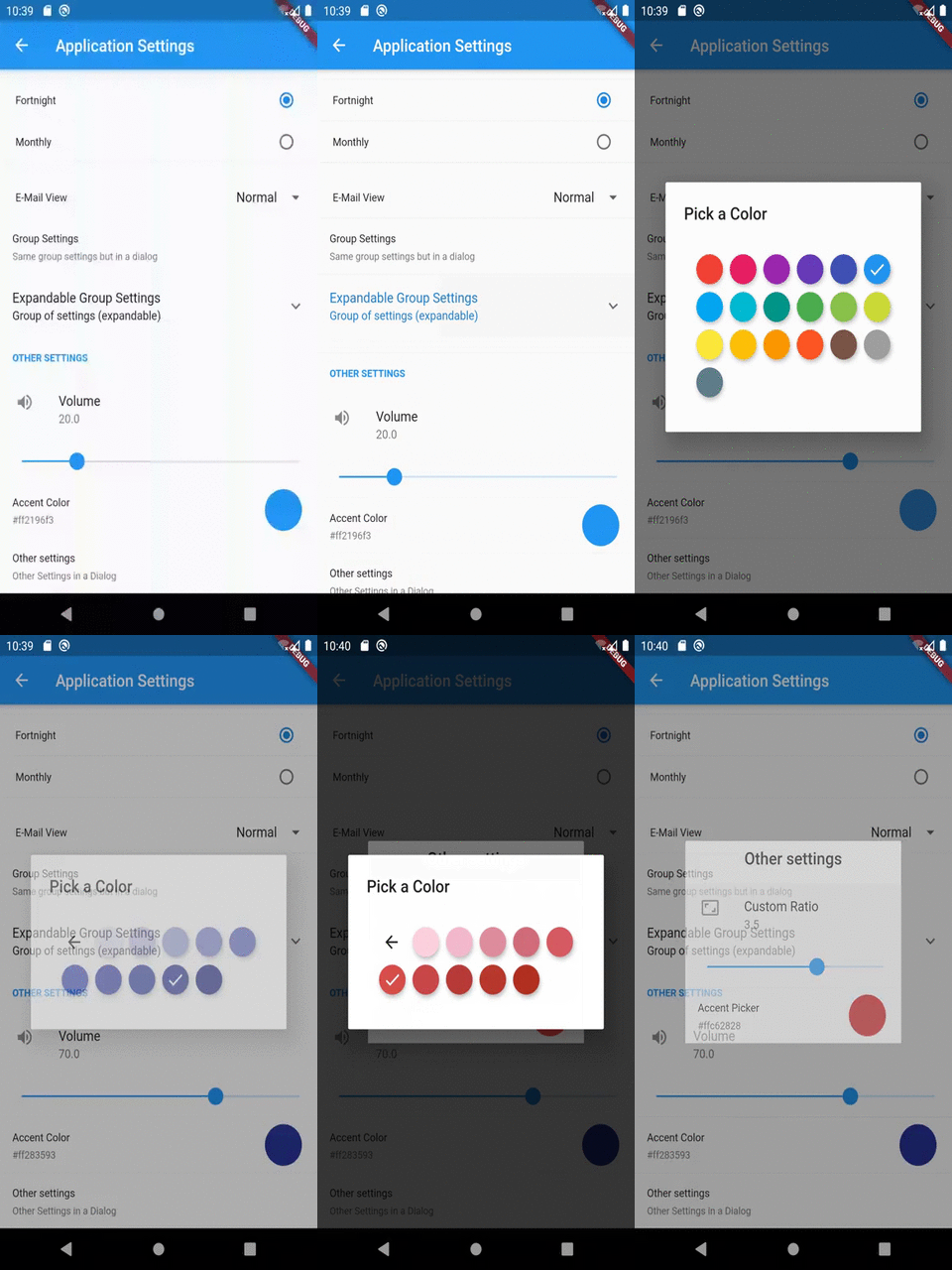
A Simple plugin to implement settings UI screens for your flutter apps. Customize what you want, From UI elements, behaviour or underlying storage library.
Package selection guidance compiled from public package information, community data, and project usage.
A lightweight Flutter package designed to simplify the creation of settings UI screens. It provides customizable components for building intuitive settings interfaces, allowing developers to tailor UI elements, behavior, and storage mechanisms. Ideal for apps requiring a clean, structured settings experience across multiple platforms. The package supports native-like interactions and integrates seamlessly with existing Flutter projects.
Use cases
Building app settings screens
Customizing user preferences UI
Implementing theme and language settings
Creating configurable app behaviors
Managing user data persistence
Designing cross-platform settings interfaces
Key features
Highly customizable UI components
Support for multiple storage backends
Cross-platform compatibility
Easy integration with Flutter apps
Modular and extensible design
Built-in support for common settings types
Suitable for
Developers creating feature-rich mobile apps
Teams needing consistent settings UX
Projects requiring platform-agnostic settings
Apps with user preference management
Frontend-focused Flutter developers
Rapid prototyping of settings interfaces
Considerations
Requires manual setup for custom storage
Limited built-in validation
May need additional state management
Not optimized for very large settings trees
Custom styling requires familiarity with Flutter widgets
Dependent on external storage implementation choices
Original README
Original README snapshot from the linked source repository. Visit the repository for the latest content.
flutter_settings_screens
This is a simple flutter plugin for easily creating app settings screens.
The unique thing about this library is that it is not dependent upon any specific storage library used to store settings.
Note:
The plugin must be initialized before Navigating to the settings page.
It is recommended that Settings.init() should be called before runApp() is called in the main file. However, anywhere before showing the settings page is fine.
Cache Provider Interface
Cache Provider is an interface by which the plugin accesses the underlying caching storage.
This plugin includes an implementation of the CacheProvider using the SharedPreferences library by flutter. If cacheProvider parameter is not given explicitly then the default implementation will be used to store the settings.
However, if you wish to use other means for storing the data, you can implement one by yourself.
All you have to do is create a class as follows:
import'package:flutter_settings_screens/flutter_settings_screens.dart';
classCustomCacheProviderextendsCacheProvider{
///...///implement the methods as you want///...
}
for example,
/// A cache access provider class for shared preferences using shared_preferences libraryclassSharePreferenceCacheextendsCacheProvider{
//...
}
OR
/// A cache access provider class for shared preferences using Hive libraryclassHiveCacheextendsCacheProvider{
//...
}
Once you implement the class, use an instance of this class to initialize the Settings class.
Accessing/Retrieving data
You can use static methods of Settings class to access any data from the storage.
Since, Color or MaterialColor is a Flutter object, we need to convert it to string version of the color before saving it to cache & convert string version to color while fetching it from the cache.
For that the plugin exposes ConversionUtils class with utility method to do that needed.
CheckboxSettingsTile is a widget that has a Checkbox with given title, subtitle and default value/status of the Checkbox
This widget supports an additional list of widgets to display when the Checkbox is checked. This optional list of widgets is accessed through childrenIfEnabled property of this widget.
SwitchSettingsTile is a widget that has a Switch with given title, subtitle and default value/status of the switch
This widget supports an additional list of widgets to display when the switch is enabled. This optional list of widgets is accessed through childrenIfEnabled property of this widget.
This widget works similar to CheckboxSettingsTile.
RadioSettingsTile is a widget that has a list of Radio widgets with given title, subtitle and default/group value which determines which Radio will be selected initially.
This widget supports Any type of values which should be put in the preference.
However, since any type of value is supported, the input for this widget is a Map to the required values with their string representation.
For example, if the required value type is a boolean then the values map can be as following:
DropDownSettingsTile is a widget that has a list of DropdownMenuItems with given title, subtitle and default/group value which determines which value will be set to selected initially.
This widget supports Any type of values which should be put in the preference.
However, since any type of value is supported, the input for this widget is a Map to the required values with their string representation.
For example, if the required value type is a boolean then the values map can
be as following:
SliderSettingsTile is a widget that has a slider given title, subtitle and default value which determines what the slider's position will be set initially.
This widget supports double and integer types of values which should be put in the preference.
ColorPickerSettingsTile is a widget which allows user to select a color from a set of Material color choices.
Since, Color is an in-memory object type, the serialized version of the value of this widget will be a Hex value String of the selected color.
For example, If selected color is red then the stored value will be "#ffff0000", but when retrieved, the value will be an instance of Color with properties of red color.
This conversion string <-> color, makes this easy to check/debug the values from the storage/preference manually.
The color panel shown in the widget is provided by the flutter_material_color_picker library.
A simple Screen widget that may contain settings tiles or other widgets.
The following example shows how you can create an empty settings screen with a title:
Inside the children parameter, you can define settings tiles and other widgets. In this example we create a screen with a simple CheckboxSettingsTile in it:
SettingsScreen(
    title: "Application Settings",
    children:
        CheckboxSettingsTile(
            settingKey: 'key-of-your-setting',
            title: 'This is a simple Checkbox',
        ),
    ,
);
SettingsContainer
A widget that helps its child or children to fin in the settings screen. It is helpful if you want to place other widgets than settings tiles in the settings screen body.
The following example shows how you can create a container with one Text widget:
SettingsContainer(
    child: Text('Hello world'),
);
In this example, we create a container with multiple Text widgets:
SimpleDropDownSettingsTile is a simpler version of the DropDownSettingsTile.
Instead of a Value-String map, this widget just takes a list of String values.
In this widget, the displayed value and the stored value will be the same.
File an issue on the repository, if something is not working as expected.
Please follow the issue template used in flutter-sdk's repository, may be we'll integrate that here as well.
File an issue in the repository, If you have any suggestions and/or feature requests, use [Suggestion] or [FeatureRequest] tags in issue titles.
To support you just have to help out fellow developers on of the filed issues in this repository.
To contribute, just follow the standard open source contributions instructions, maybe we can follow the ones used in the flutter sdk. We'll see how it goes.
All help, issues, support and contributions are most welcome.
If any one is interested in helping me maintain this library then please reach to me via comment on this issue.