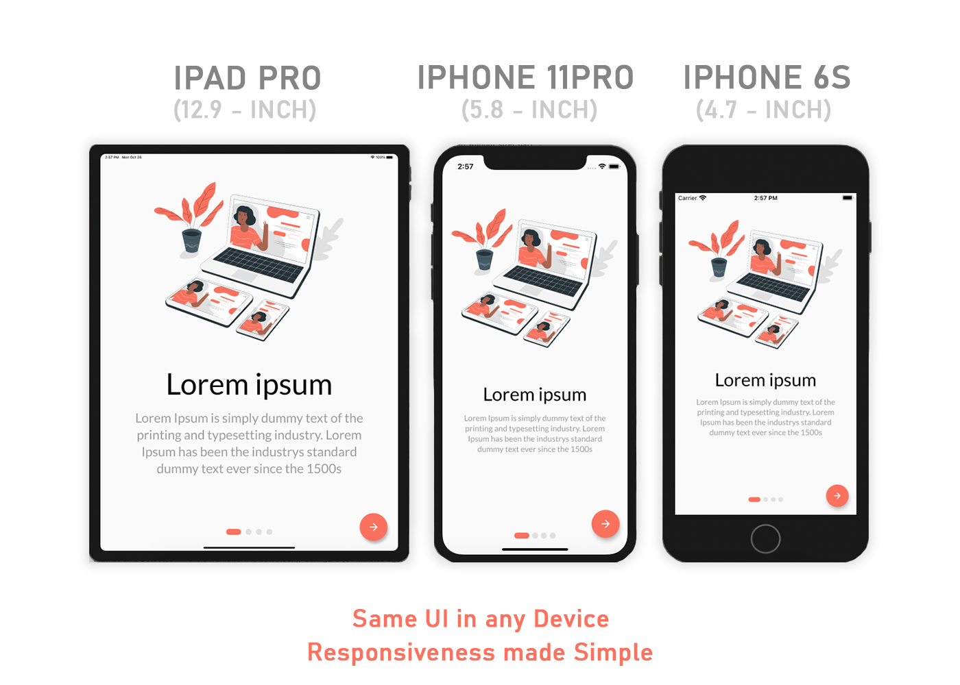
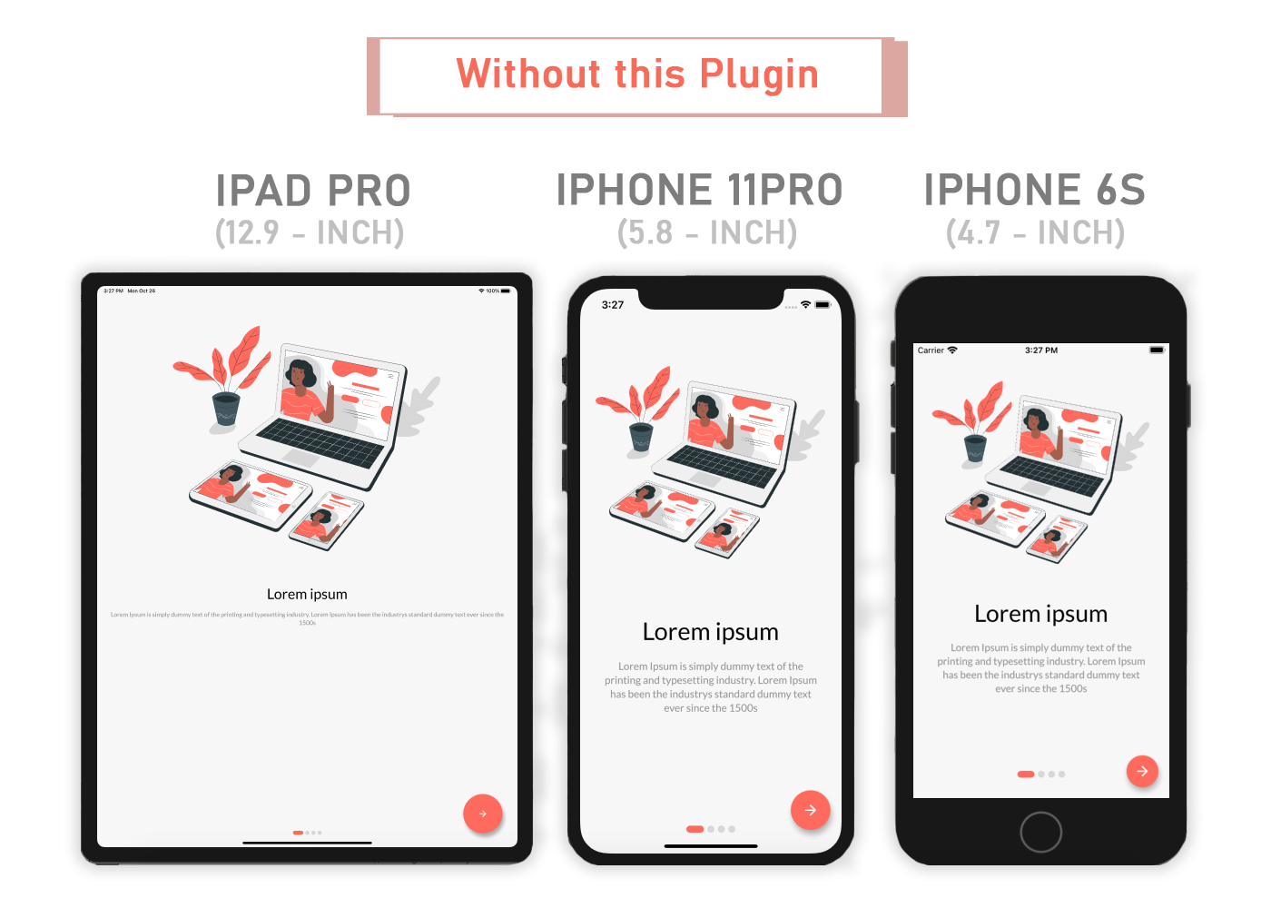
Flutter Sizer is a responsive UI package that enables adaptive layouts across different screen sizes and orientations. It provides helper widgets and extensions to easily scale fonts, sizes, and margins based on the device's screen dimensions. By leveraging the screen's width and height, it ensures consistent design appearance on various devices without manual calculations. Ideal for developers aiming to create fluid, scalable interfaces with minimal boilerplate code.
Use cases
- Creating responsive layouts for multiple screen sizes
- Scaling UI elements proportionally across devices
- Simplifying responsive design in mobile and web apps
- Maintaining consistent spacing and typography
- Building cross-platform apps with uniform appearance
- Reducing manual size calculations in UI code
Key features
- Automatic scaling of widgets based on screen size
- Helper extensions for easy unit conversion
- Support for both portrait and landscape modes
- Minimal setup with just a few lines of code
- Cross-platform compatibility
- Built-in support for Android, iOS, Web, macOS, Windows, and Linux
Suitable for
- Developers building responsive Flutter applications
- Teams prioritizing consistent UI across devices
- Projects requiring quick implementation of responsive layouts
- Apps targeting multiple platforms with varying screen sizes
- Designers working closely with developers on pixel-perfect layouts
- Beginners learning responsive Flutter patterns
Considerations
- May require adjustments when using custom layout constraints
- Not ideal for highly complex or non-uniform layouts
- Potential performance impact with excessive widget nesting
- Requires careful testing on diverse screen sizes
- Best used with a consistent design system
- Limited customization for advanced scaling logic