Search packages, repositories and app categories

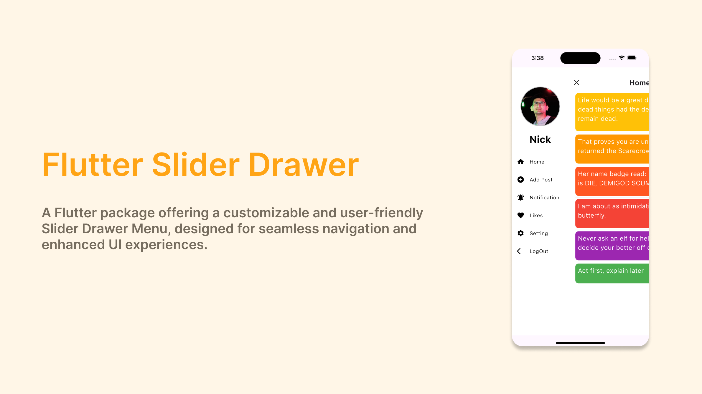
flutter_slider_drawer cover
Package detailsv3.0.2

flutter_slider_drawer

A Flutter package with custom implementation of the Slider Drawer Menu

AndroidiOSWebmacOSWindowsLinux
30-day downloads
7.9K
Likes
597
Pub points
160

Install package

flutter pub add flutter_slider_drawer

Package Overview

Package selection guidance compiled from public package information, community data, and project usage.

A Flutter package providing a customizable slider drawer menu with a unique, smooth sliding animation. Designed for intuitive navigation in mobile and web applications, it offers a modern alternative to standard navigation drawers. The package supports multiple platforms including Android, iOS, Web, macOS, Windows, and Linux, ensuring consistent behavior across devices. With lightweight implementation and easy integration via pub, developers can quickly add interactive side menus to their apps. Customization options include swipe gestures, animation speed, and styling. It's ideal for apps requiring a sleek, gesture-driven navigation experience.

Use cases

  • Mobile app navigation
  • Web dashboard sidebar
  • Gesture-based menu interaction
  • Cross-platform UI consistency
  • Customizable slide-in menus

Key features

  • Smooth sliding animations
  • Gesture support
  • Cross-platform compatibility
  • Customizable appearance
  • Easy pub integration

Suitable for

  • Developers seeking modern navigation
  • Apps needing swipeable side panels
  • Projects targeting multiple platforms
  • UI-focused Flutter applications
  • Designers wanting animated drawers

Considerations

  • Limited to drawer-style layouts
  • Requires manual handling of nested navigation
  • May need additional state management
  • Not suitable for complex multi-level menus
  • Animation performance depends on device capabilities
Original README

Original README snapshot from the linked source repository. Visit the repository for the latest content.

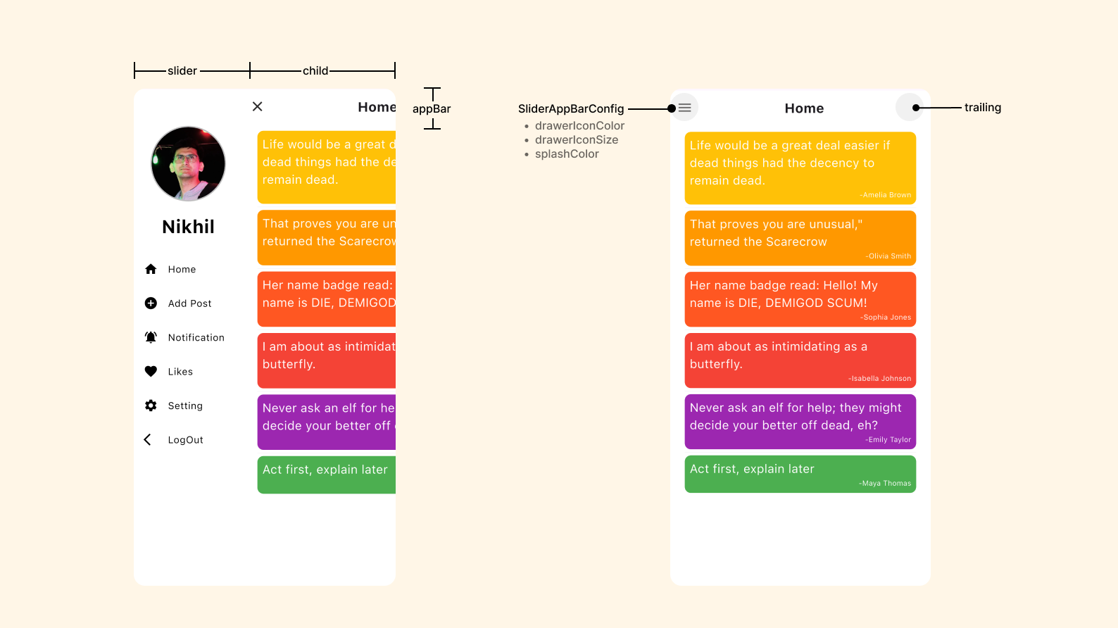
slider_document

Flutter Slider Drawer

pub package pub package

A Flutter package with custom implementation of the Slider Drawer Menu

To start using this package, add flutter_slider_drawer dependency to your pubspec.yaml

dependencies:
  flutter_slider_drawer: '<latest_release>'

Features

  • Slider with custom animation time
  • Provide Basic Appbar with customization of color and title
  • Dynamic slider open and close offset
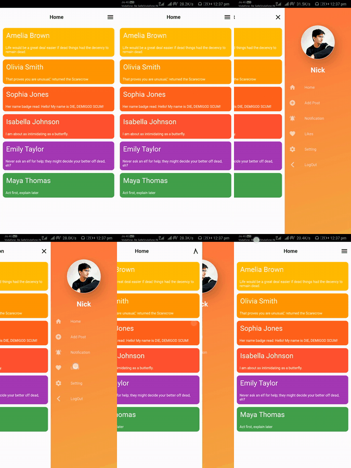
  • Provide drawer icon animation
  • Provide shadow of Main screen with customization of shadow colors,blurRadius and spreadRadius
  • Provide RTL(RightToLeft),LTR(LeftToRight) and TTB(TopToBottom) slider open selection
  • Provide Custom Appbar support and you can also use plugin appBar with use of SliderAppBar widget
  • If you are using CupertinoApp then pass isCupertino: true

Code

  Widget build(BuildContext context) {
    return Scaffold(
      body: SliderDrawer(
        key: _sliderDrawerKey,
        appBar: SliderAppBar(
          config: SliderAppBarConfig(
            title: Text(
              title,
              textAlign: TextAlign.center,
              style: const TextStyle(
                fontSize: 22,
                fontWeight: FontWeight.w700,
              ),
            ),
          ),
        ),
        sliderOpenSize: 179,
        slider: Container(color: Colors.red),
        child: Container(color: Colors.amber),
      ),
    );
  }


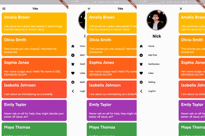
slider_document


Slider open

SliderOpen.LEFT_TO_RIGHT SliderOpen.RIGHT_TO_LEFT SliderOpen.TOP_TO_BOTTOM
slider_left slider_right slider_top

Controlling the drawer
class _MyAppState extends State<MyApp> {
   GlobalKey<SliderDrawerState> _sliderDrawerKey =
      GlobalKey<SliderDrawerState>();

  @override
  Widget build(BuildContext context) {
    return Scaffold(
      body: SliderDrawer(
        key: _sliderDrawerKey,
        appBar: SliderAppBar(
          config: SliderAppBarConfig(
            title: Text(
              title,
              textAlign: TextAlign.center,
              style: const TextStyle(
                fontSize: 22,
                fontWeight: FontWeight.w700,
              ),
            ),
          ),
        ),
        sliderOpenSize: 179,
        slider: Container(color: Colors.red),
        child: Container(color: Colors.amber),
      ),
    );
  }
}
      
  • Using the below methods to control drawer .
 _sliderDrawerKey.currentState.closeDrawer();
 _sliderDrawerKey.currentState.openDrawer();
 _sliderDrawerKey.currentState.toggle();
 _sliderDrawerKey.currentState.isDrawerOpen();

  • Use below variable if you want to control animation.

__sliderDrawerKey.currentState.animationController

Contribute to Development

Your contribution will help improve the plugin

Buy Me A Coffee

License

BSD 2-Clause License

Categories

Source repository

Projects using this package