Package selection guidance compiled from public package information, community data, and project usage.
A Flutter package that enables the display of customizable toast messages with smooth sliding animations across multiple platforms. It supports tailored styling, including colors, fonts, and positioning, and allows developers to define custom animation behaviors for a polished user experience. Ideal for providing brief feedback or notifications without disrupting the app flow. The package is lightweight and integrates seamlessly into existing Flutter projects.
Use cases
Displaying user feedback after actions
Showing success or error messages
Providing temporary alerts in apps
Enhancing UI with animated notifications
Customizing message appearance and behavior
Key features
Sliding animation effects
Customizable styling options
Cross-platform compatibility
Easy integration with Flutter
Support for various message types
Configurable animation duration and direction
Suitable for
Mobile and web applications
Apps requiring subtle notifications
Developers seeking animated feedback
UI-focused Flutter projects
Teams wanting lightweight toast solutions
Considerations
Limited to basic toast functionality
No built-in support for complex layouts
Animation customization requires code knowledge
May need additional styling for dark mode
Not suitable for persistent notifications
Original README
Original README snapshot from the linked source repository. Visit the repository for the latest content.
Flutter Sliding Toast
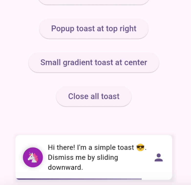
Enhance your app's UI with customizable, interactive toasts! This package offers both sliding & popup styles, with features like animation control, tap actions, and multiple dismiss options.
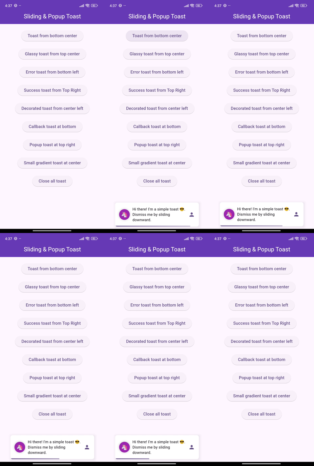
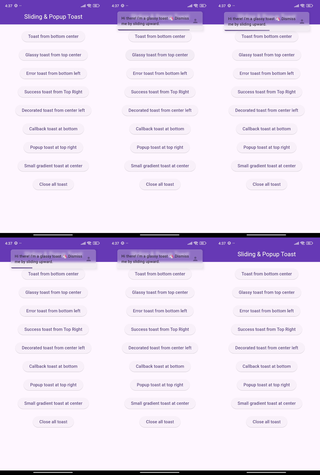
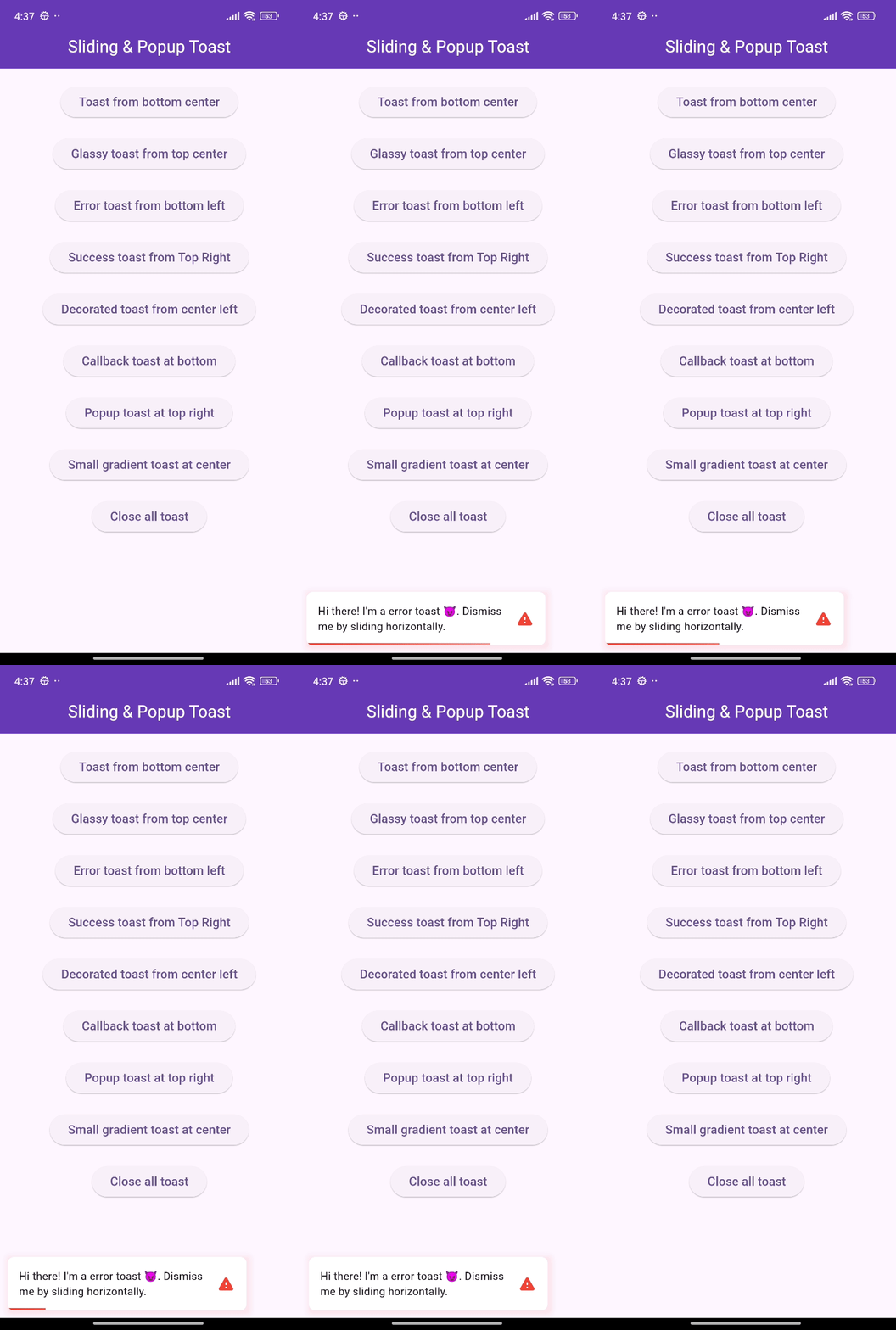
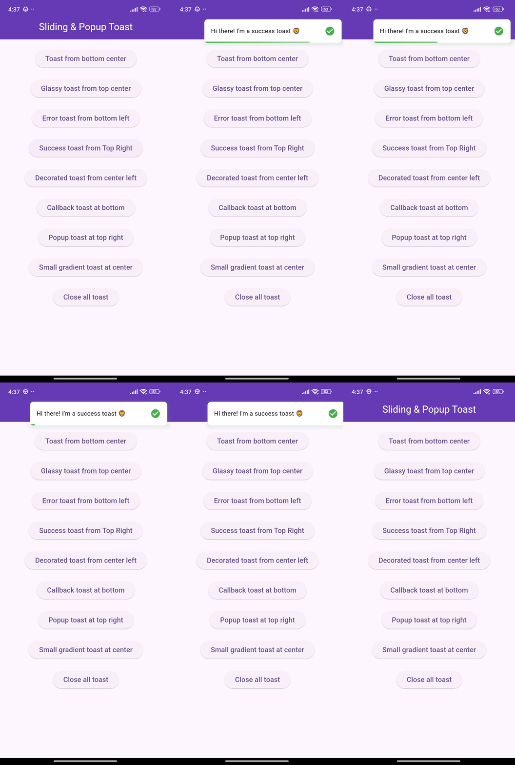
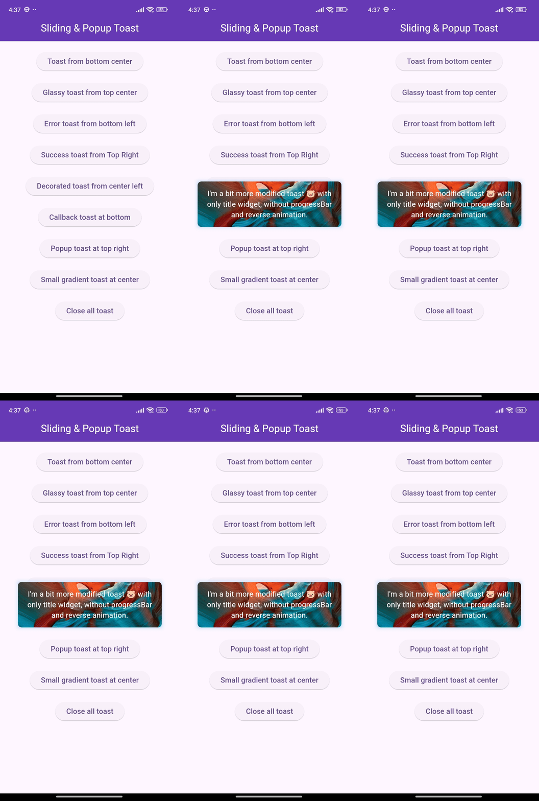
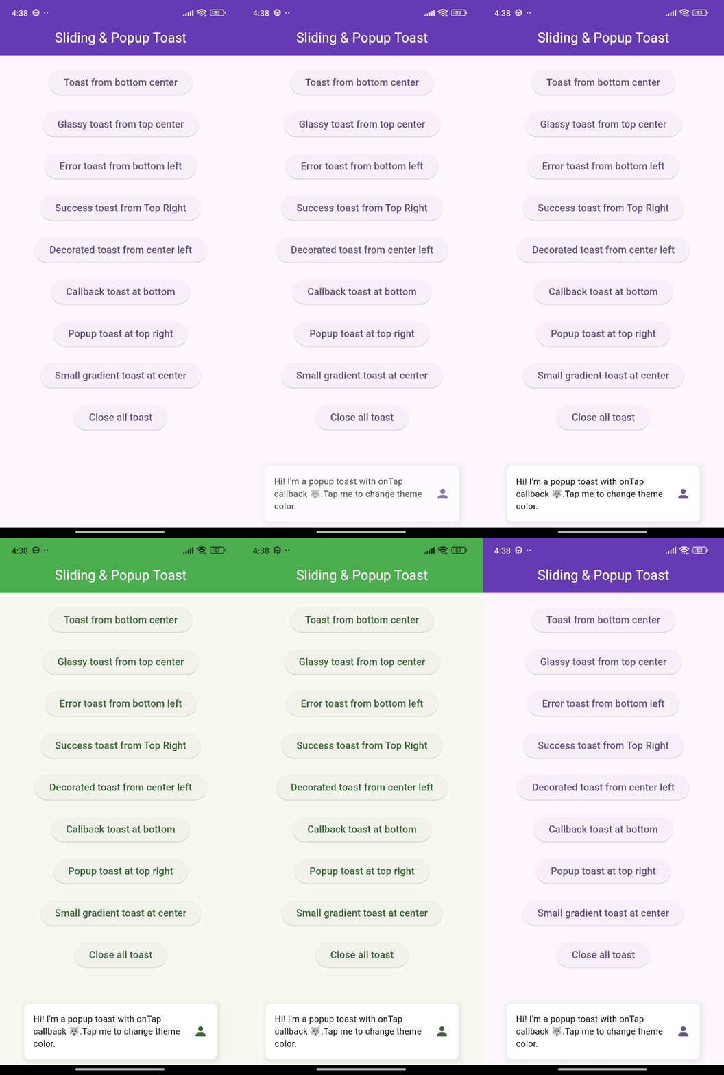
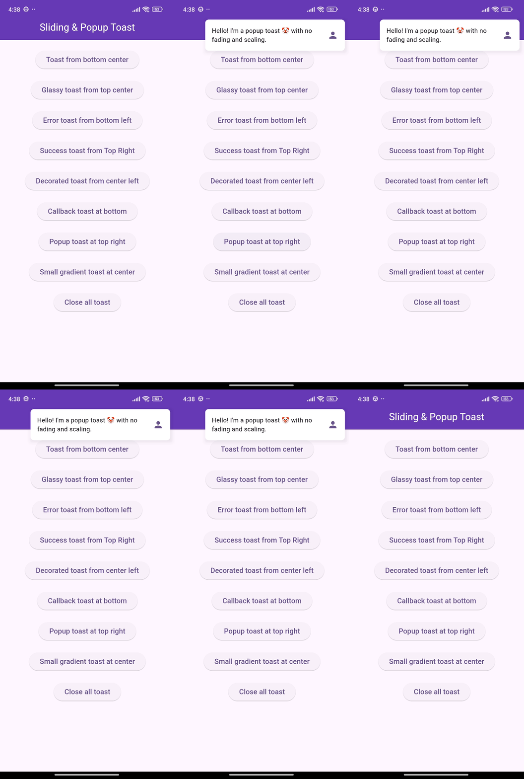
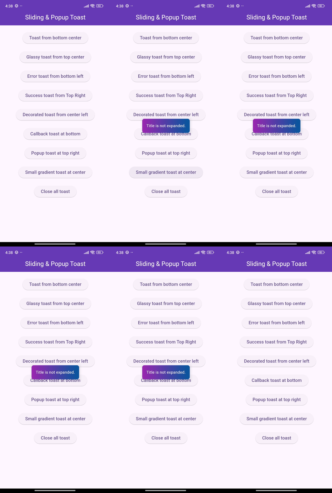
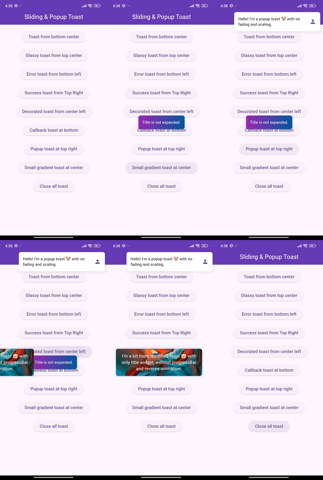
🎨 Screenshots
🎯 Features
Show sliding toasts, modify sliding behaviors
Show popup toasts, disable or modify fading and scaling behaviors
Change toast's alignment positions and sliding toast's sliding directions
Define animation and display duration, max height and width, padding
Set title, leading, trailing widgets and make title width dynamic or expanded
Disable the progressbar in sliding toast if needed
Use glassmorphism/gradient/decorated background or default success and error toast
Slide any direction to dismiss sliding toast and vertically for popup toast
Dismiss an individual or all toasts programmatically
Pause the animation with long press and release it to continue
Execute a function after the toast is tapped or disposed
Disable Multiple tapping to execute 'onTap' callback only one time
Initialize context or overlay state early for persistent toast availability