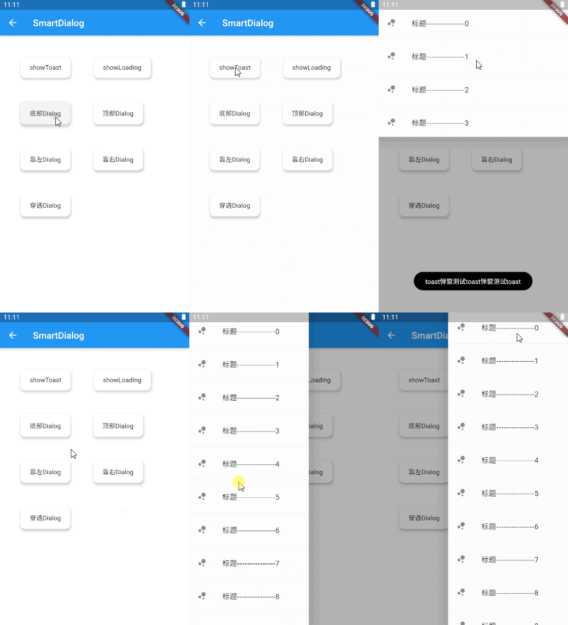
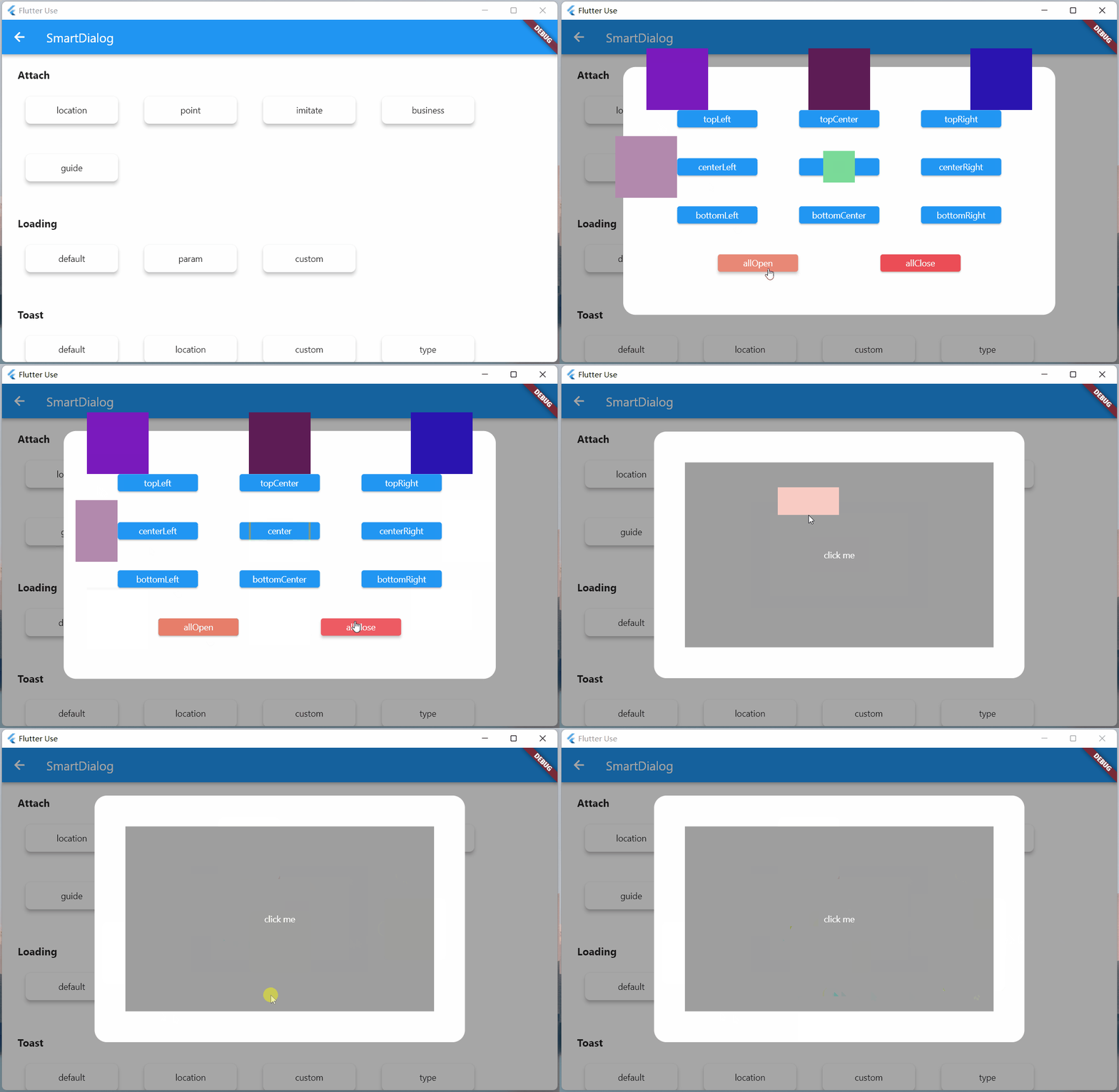
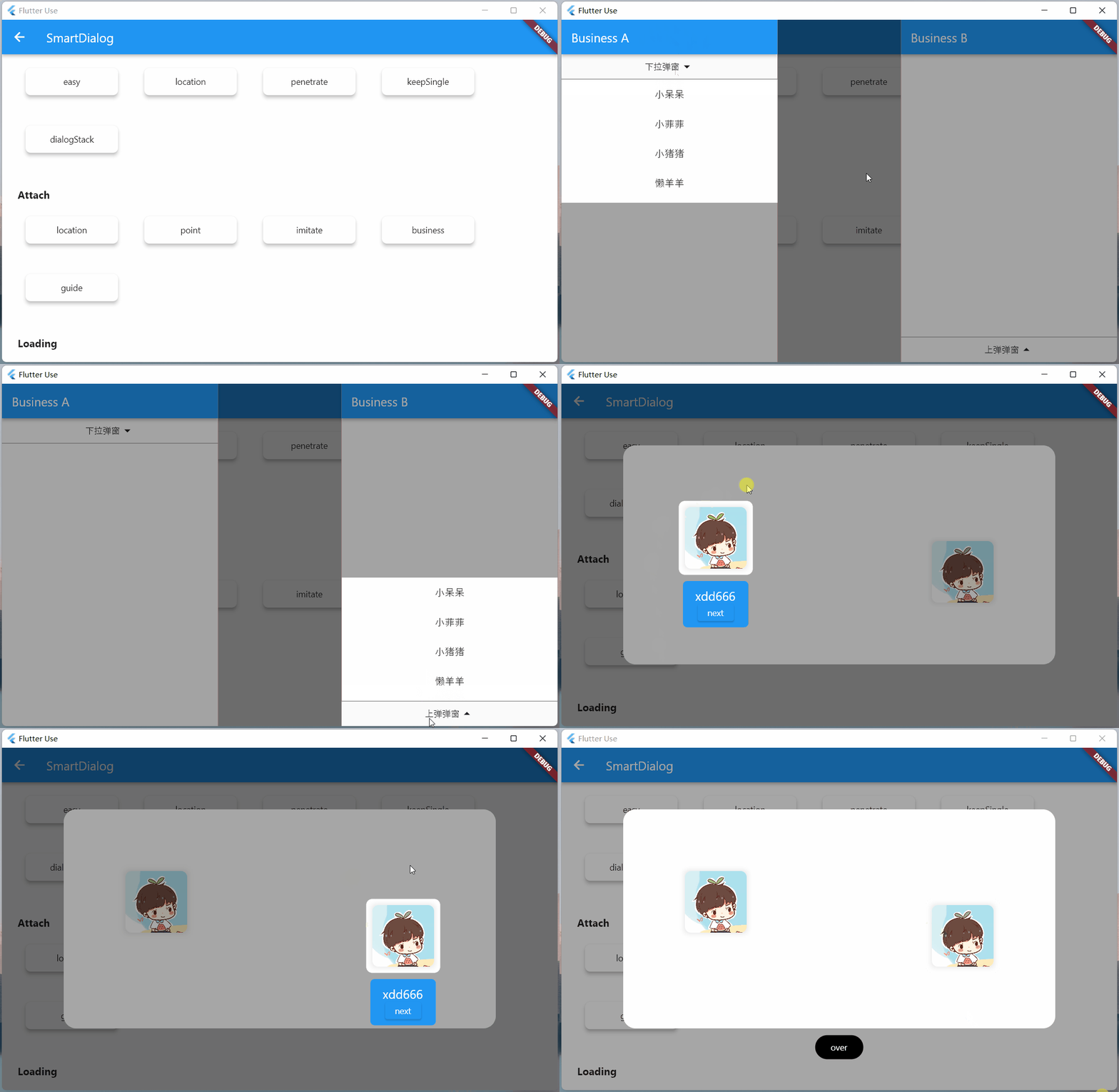
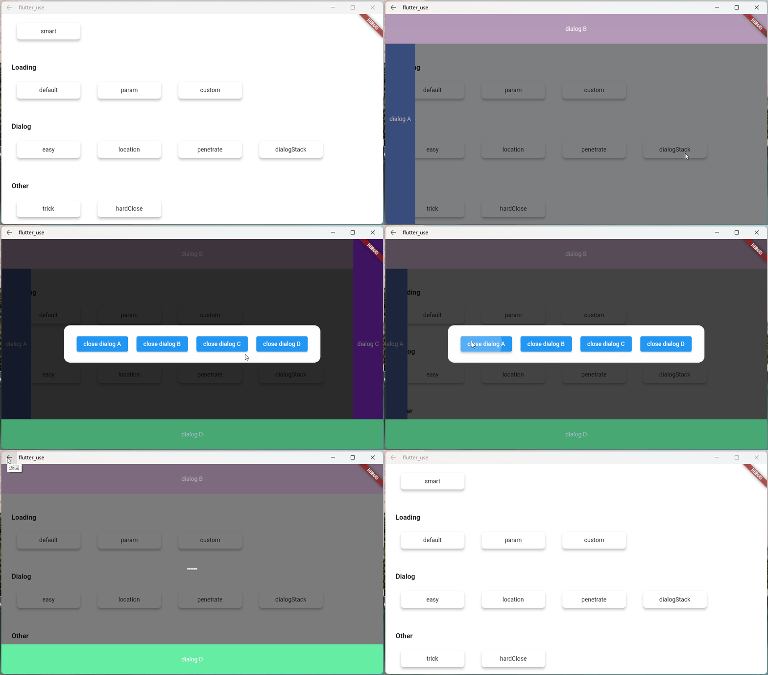
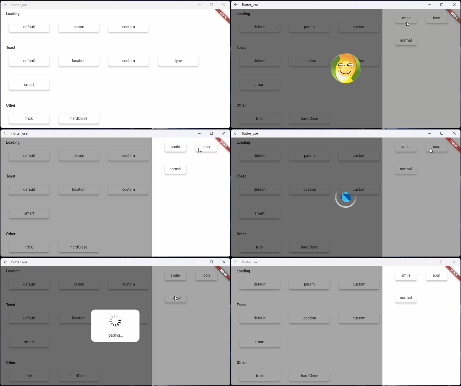
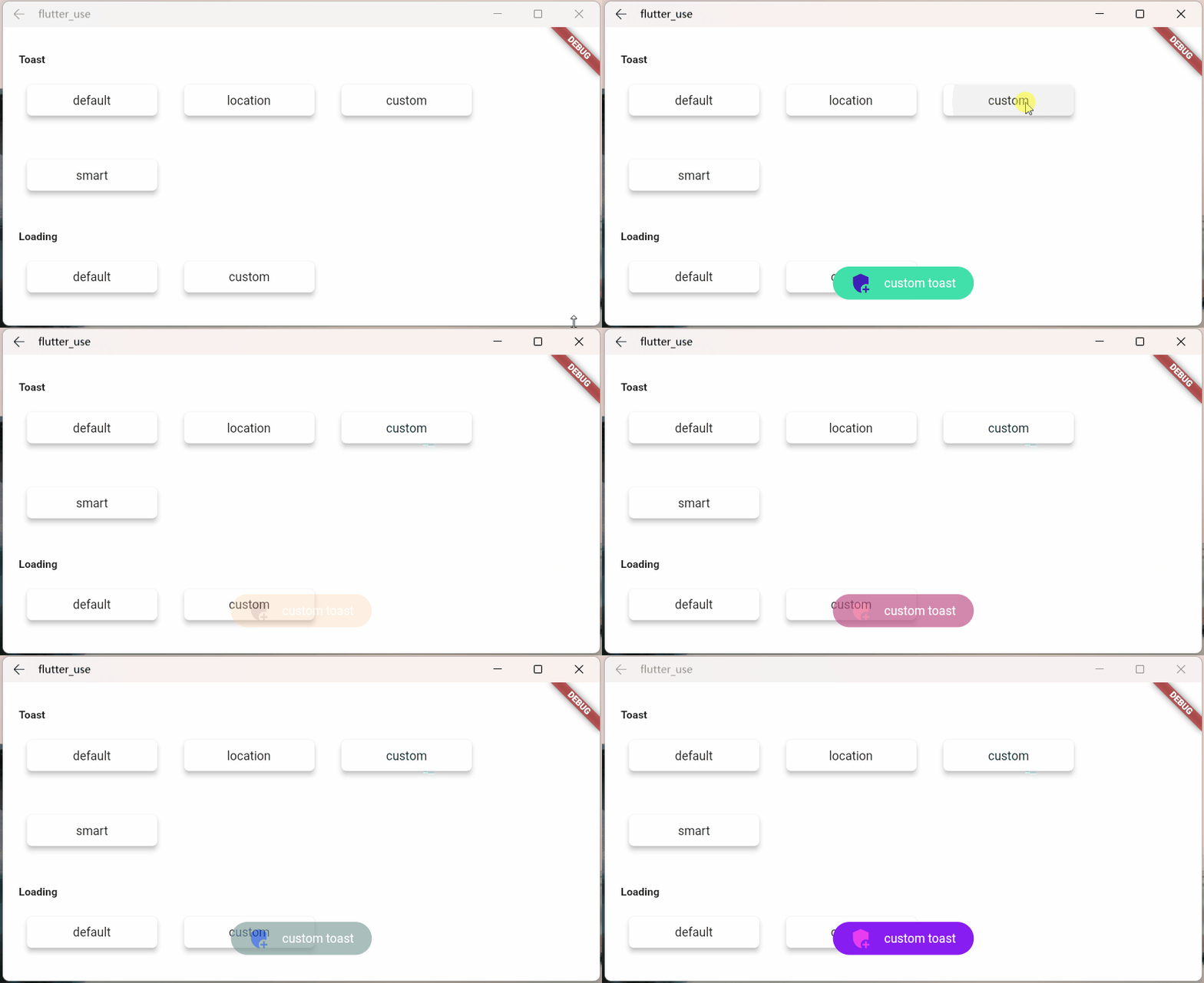
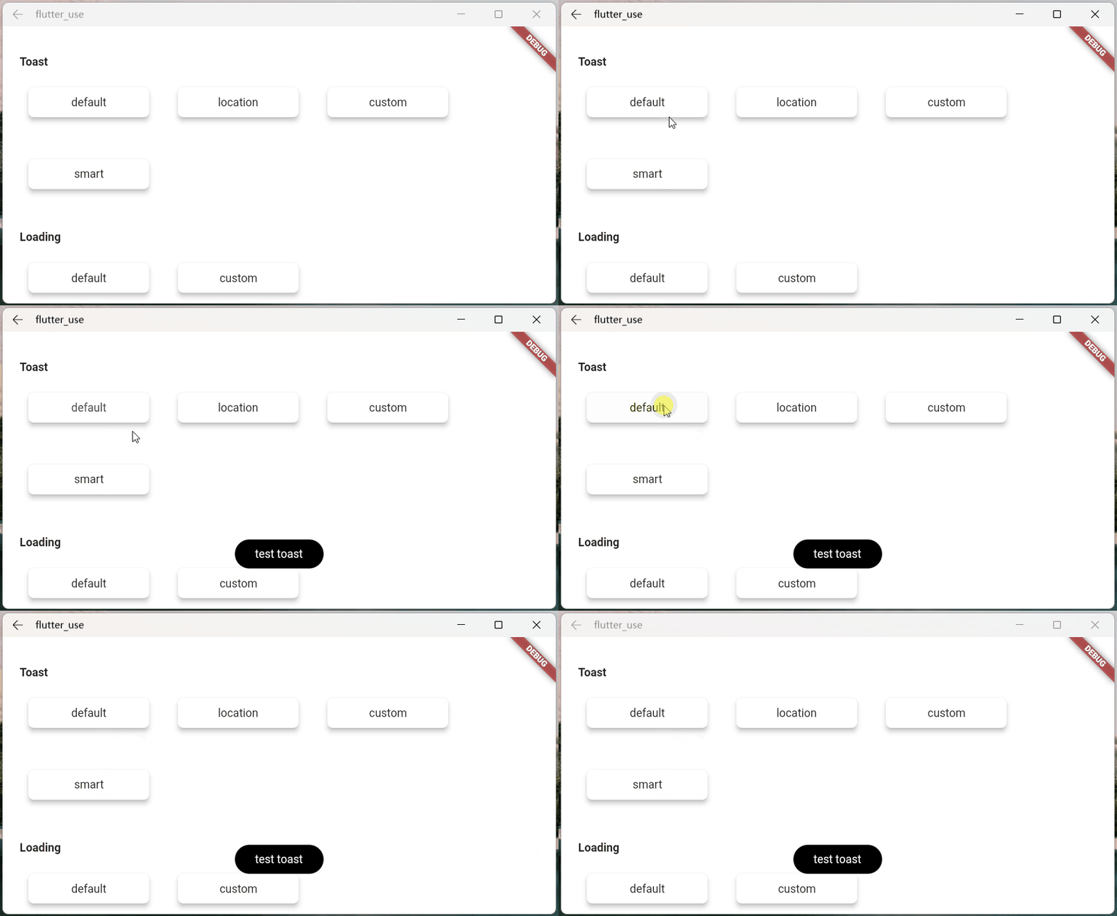
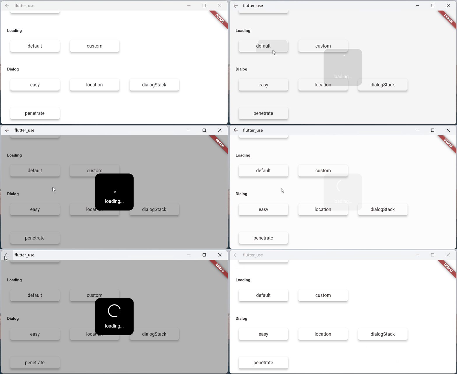
Original README snapshot from the linked source repository. Visit the repository for the latest content.
Feature and Usage(Must read!):super detailed guide
功能和用法(必看!): 超详细指南
Language: English | 中文
Migrate doc:3.x migrate 4.0 | 3.x 迁移 4.0
Flutter 2:Please use flutter_smart_dialog: 4.2.5
Introduction
An elegant Flutter Dialog solution.
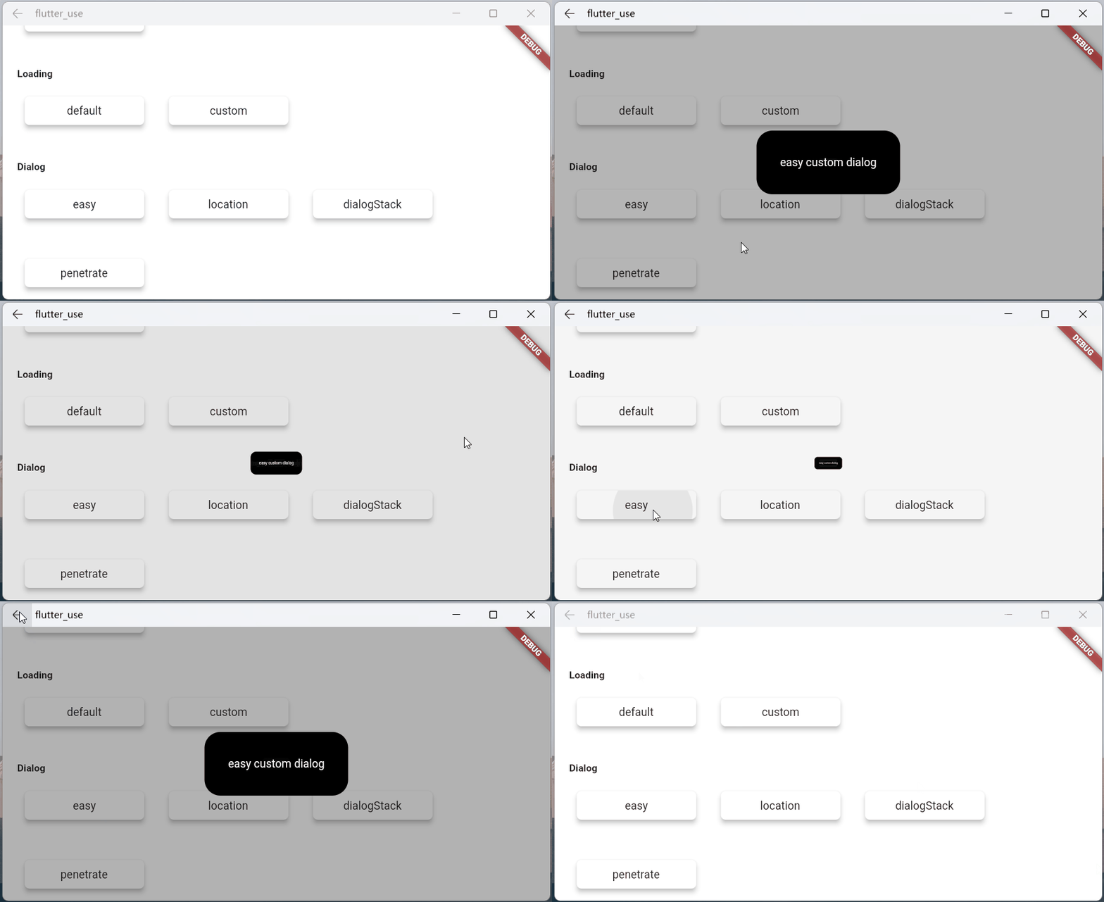
Some Effect
Advantage
Do not need BuildContext
Can penetrate dark background, click on the page behind dialog
Support dialog stack,close the specified dialog
Support positioning widget, display the specified location dialog
Support highlight feature,dissolve the specified location mask
Easily implement toast,loading,attach dialog,custome dialog,custome notify
Quick start
Install
Initialization
initialization
void main () => runApp (MyApp ());
class MyApp extends StatelessWidget @override
Widget build (BuildContext context) {
return MaterialApp (
home: HomePage ,
navigatorObservers: [FlutterSmartDialog .observer],
builder: FlutterSmartDialog .init (),
);
}
}
Advanced initialization: configure global custom Loading and Toast
SmartDialog's showLoading and showToast provide a default style. Of course, custom param are definitely supported.
SmartDialog custom Loading or Toast is very simple: However, when using it, it may make you feel a little troublesome
for example
Use custom Loading: SmartDialog.showLoading(builder: (_) => CustomLoadingWidget);
The effect we want must be like this: SmartDialog.showLoading();
In view of the above considerations, I added the function of setting custom default Loading and Toast styles at the entrance
Let me show you the following
The entry needs to be configured: implement toastBuilder and loadingBuilder, and pass in custom Toast and Loading
void main () => runApp (MyApp ());
class MyApp extends StatelessWidget @override
Widget build (BuildContext context) {
return MaterialApp (
home: HomePage ,
navigatorObservers: [FlutterSmartDialog .observer],
builder: FlutterSmartDialog .init (
toastBuilder: (String msg) => CustomToastWidget (msg: msg),
loadingBuilder: (String msg) => CustomLoadingWidget (msg: msg),
notifyStyle: FlutterSmartNotifyStyle (
successBuilder: (String msg) => CustomSuccessWidget (msg: msg),
failureBuilder: (String msg) => CustomFailureWidget (msg: msg),
warningBuilder: (String msg) => CustomWarningWidget (msg: msg),
alertBuilder: (String msg) => CustomAlertWidget (msg: msg),
errorBuilder: (String msg) => CustomErrorWidget (msg: msg),
),
),
);
}
}
SmartDialog supports default global configuration
SmartDialog .config
..custom = SmartConfigCustom (
maskColor: Colors .black.withOpacity (0.35 ),
useAnimation: true ,
)
..attach = SmartConfigAttach (
animationType: SmartAnimationType .scale,
usePenetrate: false ,
)
..loading = SmartConfigLoading (
clickMaskDismiss: false ,
leastLoadingTime: const Duration (milliseconds: 0 ),
)
..toast = SmartConfigToast (
intervalTime: const Duration (milliseconds: 100 ),
displayTime: const Duration (milliseconds: 2000 ),
);
Easy usage
SmartDialog .showToast ('test toast' );
SmartDialog .showLoading ();
await Future .delayed (Duration (seconds: 2 ));
SmartDialog .dismiss ();
SmartDialog .show (builder: (context) {
return Container (
height: 80 ,
width: 180 ,
decoration: BoxDecoration (
color: Colors .black,
borderRadius: BorderRadius .circular (10 ),
),
alignment: Alignment .center,
child:
Text ('easy custom dialog' , style: TextStyle (color: Colors .white)),
);
});