Package selection guidance compiled from public package information, community data, and project usage.
A Flutter package that enables widgets to behave like CSS 'position: sticky'—they remain visible during scrolling until they reach a specified boundary. Ideal for headers, navigation bars, or any UI element that should stay on screen as content scrolls. The package works across all major platforms including Android, iOS, Web, macOS, Windows, and Linux, providing consistent sticky behavior without requiring native platform-specific code. It integrates smoothly into existing Flutter layouts with minimal setup.
Use cases
Scrolling headers in lists
Sticky navigation bars
Persistent action buttons
Fixed side panels in scrollable views
Dynamic layout elements that follow user scroll
Floating toolbars in forms
Key features
CSS-like sticky positioning
Cross-platform compatibility
Minimal configuration
Automatic boundary detection
Supports nested scroll views
Smooth transition during scroll
Suitable for
Developers building scrollable interfaces
Designers needing sticky UI elements
Apps with long lists or forms
Web and mobile apps requiring responsive layouts
Teams wanting consistent sticky behavior across platforms
Can conflict with other scroll controllers if not managed properly
Original README
Original README snapshot from the linked source repository. Visit the repository for the latest content.
With flutter_sticky_widgets you can use a widget as if it is position: sticky; in CSS.
Sticky widgets is an UI pattern where we want widgets to scroll along with the UI upto a certain point, and then stick to the screen instead of scrolling off the screen.
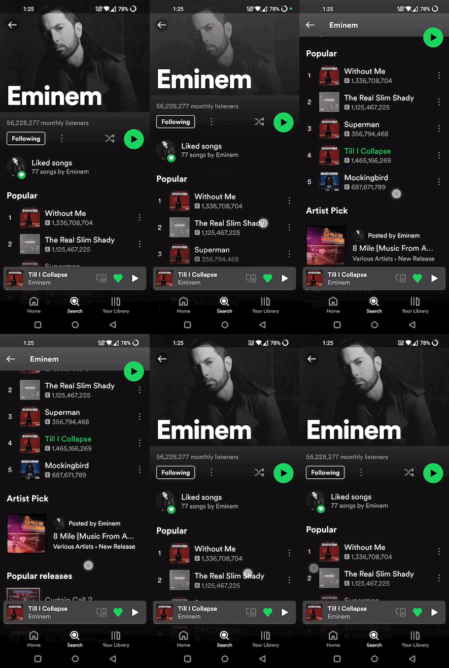
(Green play button in first image, and shuffle play button in second image are examples for position: sticky)
initialPosition (StickyPosition): indicates the position of the widget before the scrolling has started. Position is represented by a custom class StickyPosition.
finalPosition (StickyPosition): indicates the position of the widget where it will remain sticky after sufficient amount of scrolling. Widget will return to its initial position if scrolled in reverse direction.
controller (ScrollController): used by StickyWidget to detect scrolling. Same ScrollController must be attached to your Scrollable (ListView, SingleChildScrollView, CustomScrollView, ...) for StickyWidgets to work. It is also used to determine if the scroll axis is vertical or horizontal.
callback (Function(double)?) (optional): An optional callback function, which gets called on every scroll. It receives scrolloffset as parameter which can be used to animate the StickyWidget.
StickyContainer
It must be the parent element of the Scrollable widget used. StickyContainer's size is used as reference size by StickWidgets to position themselves. So make sure StickyContainer's size is same as the size of the Scrollable widget.
child (Widget): ideally Scrollable widget should be supplied for this parameter, if not you have to make sure StickyContainer's size is same as Scrollable's size.
stickyChildren (List<StickyWidget>): you can supply one or more StickyWidgets.
displayOverFlowContent (bool) (optional): true if you want to display the StickyWidgets overflowing outside of the StickyContainer's bounds.
StickyPosition
A Custom class used to represent initial and final positions of StickyWidget. It takes 4 parameters (top, bottom, left, right). But you should supply only 2 of them (top / bottom, right / left)
Note: Make sure to pass same set of parameters for StickyPosition used in initialPosition and finalPosition