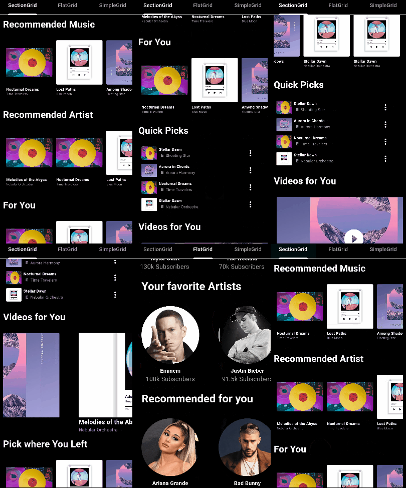
Original README snapshot from the linked source repository. Visit the repository for the latest content.
Flutter Super Grid
A customizable Flutter package for displaying grid views of sections.
Installation
Add the following to your pubspec.yaml file:
dependencies:
  flutter_super_grid: ^1.0.9
Then, run:
$ flutter pub get
Features
Customizable grid view with sections and various configuration options.
Support for item tap callbacks with section and item indices.
Option to invert the row and display the grid horizontally.
Section titles with customizable styling and alignment.
SectionGridView
Usage
import 'package:flutter_super_grid/flutter_super_grid.dart' ;
SectionGridView (
sections: yourSectionsList,
renderItem: (itemData) {
return YourCustomItemWidget (itemData);
},
itemsPerRow: 3 ,
)
FlatGridView
Usage
import 'package:flutter_super_grid/flutter_super_grid.dart' ;
FlatGridView (
data: yourDataList,
renderItem: (itemData) {
return YourCustomItemWidget (itemData);
},
itemsPerRow: 3 ,
)
SimpleGridView
Usage
import 'package:flutter_super_grid/flutter_super_grid.dart' ;
SimpleGridView (
data: yourDataList,
renderItem: (itemData) {
return YourCustomItemWidget (itemData);
},
)
Configuration Table
Configuration
Type
Default Value
Description
dataList
-
The data to display in the grid (SimpleGridView and FlatGridView).
sectionsList
-
The sections to display in the grid (SectionGridView only).
renderItemFunction
-
Function that renders each item in the grid.
onNewItemAddedFunction or null
null
Callback when a new item is added (SectionGridView and FlatGridView).
onPressedFunction or null
null
Callback when an item is pressed (SectionGridView and FlatGridView).
itemsPerRowint
0
Number of items per row or column (applies when isFixed is false).
itemSizedouble
120.0
The size of items in the main axis.
minItemDimensiondouble
120.0
Minimum dimension (width or height) of each grid item (applies when isFixed is false).
verticalSpacingdouble
10
Vertical spacing between items.
horizontalSpacingdouble
10
Horizontal spacing between items.
isFixedbool
false
Whether the grid item size is fixed.
horizontalbool
false
Whether the grid view is horizontal.
invertedRowbool
false
Whether to invert the row.
adjustGridToStylesbool
false
Whether to adjust the grid to styles.
styleSectionGridViewStyle
-
Style configuration for the grid view.
itemContainerStyleContainerStyle
ContainerStyle()
Style for the container of each item (FlatGridView only) (applies when isFixed is false).
footerWidgetWidget
SizedBox
Widget to be displayed as a footer (SectionGridView and FlatGridView).
gridViewHeightdouble
300
Height of the gridview.
gridViewWidthdouble
double.infinity
Width of the gridview.
containerWidthdouble
double.infinity
Width of the main container (applies when it's greater than gridViewWidth).
containerHeightdouble
300
Height of the main container (applies when it's greater than gridViewHeight).
physicsScrollPhysics or null
null
The physics of the scroll view.
Documentation
For detailed documentation, see API Documentation .
License
This project is licensed under the MIT License - see the LICENSE.md file for details.
Issues and Contributions
Feel free to contribute to this project.
If you find a bug or want a feature, but don't know how to fix/implement it, please fill an issue .
If you fixed a bug or implemented a feature, please send a pull request .