Search packages, repositories and app categories

flutter_switch_clipper cover
Package detailsv0.0.7

flutter_switch_clipper

A Flutter package that two widgets switch with default clipper or customized clipper.

AndroidiOSWebmacOSWindowsLinux
30-day downloads
50
Likes
60
Pub points
160

Install package

flutter pub add flutter_switch_clipper

Package Overview

Package selection guidance compiled from public package information, community data, and project usage.

A Flutter package that enables smooth switching between two widgets using either a default or custom clipper. It enhances UI transitions with animated clipping effects, ideal for creating dynamic and visually engaging interfaces. The package supports multiple platforms and integrates seamlessly into Flutter apps. Developers can customize the clipper behavior to match specific design requirements, offering flexibility in animation style and performance. Perfect for interactive elements like tabs, toggles, or content switches.

Use cases

  • Animated widget transitions
  • Custom tab indicators
  • Interactive UI components
  • Dynamic content switching
  • Smooth screen transitions
  • Design-focused animations

Key features

  • Default and custom clipper support
  • Cross-platform compatibility
  • Smooth transition animations
  • Easy integration with Flutter
  • Flexible widget switching
  • Highly customizable clipping effects

Suitable for

  • UI designers seeking visual flair
  • Developers building interactive interfaces
  • Apps requiring dynamic content switching
  • Projects with custom animation needs
  • Flutter beginners exploring clipper effects

Considerations

  • Performance impact with complex clips
  • Requires understanding of Clipper class
  • May need optimization for large widgets
  • Limited documentation beyond basic usage
  • Not suitable for simple static layouts

Original README

Original README snapshot from the linked source repository. Visit the repository for the latest content.

Flutter Switch Clipper

A Flutter package that two widgets switch with clipper.

pub package GitHub stars GitHub forks CodeFactor FlutterCandies

体验一下

体验网址:Demo

使用

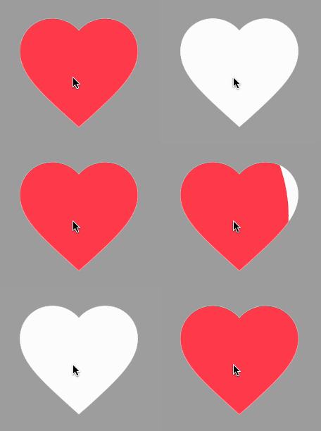
使用FillClipper并自定义相关参数

View code
SwitchClipper(
    initSelect: true,
    child: const Icon(Icons.favorite, size: 200, color: Colors.redAccent),
    background: const Icon(Icons.favorite, size: 200, color: Colors.white),
    duration: const Duration(milliseconds: 800),
    animationClip: FillClipper(fillAlignment: _alignment,fillOffset: 50),
),

使用默认FillClipper

View code
const SwitchClipper(
    enableWhenAnimating: false,
    child: Text(
        'FlutterCandies',
        style: TextStyle(
            fontWeight: FontWeight.bold,
            fontSize: 50,
            color: Colors.amber,
            height: 2,
        ),
    ),
    background: Text(
        'FlutterCandies',
        style: TextStyle(
            fontWeight: FontWeight.bold,
            fontSize: 50,
            color: Colors.white,
            height: 2,
        ),
    ),
    curve: Curves.slowMiddle,
    reverseCurve: Curves.linear,
),

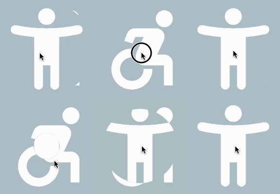
使用CircleClipper切换图标颜色

View code
SwitchClipper(
    child: const Icon(Icons.accessibility_new_rounded, size: 200, color: Colors.blueAccent),
    background: const Icon(Icons.accessibility_new_rounded, size: 200, color: Colors.white),
    curve: Curves.ease,
    duration: const Duration(milliseconds: 800),
    animationClip: CircleClipper(),
),

使用CircleClipper切换两个图标

View code
SwitchClipper(
    child: ColoredBox(
    color: Colors.blueGrey[200] ?? Colors.blueGrey,
    child: const Icon(Icons.accessibility_new_rounded, size: 200, color: Colors.white)),
    background: const Icon(Icons.accessible_forward_outlined, size: 200, color: Colors.white),
    curve: Curves.ease,
    duration: const Duration(milliseconds: 800),
    animationClip: CircleClipper(),
),

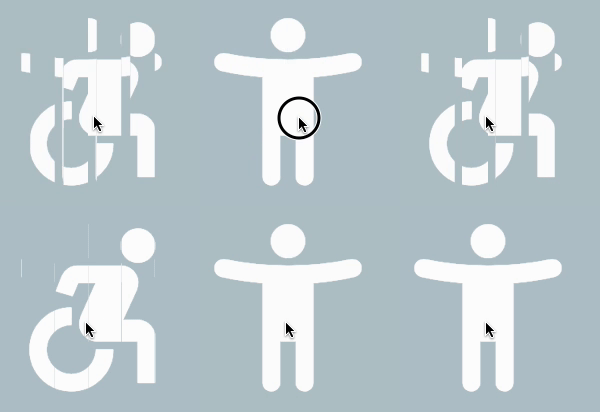
使用ShutterClipper

View code
SwitchClipper(
    child: ColoredBox(
        color: Colors.blueGrey[200] ?? Colors.blueGrey,
        child: const Icon(Icons.accessibility_new_rounded, size: 200, color: Colors.white)),
    background: const Icon(Icons.accessible_forward_outlined, size: 200, color: Colors.white),
    curve: Curves.ease,
    duration: const Duration(milliseconds: 800),
    animationClip: ShutterClipper(activeAlignment: _alignment),
),

使用WaveClipper

View code
SwitchClipper(
    child: const Icon(Icons.access_time_filled_rounded, size: 200, color: Colors.blue),
    background: const Icon(Icons.access_time_filled_rounded, size: 200, color: Colors.white),
    curve: Curves.ease,
    duration: const Duration(milliseconds: 2000),
    animationClip: WaveClipper(
        waveAlignment: _alignment == FillAlignment.left ? WaveAlignment.left : WaveAlignment.right,
    ),
),

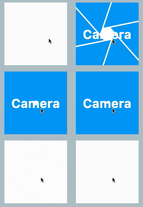
使用CameraClipper

View code
SwitchClipper(
    child: Container(
        width: 200,
        height: 200,
        alignment: Alignment.center,
        decoration: const BoxDecoration(
            shape: BoxShape.circle,
            color: Colors.blue,
        ),
        child: const Text(
            'Camera',
            style: TextStyle(color: Colors.white, fontSize: 40, fontWeight: FontWeight.bold),
        ),
    ),
    background: Container(
        width: 200,
        height: 200,
        decoration: const BoxDecoration(
            shape: BoxShape.circle,
            color: Colors.white,
        ),
    ),
    duration: const Duration(milliseconds: 2000),
    animationClip: CameraClipper(),
),

Categories

Source repository

Projects using this package

No data available yet.